designed-by-architect-robin-donaldson-as-his-personal-home-this-3160-square-foot-loft-is-located-in-downtown-santa-barabara.jpg

Architect Robin Donaldson Just Listed His Santa Barbara Home for $5M

The concrete home soaks up the sun with solar panels, floor-to-ceiling windows, and a rooftop terrace with views of the Pacific Ocean and the Santa Ynez mountains.

Designed by architect Robin Donaldson as his personal home, this 3,160-square-foot loft is located in downtown Santa Barabara.

Location: 414B Anacapa Street, Santa Barbara, California 

Price: $5,000,000

Year Built: 2017

Architect: Robin Donaldson

Footprint: 3,160 square feet (4 bedrooms, 5 baths)

Lot Size: 3,484 square feet

From the Agent: “Designed by award-winning architect Robin Donaldson as his personal residence, this 1-of-1 home epitomizes the Santa Barbara lifestyle on a site in the heart of downtown, right next to the beach. This home offers the utmost privacy, set back from the street behind two gates. The 3,160-square-foot residence features four beds, five baths, a separate office, and an elevator. The design’s seamless indoor/outdoor spaces are enhanced by floor-to-ceiling windows and a rooftop terrace with soaking tub. Additional highlights include a massive two-car garage and solar panels.”

Designed by architect Robin Donaldson as his personal home, this 3,160-square-foot loft is located in downtown Santa Barabara.

Designed by architect Robin Donaldson as his personal home, this 3,160-square-foot residence is located in downtown Santa Barbara. 

Photo by Blake Bronstad

Photo by Blake Bronstad

Photo by Blake Bronstad

See the full story on Dwell.com: Architect Robin Donaldson Just Listed His Santa Barbara Home for $5M

large.jpg

This London Townhome Boasts Two Dedicated Music Listening Areas

A renovation made space for a record cabinet that’s wired to every room in the house; outside, a garden studio features a second setup.

Houses We Love: Every day we feature a remarkable space submitted by our community of architects, designers, builders, and homeowners. Have one to share? Post it here.

Project Details:

Location: London, United Kingdom

Architect: Archmongers / @archmongers

Footprint: 2,200 square feet

Structural Engineer: Foster Structures LTD

Landscape Design: Miria Harris

Carpenter: Tepassé

Photographer: Jim Stephenson / @clickclickjim

From the Architect: “Archmongers has completed a modern update of a Victorian house in a conservation area in Dalston, Hackney, for a creative couple working in the fields of graphic design and illustration. The project has transformed the house from a poorly insulated, single-glazed, gas-heated property with an irrational compartmentalized plan into a thermally efficient, all-electric, hi-tech, contemporary home with abundant daylight. A sunny yellow frieze on the new rear extension features a pattern with stylized rays overlooking the re-landscaped garden and new garden annex housing a music room.

“The rear elevation is defined by a two-story yellow brick column with frameless windows, accommodating an additional single room on the ground and first floors and a lateral extension on the lower ground floor. The lower ground extension introduces generous sliding glazed doors that open onto the garden and is characterized by its ornamentation: decorative concrete tiles cut with a pattern which takes inspiration from the Victorian plasterwork on the street elevation. The bespoke pattern was designed by the client, Leona Clarke, working closely with Archmongers to fabricate and install it. The tiles were designed to have interlocking and overlapping shapes at different depths. Over time, the design will become more visible as the raised areas darken.

“Inside, the house has been remodeled as a background to the clients’ collection of art and furniture. The solid steel columns and beams defining the threshold to the extension are revealed, combined with the warmth and tactility of raw materials. The new layout relocates the kitchen to the upper ground floor, where it faces onto the front garden and receives even north light. This reunites the kitchen with the dining room, creating a progressively more private domain towards the back of the house, facing the garden.

“The extension now holds a cozy snug on the upper ground floor, and on the lower floor is a seating area in the living room which is dedicated to listening to music. This area is lit from above and furnished with a bespoke Douglas fir DJ cabinet with wall-mounted speakers, and the entire house is wired to stream music into every room from this listening space.

“A new stair centers these spaces, crafted from Douglas fir and ply—softwoods specified over carbon-heavy slow growing timbers—and accented with black rubber treads. This joinery—handcrafted by furniture designer/maker, Charles Tepasse—is a central design device repeated throughout, and an exercise in exploring the range of a single material. It reappear in the door frames, the deep timber window sills, as a fire door in the first-floor lobby, as a bed frame in the principal bedroom, and as a dividing wall to form a dressing room.

“The house is future proofed: kitted out with thermal insulation and underfloor waterproof membranes to reduce moisture levels, it is now powered by a heat pump, which is located in the front garden and cleverly concealed by a decorative Cor-Ten steel screen designed by Leona and fabricated by Bikebox Works.

“A new 129-square-foot garden studio provides an annexed space separate from the house for the client to enjoy their extensive vinyl collection. It features a wildflower green roof and rainwater collection and is accessed via the south-facing garden, which features a stepped landscape with verdant planting including evergreen climbers, designed by garden designer Miria Harris. A pergola provides shading to the rear façade and patio.”

Photo by Jim Stephenson

Photo by Jim Stephenson

Photo by Jim Stephenson

See the full story on Dwell.com: This London Townhome Boasts Two Dedicated Music Listening Areas
Related stories:

large.jpg

My Big-Box Store Sofa Does Exactly What My DTC Sofas Didn’t

When my dream sectional arrived covered in what looked like blood stains, Raymour & Flanigan saved the day.

Welcome to Sofa Sagas—stories about the circuitous search for a very important and occasionally fraught piece of furniture.

I recently purchased a sectional from a DTC furniture brand. Yes, I’m ashamed. I knew better than to spend thousands of dollars on an object I’d never experienced in person, and to buy that object from a company whose Google results contain multiple Reddit posts titled things like “DO NOT BUY FROM [THIS COMPANY]” and “HELP!! HOW DO I DEAL WITH [THIS COMPANY]?” And yet I did. Please, listen to my story and learn from my mistakes.

To explain myself briefly—I’m not a particularly picky person when it comes to home decor. Most of the furniture in the apartment I share with my husband and our two dogs was acquired either as a hand-me-down or at low cost. Our space is decorated not intentionally, but merely with the things we’ve collected over the course of our lives: a papier-mâché head, multiple paintings of our dogs, a clay guy who is screaming, a small wooden hippo. My husband purchased our previous sectional before we lived together; it came from Wayfair and cost $500, which is an amount I didn’t know a sectional could cost. We had it for years.

That couch had undergone multiple surgeries over the years, performed by my husband. During the surgeries he would remove errant springs from the underside of the cushions and replace them with dish towels, duct taping the resulting hole. Eventually the couch became more dish towel than spring, and yet still, every time you sat down, you felt a spring poking you in your butt. I decided I couldn’t sit on this couch for another second around November of 2024. We sold it for $100 to a nice couple who, when they picked it up, said, “this will be perfect for our dog.” Correct.

I think you would agree that it was reasonable to assume a new DTC couch could not be worse than our previous couch. While researching options, I sought advice from friends, none of whom recommended the brand we ended up going with, and all of whom recommended DTC brands that indeed seemed better but were outside of our budget.

We settled on our new couch in part because the brand had a flashy Black Friday sale. Normally over $5,000, this couch was priced at just over $3,000. (Yes, I’m aware that brands like this hold these “sales” frequently, and that the “actual” price of over $5,000 is little more than an illusion. This is another red flag I ignored so you could learn this valuable lesson—you’re welcome.)

The couch seemed like everything I wanted our new couch to be, which was only three things: comfortable, a bit larger than our previous couch, and normal. It seemed to have good reviews and, in part because my bar was low, I felt confident splitting the purchase between my credit card and my husband’s so we could each get a share of the points.

The couch took a little over two months to ship. The idea of it somewhat brightened the ceaseless litany of dark American moments in the weeks between November and late January. Then finally it arrived.

After the couch was delivered and set up in our living room, my husband and I immediately noticed it was covered in large red stains that looked unnervingly like blood. (They could have also been permanent marker or, I guess, an extraterrestrial substance meant to serve as some sort of warning.) We counted six stains across the sectional’s body and pillows, and immediately I knew the expensive and scary couch must be returned. My husband—grasping at the idea that maybe, since we’ve been waiting so long for the couch, and since the couch was pretty much the only thing we had going for us right now and in fact our entire sense of wellbeing was dependent upon the couch, we could just live with the apparent blood stains if everything else was okay—expressed the desire that I slow down. “Let’s at least see if it’s comfortable first,” he said.

“You have to go Karen mode,” a friend advised. She was right.

The couch certainly appeared comfortable, with large, amply-stuffed pillows. It was big, poofy, and inviting. We sat down with our full weight, expecting to be supported by a dreamy cushion, only to instantly meet the cruel reality of a wooden plank. It felt like sitting on a surf board, or the stage crew-crafted Central Perk couch in a high school production of Friends. It was not only uncomfortable, it was flimsy; it made our old couch seem like a dish towel–stuffed picture of craftsmanship and relaxation. It was the worst couch I had ever experienced.

I sat on the surfboard couch while I Googled the company’s return policy. It showed that between shipping costs and the restocking fee, I would likely end up paying more to return the couch than I did to buy the couch. On top of that, Redditors complained that the company had a tendency to draw out returns past the return window, leaving you without whatever sum would even be left after their rapacious fees. Thank god, then, for the blood stains. “You have to go Karen mode,” a friend advised. She was right.

“Call [the company] immediately,” I told my husband. “To ask them what we should do?” he asked, too kind for this world. “No,” I said. “Tell them we’ve been shipped a defective couch with mysterious stains, we do not feel comfortable having it in our home, and we require an immediate pickup and a full refund without fees!!”

While he called, I emailed; we had to come at them from all sides. The customer service rep he spoke to said they would likely comply with our demands, but she had to check something and would call him back later that day. I said, to my husband, “SHE’S LYING! CALL BACK IN HALF AN HOUR! MENTION FEDERAL LAW!” Frightened, he did what I said, and that phone call led to a request for photos of the apparent blood stains, which we were happy to provide. And, well—I could explain to you in detail the litany of straining and polite emails and increasingly stern phone calls that took place over the next days, and believe me I would like to, but I know you’re busy, so let me just say: we eventually won. They agreed to pick up the couch at no cost, which they did a week after they delivered it, and gave us a full refund.

The day after we were introduced to the horror of the demon couch, my husband and I drove to the nearest Raymour & Flanigan. There, we sat on 30 to 40 reasonably comfortable couches. They were nearly all priced far lower than anything we’d looked at online. Eventually, we found our couch: comfortable, a bit larger than our last couch, normal, and $1,000 less than the other one. Raymour & Flanigan delivered it two days after we ordered it. It’s gray and its vibe is cozy, but it’s aesthetically neutral enough that it would likely register as nothing more than “couch” to a visitor. It looks at home in our living room, and it is a pleasure to sit upon.

Please, if you take anything away from this story, let it be this bit of wisdom: just buy a couch you’ve already sat on. You don’t have to buy a direct-to-consumer couch based on vibes and the misguided idea that there is something to gain financially by doing so. You can actually just go to one of the brick-and-mortar places that sells couches, sit on all of their couches, and pick the one you like the best. I love our new couch. 

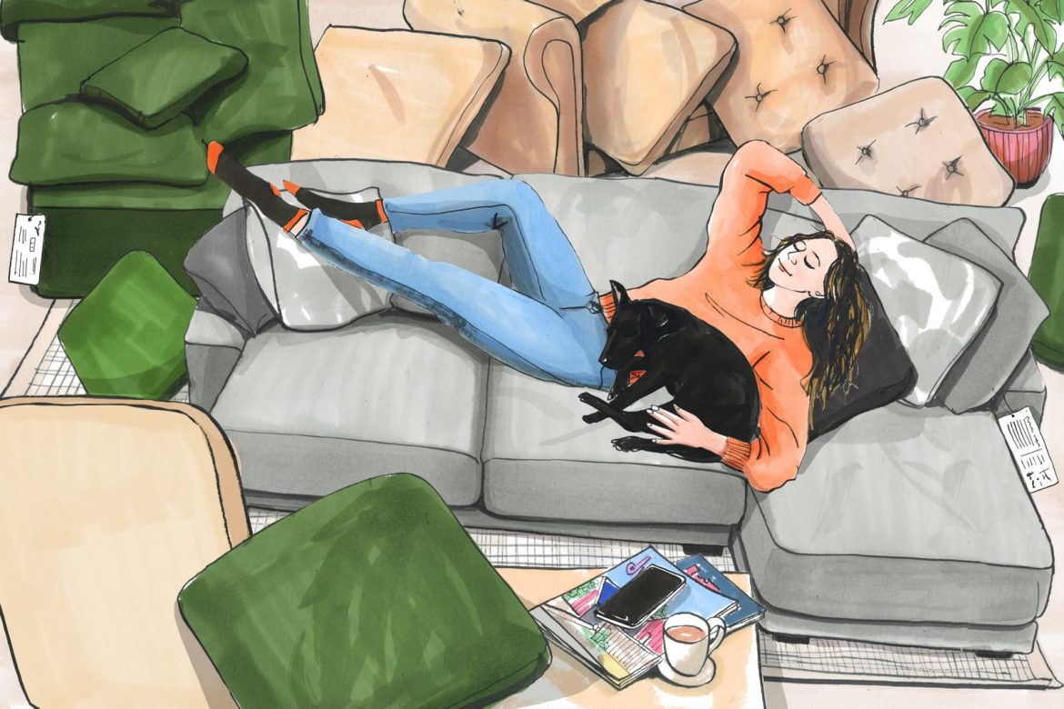
Illustration by Clare Mallison

Related Reading:

My Wayfair Sofa Is Perfectly Fine—and That’s Good Enough for Me

My Exasperating Odyssey to Find the Perfect (Not Gray) Couch(es)

large.jpg

Carved Up Floors Make This Five-Level Belgian Home More Open

Some were turned into mezzanines, making the vertical plan feel connected—right down to a “pond” in the backyard.

Houses We Love: Every day we feature a remarkable space submitted by our community of architects, designers, builders, and homeowners. Have one to share? Post it here.

Project Details:

Location: Ghent, Belgium

Architect: LDSRa / @ldsra.be

Architect: Olivier Goethals / @oliviergoethals.info

Footprint: 2,368 square feet

Builder: Jonas Bockxstaele

Structural Engineer: H110 Ingenieur en Architecten

Photographer: Michiel Decleene

From the Architect: “Valine is the renovation of a narrow, tall, and deep terraced house. Before the renovation, it was a home with a very small west-facing garden. On the ground floor, the veranda and the ground-level extension were demolished. The small garden transforms into a large garden with a floating caravan above it. The living spaces are organized around the transition between indoors and outdoors, in both depth and height. The existing staircase, spiral staircase, void, and bridge create a route between the kitchen on the ground floor, the living area, and the caravan on the first floor. The caravan accommodates storage, an additional bathroom, and a toilet. The second floor is organized as office space, with access to a rooftop garden and a bay window. The rooms on the third and fourth floors are designed as bedrooms with a bathroom.

“Valine is a personal project. It is radical in its interventions yet empathetic in how life within and around the house is accommodated. The house is boldly designed and richly detailed. The relationship between the rooms and floors is enhanced by removing sections of the floors. The floor plan is derived from the cross-section design. The house appears to have an extra floor, and several additional spaces have been incorporated. As a result, the house feels generous and accommodating. The joinery of the rear façade, the canopies, and the folding door strongly emphasize the connection between indoors and outdoors. The collection of rainwater in the pond adds an extra dimension to the project. Throughout the day, you move with the light of the sun. The folding door remains open, blurring the boundary between inside and outside.”

Photo by Michiel Decleene

Photo by Michiel Decleene

Photo by Michiel Decleene

See the full story on Dwell.com: Carved Up Floors Make This Five-Level Belgian Home More Open
Related stories:

before-the-houses-exterior-with-neglected-overgrown-landscaping-left-much-to-be-desired.jpg

Before & After: Three Creative Sisters Team Up to Remodel Their Mom’s Forever Home

The cheerful Seattle midcentury sports fish scale shingles, punchy paint, and stained glass windows designed by one of the siblings.

Sitting jauntily on its block, this renovated residence in Seattle’s Mount Baker neighborhood retained the original home’s footprint. The architect (and daughter of the homeowner) opened up the living spaces inside and overhauled the exterior and landscaping to give it a more contemporary presence. Cambium Landscape created the outdoor spaces which perfectly balance hardscape with greenery.

One of the first times Cynthia Chua saw her future home in person, it was about to take an excavator to its side. Fortunately, the Seattle property was handpicked by two of her daughters, Sarah and Julia Smith, who have a keen eye for design: Sarah is an architect at local firm Best Practice Architecture, and Julia works at Unique Art Glass, a family-owned, custom stained glass studio.

Homeowner Cynthia Chau chats with two of her daughters in the kitchen of her Seattle home.

The 1950s two-level residence is set on a quiet street in Seattle’s Mount Baker neighborhood, and it has views of Lake Washington just a few blocks away, so it seemed like the perfect place for Cynthia, a retired doctor, who was moving to Seattle from Cincinnati to be closer to two of her three daughters. (The oldest, Lauren is a creative director and amateur photographer living in Los Angeles with her three young children).

Before: Exterior 

Before: The house’s exterior, with neglected, overgrown landscaping, left much to be desired.

Before: The home’s exterior, with neglected, overgrown landscaping, left much to be desired.

Courtesy of Best Practice Architecture

After: Exterior 

Sitting jauntily on its block, this renovated residence in Seattle’s Mount Baker neighborhood retained the original home’s footprint. The architect (and daughter of the homeowner) opened up the living spaces inside and overhauled the exterior and landscaping to give it a more contemporary presence. Cambium Landscape created the outdoor spaces which perfectly balance hardscape with greenery.

Sitting jauntily on its block, this renovated residence in Seattle’s Mount Baker neighborhood retains the original home’s footprint. Sarah Smith, the architect (and daughter of the homeowner, Cynthia) opened up the living spaces inside and overhauled the exterior and landscaping to give it a more contemporary presence. The landscape firm Cambium created the outdoor spaces, which perfectly balance hardscape with greenery.

Photo by Rafael Soldi Photography

See the full story on Dwell.com: Before & After: Three Creative Sisters Team Up to Remodel Their Mom’s Forever Home
Related stories:

large.jpg

How Coveted Midcentury Furniture Is Getting Way More Coppable

You might not need to scour auction sites for that rare item—new licensed productions from famous designers are making it easier than ever to get the real thing.

Welcome to Field Guide, a column by Sami Reiss of Snake covering all-time design and where you can find it.

At a recent edition of Salone del Mobile in Milan, Cassina, the Italian furniture company, debuted a light by Ray and Charles Eames that had never been put into production before. Working behind the scenes of the release of the Galaxy, a 1949 design that Eames Office had been working on introducing since the 1980s, was Form Portfolios, a licensing company that opened shop expressly to make designer midcentury furnishings more accessible to the era’s aficionados.

For that crowd, Form’s efforts, along with those of legacy producers, are today creating a refreshed retail environment for historic design objects: some originally made only in small numbers, others that may have been produced at grand scale but went out of production, and, in the case of the Galaxy, those that were never created to begin with. These objects now give the vehement design lover other options besides shelling out five figures for a vintage piece, or competing against other buyers at auction in hopes of a deal on one.

At Salone del Mobile in 2023, Cassina debuted the Galaxy light, a 1949 design by Ray and Charles Eames.

At Salone del Mobile in 2023, Cassina debuted the Galaxy light, a 1949 design by Ray and Charles Eames.

Photos © Eames Office, LLC, 2025

For Form’s founder and CEO, Mark Masiello, seeing through the release of the Galaxy and more objects like it comes out of a “pure love for design and a desire to bring innovation to the industry,” he says. An avid furniture collector who was working in private equity, Masiello began Form, based in Rhode Island and Copenhagen, in 2017 after taking a tour of Hans Wegner’s studio. A long-time collector of Wegner’s, Masiello was moved by a folder containing designs for the Wishbone chair, and dismayed by the spare fashion in which the studio was operating. “It was just one family member,” Masiello says, “part-time, three days a week.” It was clear the archive was languishing: despite Wegner’s name and body of work, the family didn’t know what to do.

“If an artist makes music,” Masiello explains, “a music publisher manages these rights—but that doesn’t exist in the design world.” Or it didn’t before: Form, Masiello says, has put 600-plus pieces into production by connecting families with producers. (In furniture, generally, a designer owns a design and licenses it to a furniture company, which then produces it. Myriad factors, though—including the death of a designer—determine whether it remains in production.) Most notably, the firm helped return Paul McCobb’s work to the market after a several-decades-long absence. While he was among the most popular designers of the 1950s and ’60s—his disarmingly simple tapered-leg chairs and desks were often modular, and built out the midcentury home and office aesthetic—times changed, and his pieces fell out of production. And over the past several years, the McCobb heirs, through Form, have returned the designer’s work back into wide availability under several different makers. CB2, notably, has reintroduced several designs by McCobb, many of them from his Irwin collection and others a selection of Bowtie seating.

Designed in 1952, Paul McCobb’s C7806 coffee table from CB2 is hewn from American white oak and Arabescato marble.

Designed in 1952, Paul McCobb’s C7806 coffee table from CB2 is hewn from American white oak and Arabescato marble.

Photo courtesy of Form Portfolios

The process for bringing some of these objects to market can be lengthy. To update Eames’s Helena light, originally created for a church in Arkansas, Eames Demetrios, Ray and Charles’s grandson and the Eames Office’s director, says he spent 200 hours interviewing people, including churchgoers, who were close to the object in some way. Recreating other items is more straightforward: Hem, a Finnish design brand, is responsible for a faithful remake of Yrjö Kukkapuro’s Experiment chair. (Having debuted at Salone del Mobile in 1982, the chair itself isn’t midcentury, but Kukkapuro is of that era.) On its own, Eames Office handles the creation of some of Ray and Charles’s designs, like an elephant toy that was never put into production until recently. As with that instance, sometimes items are rolled out with an eye toward younger consumers, or those who are new to design. “The elephants were part of that,” says Demetrios, an “entryway into design.”

Photos courtesy of Hem

See the full story on Dwell.com: How Coveted Midcentury Furniture Is Getting Way More Coppable
Related stories:

set-on-a-wooded-coastal-site-just-south-of-vancouver-the-home-evokes-the-design-language-of-the-utopian-community-with-its-sloped-roof-cozy-nooks-and-exposed-timber-construction.jpg

This $1.2M Cabin Is Like a Slice of Sea Ranch in British Columbia

Set on a wooded coastal site just south of Vancouver, the home evokes the design language of the utopian community with its sloped roof, cozy nooks, and exposed timber construction.

Set on a wooded coastal site just south of Vancouver, the home evokes the design language of the utopian community with its sloped roof, cozy nooks, and exposed timber construction.

Location: 2432 Christopherson Road, Surrey, British Columbia, Canada

Price: $1,700,000 CAD (approximately $1,189,347 USD)

Year Built: 1979

Architect: John Perkins

Footprint: 1,907 square feet (3 bedrooms, 2 baths)

Lot Size: 0.19 Acres

From the Agent: “Presenting The Cedar House—a rare surviving modernist retreat set between ocean and forest, designed by John Perkins after shaping Whistler Village. Its Sea Ranch–inspired form—steeply sloped roofs, exposed timber, and seamless integration with nature—creates a home that is both striking and serene, where architecture disappears into the landscape, offering an escape deeply rooted in its surroundings.”

The home was designed by John Perkins, an award-winning Canadian architect who shaped much of Whistler Village.

The home was designed by John Perkins, an award-winning Canadian architect who shaped much of Whistler Village.

The Whitespace Co.

The living room features a functional fireplace.

The living room features a functional fireplace.

The Whitespace Co.

The Whitespace Co.

See the full story on Dwell.com: This $1.2M Cabin Is Like a Slice of Sea Ranch in British Columbia
Related stories:

large.jpg

How They Pulled It Off: A Twisty, Floating Staircase for a 14-Foot Ceiling

INC Architecture and Design used creative solutions to meet building codes and build “the tightest puzzle you’ve ever seen.”

Welcome to How They Pulled It Off, where we take a close look at one particularly challenging aspect of a home design and get the nitty-gritty details about how it became a reality.

Hiding in plain sight in Greenpoint, Brooklyn—a neighborhood known for its railroad-style apartments and recently developed high-rise buildings—is a ground-level maisonette with a winding floating staircase. In terms of New York City apartments, this two-bedroom is a unicorn with a lofty, 14-foot-high ceiling and a private terrace with its own entrance. It’s the only unit of its kind in a six-floor residential building. 

On the main wall, Lin hung a photograph by Matthew Johnson; under the stairs, a small table by Phaedo. A custom chandelier by In Common With hangs overhead and a side table by Grain Design was added to the first landing.

On the main wall, Lin hung a photograph by Matthew Johnson; under the stairs, a small table by Phaedo. A custom chandelier by In Common With hangs overhead and a side table by Grain Design was added to the first landing.

Photo by Brooke Holm

INC Architecture & Design, the firm that designed 1 Hotel Brooklyn Bridge and the TWA Hotel at JFK Airport (among other architectural landmarks), handled every creative aspect of this property. “It was exciting for us as we don’t often get approached for a project like this,” says Drew Stuart, INC cofounder and Construction & Development Director. “We took on the entire scope as executive architect, design architect, and interior designer for all the units.”

The ground-floor windows flood the apartment with natural light. For the dining area, Lin commissioned a table by Moving Mountains and installed a pendant light by In Common With.

The ground-floor windows flood the apartment with natural light. For the dining area, Lin commissioned a table by Moving Mountains and installed a pendant light by In Common With.

Photo by Brooke Holm

For the ground floor unit, which is considered a retail-level space, INC saw an opportunity to create an elegant staircase that works with the large, windowed patio doors. (A legitimate retail space requires at least 14-foot-high ceilings; this ceiling line strikes all the way through to the back where the apartment is located. A bank occupies the front-facing retail space.)

The primary bedroom upstairs.

The primary bedroom upstairs.

Photo by Brooke Holm

See the full story on Dwell.com: How They Pulled It Off: A Twisty, Floating Staircase for a 14-Foot Ceiling
Related stories: