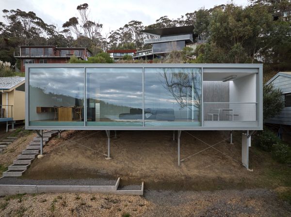
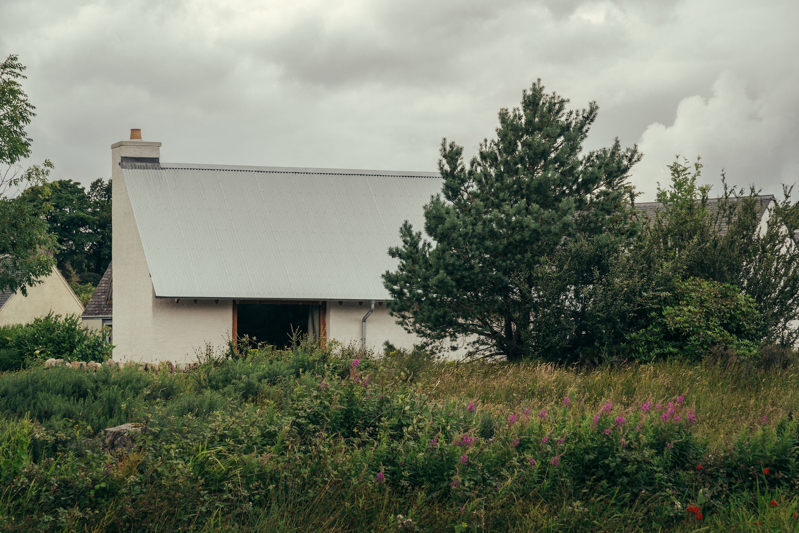
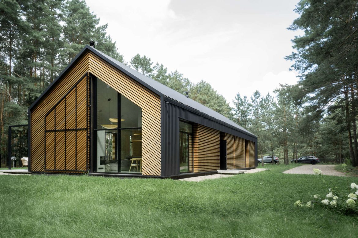
After spending about $247K on land, Matt Goodman saved on square footage and splurged on glazing to build a minimalist getaway on stilts that feels like it’s floating.
Matt Goodman had been keeping an eye out for vacant blocks along the Great Ocean Road in Victoria, Australia, for years.
The architect and his wife, Corrie, hail from Wollongong on Australia’s east coast, although they’re based in Melbourne and they often holidayed in the small nearby towns of Separation Creek and Wye River, drawn to their simple lifestyle and similarity to the coastline where they grew up. Building their own beach house in the region was a long-held dream.
In the Australian town of Separation Creek, architect Matt Goodman built a compact beach house for about $270,000 USD. The cabin hovers over the site on stilts, giving it a floating effect.
Photo by Jack Lovel
Such was their connection to the locale that in December 2015, when a wildfire tore through the area, Matt felt compelled to step up. He put word out through local businesses, offering to help residents who had lost their homes rebuild. “It was around the same time that I started my office and I didn’t have a lot of work—and then instantly I had three pro bono jobs,” he recalls. “I was busy, but still not making much money.”
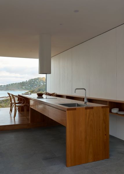
The custom kitchen counter and dining table set the couple back $5,600 ($3,350 USD), but Matt says it’s now the hub of the home. They installed the wall shelf after moving in at an additional cost of $2,600 ($1,550 USD). It had initially been scrapped to save money, but they quickly realized the extra storage it offered was essential after all.
Photo by Jack Lovel
The silver lining was that the pro bono work gave Matt valuable insight into the landscape. When vacant blocks popped up for sale, “I was able to weed out whether a site was good, or too difficult, or too expensive,” he says. “I had knowledge that I could put into our own build, so that we could try to do it for a song.”
In 2018 they secured a “perfect” site on a hill overlooking the ocean, but their budget for the build was just $400,000 ($250,000 USD). “We knew the house needed to be compact and simple and cost-effective,” Matt says, “but we also wanted it to be a beautiful space where the experience of being down there, surrounded by nature, was really intense.”
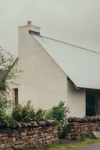
The cabin’s corrugated iron cladding (Colorbond steel in Windspray) riffs on the quintessential Aussie beach shack’s fiber cement sheeting, but is far more fireproof. When not in use, the cabin can be completely closed off with a sliding gate.
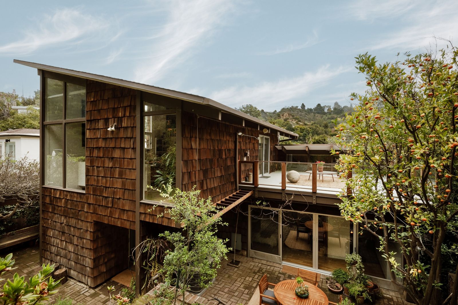
Drawing inspiration from Sea Ranch and their passion for the natural world, Leona and Rudolph Mattoni crafted a Beverly Hills home with soaring windows, plentiful patios, and overflowing gardens.
Location: 9620 Heather Road, Beverly Hills, California
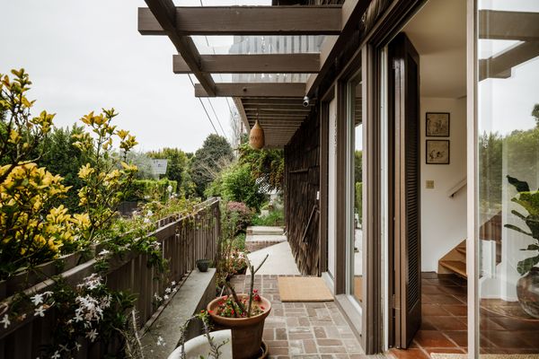
From the Agent:“Leona and Rudolph (Rudi) Mattoni, partners in life and business, designed this three-level home, incorporating period features like cedar-shake siding, post-and-beam construction, soaring vaulted ceilings, and luminous clerestory windows. Each room prioritizes abundant natural light and an immediate connection to Coldwater Canyon’s sylvan setting. Terraced exterior spaces and views of coast live oak and neighboring Norfolk Island pines stretch the lot lines to appear far beyond their measure. Rudi Mattoni, a renowned lepidopterist, environmentalist, and real estate investor, was a self-taught designer who built several houses, a laboratory, and two apartment complexes, often collaborating with his close friend, Robert Skinner, AIA. For this home, Rudi and Leona crafted a unique hybrid of California modernism that marries the clean lines of Los Angeles midcentury design with the angular 1960s rusticity of the Sea Ranch. This residence represents the best of both worlds, a rare survivor of innovative midcentury architecture ideally suited for the 21st century.”
The garden is still home to some of the Wisteria, Camelias, and Magnolias that the previous owner planted before the house had even finished construction.
Sterling Reed
The garden is still home to the same wisteria, camelia, and magnolia specimens that the previous owners planted before the house had even finished construction.
Sterling Reed
This is the first time the home has hit the market since it was built in 1969.
The metal is fixed with translucent panels that make the 860-square-foot plan feel more open.
Houses We Love: Every day we feature a remarkable space submitted by our community of architects, designers, builders, and homeowners. Have one to share? Post it here.
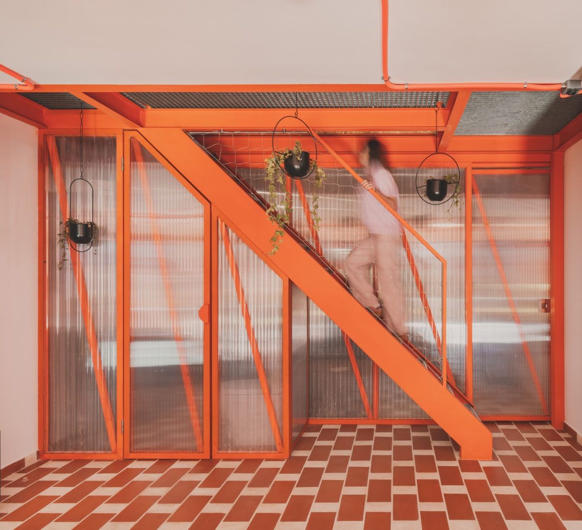
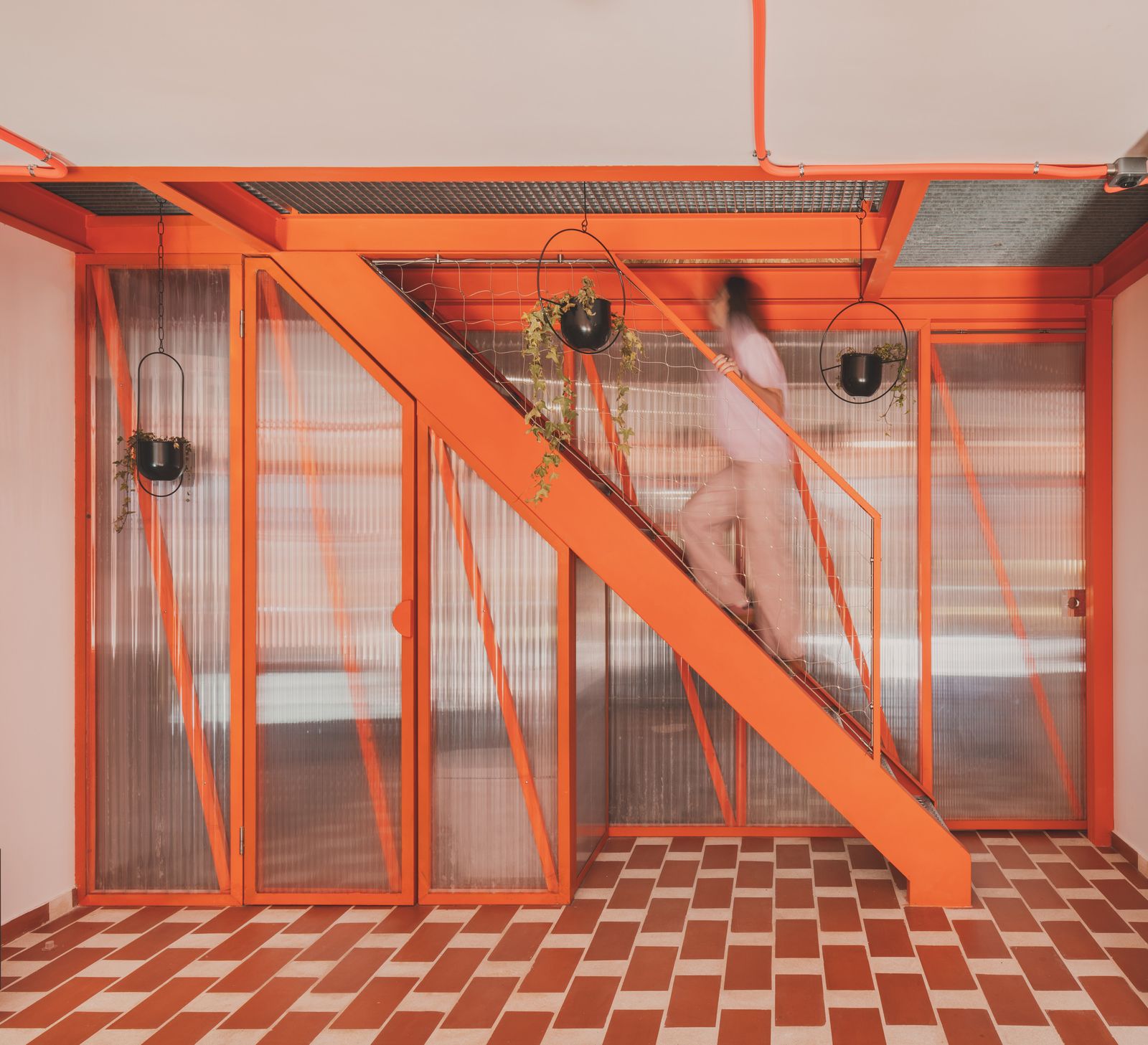
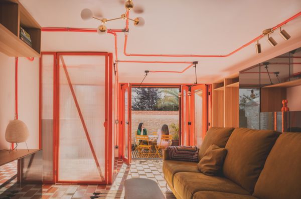
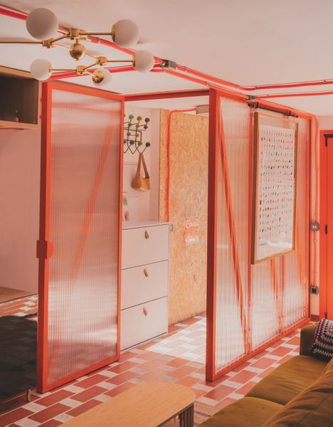
From the Architect: “This house is located in one of Madrid’s satellite settlements, urban developments in the north of the city built between 1956 and 1966. The house took a new direction in 2023 with the arrival of a new family, consisting of two adults, two newborns, and a dog, adapting to the contemporary needs of a neighborhood struggling to find peace in the midst of the nearby traffic.”
“When the family acquired the house, it had undergone significant modifications. The courtyard’s original U-shaped layout had been converted into a storage room. The lower façade had been altered, losing the distinctive porch that once defined it. Sliding shutters were replaced by a large awning, and the exposed brick wall was covered with white tiles. Its previous users had lived in the house for a long time, and the original plan was compromised.
“The primary goal was to restore the building’s original spirit while adapting it to the modern needs of its new inhabitants and preserving the material memories embedded within it. The renovation prepares the house for a second life, accommodating a diverse group of living beings and the material objects required to develop their daily routines.
“The house is designed to accompany the family through various stages of life, evolving alongside the twins as they grow. During their early years they will share the large room. Later it will be divided into two separate spaces for more privacy. The kitchen is equipped with space for high chairs and will evolve into a kitchen-office, where the twins can read in the company of their parents while cooking. The living room, protected by a large lattice in summer, can fully open to connect the indoor and outdoor spaces whenever needed.”
Post-gridiron, Kevin Jones took an internship with USM. Now he’s given the company’s famous Haller pieces what might be their most radical update yet.
Former NFL running back Kevin Jones is full of surprises. Twenty five years ago, as the number-one college draft pick in the country, Jones was suspected to be choosing between Penn State and Virginia Tech. In a much-anticipated televised reveal, he picked up the Penn uniform and tossed it aside, ripping off his sweatshirt to reveal a VT jersey to announce he would be a Hokie. The stunt kicked off a long and fruitful pro-athlete career for Jones, who, after leaving Virginia Tech his junior year, went on to play for the Detroit Lions and Chicago Bears. Then, when Jones retired in 2009, he made another surprising move, this time into the world of design. He returned to Virginia Tech for a bachelor’s in industrial design followed by an MBA, and then founded his own design firm, Joba Studio (Joba is an acronym for Just One Billion Attempts) in 2015 to pursue his longtime passion for creating objects and environments.
This year at Salone del Mobile in Milan, Jones unveiled his latest: an update to USM’s famous Haller shelving that represents a major update to the modular system’s functionality and industrial aesthetic. The release, a collaboration with French designer Marc Venot, introduces felted two-tone reversible panels and magnetic attachments that lets users customize their pieces on the fly. Here, Jones shares why it was time to bring a “more connected, more human, and more modular” touch to the beloved utilitarian shelving, and how his former career on the gridiron helped prepare him for one working with one of the biggest design brands in the world.
Designer Kevin Jones, a former NFL running back, and his firm Joba Studio have released an update to USM’s Haller shelving system that adds customizable touches.
Photo courtesy of USM
Dwell: Let’s start with your decision to make a leap from professional sports into industrial design—what was going on professionally, intellectually, or emotionally that made you want to change careers?
Kevin Jones: I left early from Virginia Tech to enter the NFL draft, so I didn’t finish my degree. I was studying business and property management. I didn’t know about industrial design as a practice or major, and I thought architecture was the same as construction at that time, so I had really no desire to pursue it. During my time in the NFL, I was sponsored by Reebok, Under Armor, and Red Bull. Having those relationships, you get involved—I wanted to make a decision on the color for my cleats, or I wanted the bottom of my shoes to be all chrome so when I’m running past somebody, they see the shining sole of my shoe. Sitting at the tailor’s shop, my wife was like, Oh, we got to be here all day, because I was so interested in the thread count of the fabrics and the colors. Back then, I didn’t see athletes really caring about fashion and things like they do now, from the standpoint of, like, having a custom-made piece.
So when I was trying to figure out what I wanted to do next, I thought fashion was my gig. I went back to Virginia Tech and told an advisor I wanted to study fashion. They said go to Parsons in New York. And I’m like, Well, I’m a Virginia Tech guy. So what would be comparable if I didn’t do fashion? They said to go check out the architecture program—but again, I thought that that was construction. I talked to an advisor there, and she gave me a tour. They had this huge space where I saw architects and engineers and industrial designers. And I had an overwhelming sense of this is what I should be doing. As soon as I walked in the room, I was like, Oh my God. Product designers were making prosthetic legs and designing sneakers and handbags and all these different things over here, and then there were architecture students that had all these skyscrapers and buildings and pavilions. And I was just like, Yo, this is heaven.
You completed an internship with USM during school. What types of experiences were exciting to you that maybe still resonate with you today that made you want to work with them again?
In my junior year, I met the owner of USM at a Virginia Tech sporting event. He was a football fan, and invited my wife and I to sit in the president’s box—my wife was the president of her class at VT, so that’s why we were invited. We were having a conversation, and I said, Hey, do you guys give internships? And then he basically says, yes, but it wasn’t like this positive, yeah, we do internships.When do you want to start? It didn’t start off like that. But three months later, I got a call from my professor who said USM reached out and asked if I was still interested in an internship.
I went to the company’s headquarters in Switzerland and learned there was a process by which they do things. They manufacture on-site, so I was able to get a first hand experience of the company’s history and how they make the products. I got really familiar with all the parts and the modules and their ethos and way of thinking.
I also got to move around with the creative directors and the COO of the company. They had clients that were creatives—designers that worked for Louis Vuitton and all these other companies, but also work for USM. Most of the employees that work at USM are engineers: They never really have designers or creatives on their team because they don’t want to have group think; they want creatives to stay innovative and not just be stuck with the same modules and tools.
Because it was never on the table to go from being an intern to a creative person within the company, I found other ways to work with them—I had the USM internship, and then they recommended me to Scott, which is a bike and outdoor product company. And at the end of my senior year, I wound up using USM as my thesis project.
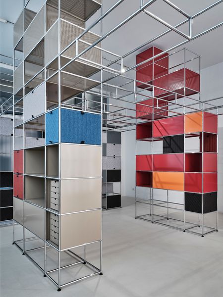
The new release utilizes the same framework as the original shelving, but lets users swap out felted and patterned panels, which are fixed with magnets.
Photo courtesy of USM
Now you’re back with USM, this time collaborating on its famous Haller shelving system. Tell us about the new iteration.
It’s like sports—there’s a system that you put athletes into. That’s why I like the USM Haller system—you have a set of rules, and you have a system, and you can play within those rules. These are the tool: In sports, you have a quarterback, a running back, offensive lineman, wide receiver; in the Haller system, you have a tube, a ball joint, and panels. This is how you put it together. For the new Soft Panel system, we were thinking about the phrase, “More connected, more human, and more modular.” And I was scared to say more modular, because USM is the modular company, right? For us, it was a doubling down on the brand promise.
As a customer, I can build my Haller system from a modularity standpoint online. I can make what I want, but then when I get it in person, it’s hard for me to change it and adapt it in my house to something different. You need special tools, and it’s a tough process. So when we were creating the Soft Panel, we used magnets. It has magnets on the four corners, and you can literally just take a panel, and as soon as it hits the metal, it’s in the frame. And then you can flip the panel up or down, or slide it left and right, depending on what size you have. We also have a two-color panel: Every time you flip the panel, we want the consumer to have a new option. If you have vertical lines on the panel, when you flip it, the other side is going to have color.
Jones, USM, and French designer Marc Venot, a collaborator on the release, debuted the update at Salone del Mobile in Milan.
In Oakland, design studio Kalos Eidos creates structure in a tight living room with a custom seating solution.
Welcome to How They Pulled It Off, where we take a close look at one particularly challenging aspect of a home design and get the nitty-gritty details about how it became a reality.
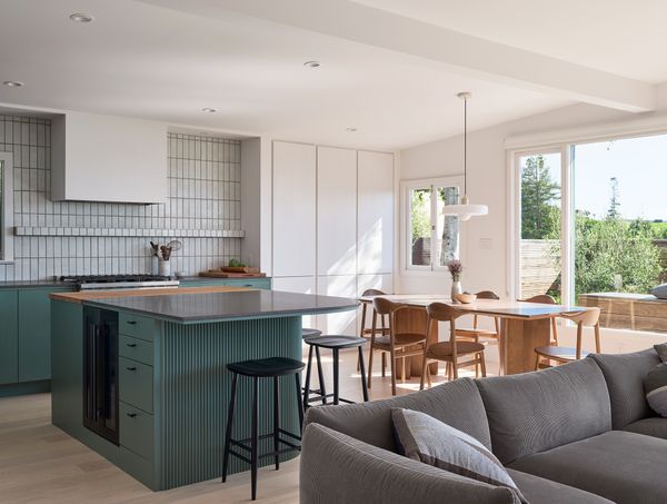
Northern California’s Bay Area is known for its resplendent natural beauty. In a home in Oakland, New York-based design studio Kalos Eidos paid tribute to the characteristics of that ecosystem, with a nature-inspired palette and a layout designed to encourage flow between interior and exterior. “Our approach to the renovation was really geared towards having an emphasis on the main living spaces, extending them to the outside, and really seeing that part of the property as an underutilized asset when they purchased the home,” Kalos Eidos founder Ryan Brooke Thomas explains.
At 1,400 square feet, the three bedroom, two bathroom home’s spaces are each relatively tight, so Thomas decided to utilize the 2,900 square feet of exterior space by creating intentional distinct areas to allow for a much roomier living environment. The living space already had large windows and a fireplace, so the studio’s work was in figuring out how to fully honor those details in their new design.
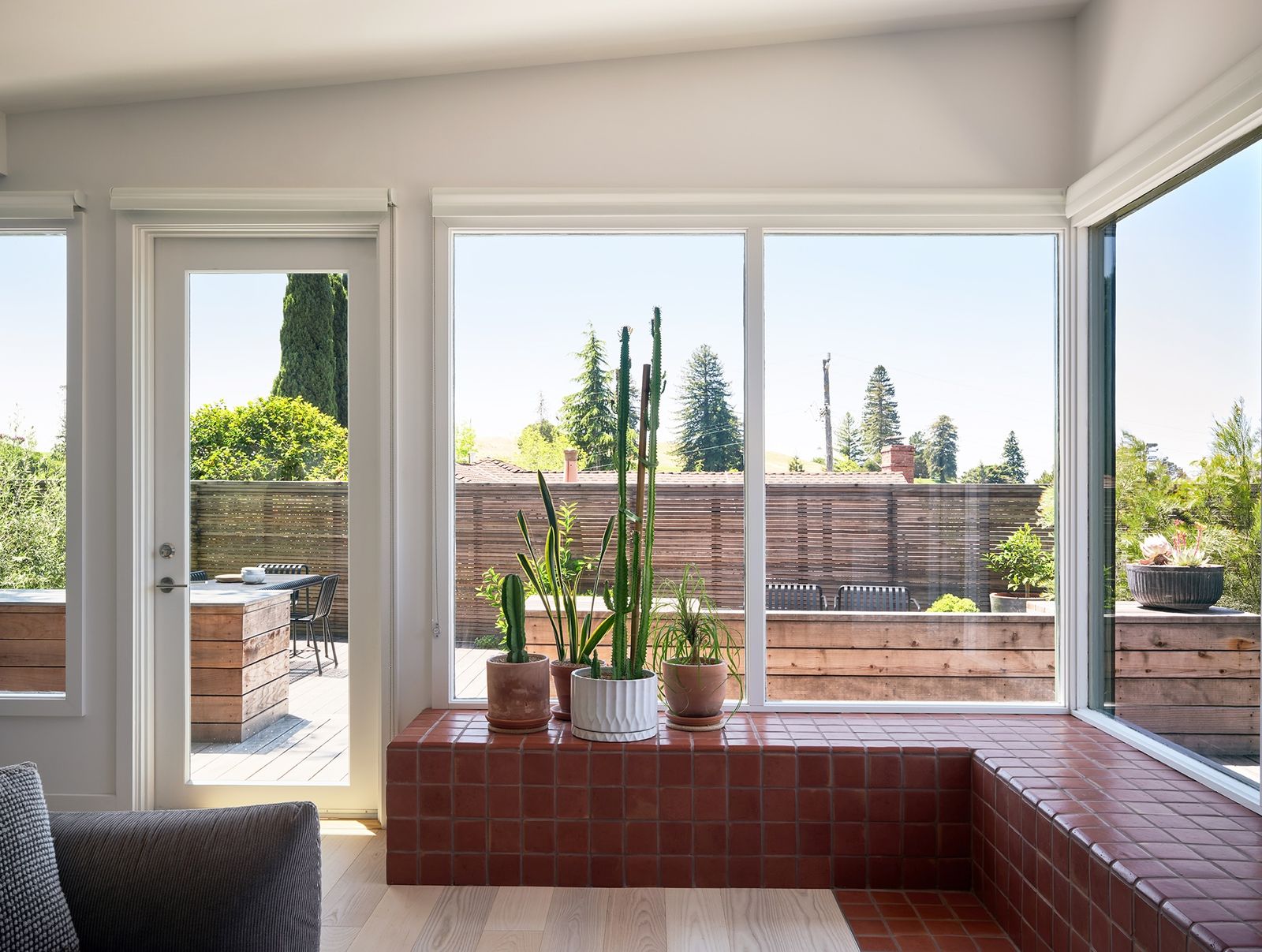
A view into the open living space, where the large windows allow for abundant natural light.
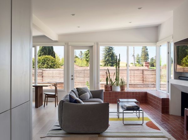
The tiled bench extends in front of the fireplace and down toward the entryway, creating a satisfying tie between the multiple different distinct areas of the open living space.
“Once we kind of sorted through the kitchen and the dining and what we had decided on as the best kind of open plan in terms of where the partitions would go, what remained for quote unquote ‘living’ was still a pretty tight footprint,” Thomas explains. “Whatever solution needed to both complete the living area floor plan in a way and participate in that functionally, while also helping to shape and frame up the window and the hearth.” The team landed on a terracotta bench that extends from the back of the house to the front entryway.
The portion of the bench that’s closer to the entryway has cubbies that were originally designed to store firewood, but now the homeowners use them to store baby toys, adding yet more flexibility.
The Pacific Northwest home still has its original fireplace, clerestory windows, and post-and-beam ceiling—plus a slate-gray kitchen, a sunny studio, and a sauna.
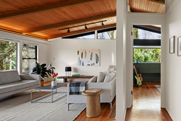
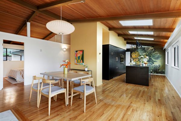
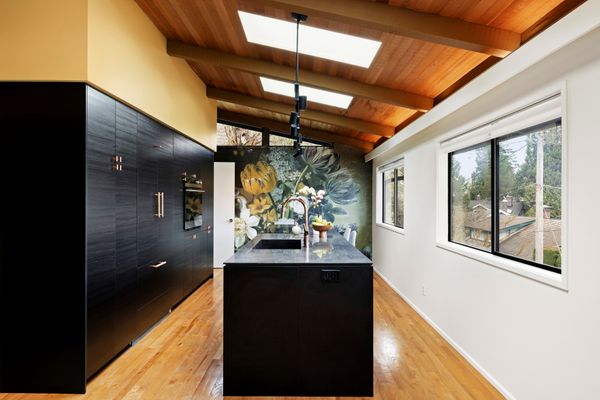
From the Agent: “This midcentury-modern home sits on a corner lot in a fantastic Council Crest location in Southwest Portland. The gate opens to an intimate courtyard patio with multiple outdoor entertaining and dining areas. The interior features original cedar-lined ceilings with heavy beams, large windows, a white brick fireplace, and large clerestories lining the roof’s gabled ends. The remodel added additional interior clerestory windows which transmit light while maintaining acoustic privacy, and recessed lighting that kicks a warm glow onto the extensive vaulted ceilings. Other improvements include a studio with a cantilevered bay window and custom cabinetry in a blue-green color that compliments the rich wood tones. There are three bedrooms (one being the studio) and two baths upstairs. The lower level was converted into an independent living quarters, complete with a contemporary kitchen, eating bar and bath, bedroom, living area with fireplace, media room, and private deck.”
The living area features original beamed ceilings and a large white brick fireplace.
Justin Jones / Jones Media Shop
Justin Jones / Jones Media Shop
Justin Jones / Jones Media Shop
The kitchen wallpaper is a print of Eelke Jelles Eelkema’s Still Life With Flowers from the Netherlands National Museum.
The 409-square-foot Highlands retreat combines clay with locally felled Douglas fir, which was used for everything from structural elements down to kitchen cabinets.
Houses We Love: Every day we feature a remarkable space submitted by our community of architects, designers, builders, and homeowners. Have one to share? Post it here.
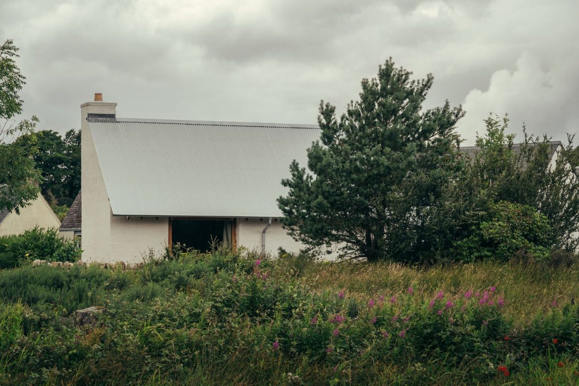
From the Architect:“Iorram is a contemporary take on a traditional cottage in the Scottish Highlands by Baillie Baillie Architects. Celebrating the use of local timber as well as local tradition, Colin and Megan Baillie designed and built the house for themselves, creating a compact holiday let that allows them to share the virtues of sustainable design and craftsmanship.
“The self-build project took a low-tech, natural materials approach, using monolithic clay block walls—a material which is simple to build with, durable, and completely plastic free. Scottish Douglas fir, sustainably felled and milled in the Highlands, was used for all timber structural elements, wall linings, and details. Baillie Baillie minimizes waste material by using timber offcuts as mortised doors and kitchen cabinets.
“Despite a compact internal area of 409 square feet, Colin and Megan wanted to show that they could create a feeling of generosity, which is achieved through varied qualities of light and volume, as well as the use of warm, tactile materials. Apertures are configured sparingly with a single large east-facing window angled to take in the landscape with long views across the bay and low-morning sun.”
One-color interiors are all the rage right now, but mastering the look takes more than just a can of paint.
A recent trip to a bar decorated completely in various shades of purple left me feeling underwhelmed by the execution. Despite being saturated by various delicious shades of purple-ish, reddish hues, the room lacked the cohesion and visual impact I’d expect from such a choice. This particular space could’ve been an absolute moment—but the subtly clashing hues threw the design off entirely and something about the draped LED chandelier lights made the colors feel flat and one-dimensional. While these were obvious faux pas to my barely trained eye, I wondered what could’ve been done to remedy these issues (or avoid them in the first place).
As it turns out, monochromatic doesn’t always mean just one color–including a different color might’ve breathed more life into this aesthetic. And judging by the aforementioned monochromatic mishap, there’s more to this process than saturating a room in a single color and calling it a day.
This isn’t quite color drenching, but something a bit more nuanced. We spoke with Kasandra Rafter, founder/designer of Canyon Creative Design and Andrea DeRosa, co-founder and CEO of Avenue Interior Design for all the ins and outs of properly tackling a monochrome palette.
The perks of a single-shade palette
Painting an entire bedroom a calming cerulean creates visual impact without being busy.
Photo by Jen Woo
In DeRosa’s opinion, monochromatic palettes are a rare occurrence in interior design and the impact it makes serves as one of its strongest advantages. Opinions vary on whether monochrome decor skews too cold but those who love the trend have described it as “calming,” lauding its ability to create a coziness caused by the intentional focus on a sole color.
“Monochromatic interiors have an allure and mystery to them—they are undeniably powerful, almost drawing you in,” DeRosa says. “They are also more curious, complex and almost confident in nature.”
Finding the perfect monochromatic color and room placement
In a world where beige and grey interiors reign supreme, a fascination with the creative application of colors almost feels radical—but the best monochromatic palette designs require a bit of outside-the-box thinking. If not, you run the risk of creating something boring, which Rafter says can be avoided by paying attention to undertones and using an accent in the room as the foundation for the color palette.
In this room designed for the homeowner’s cat, pink suffuses the space with warmth, while the Pandomo surface adds texture.
Photo by Hey! Cheese
“If the undertones don’t align, the entire space can feel off,” Rafter explains. “Start with a single anchor—whether it’s the perfect sofa fabric, a rug, or a piece of art—and then build the palette around it by layering in varying tones of that color.”
Before you take the paintbrush to your tiny bathroom, bedroom, or entryway, a word of caution. The monochrome technique works best in specific spaces. According to DeRosa, the room size and ceiling height could make or break the design.
“If you have a very small space, a space without natural light or an abundance of ambient lighting, or if you have a low ceiling height, the space tends to feel confined when limited to a single color.”
On the other hand, Rafter recommends the tonal approach for bedrooms and living rooms for a space that soothes the senses.
‘We love using monochromatic palettes in formal living rooms and serene bedrooms. In a living room, deeper tonal ranges—like inky blues or charcoals—can instantly elevate the space and give it a rich, refined feel,” she says. “In bedrooms, soft tonal palettes can create a sense of calm and quiet—think layers of ivory, oatmeal, and putty. It’s a look that’s both restrained and deeply intentional.”
Make it multi-dimensional
So you’ve selected your color and decided which room will get the all-beige-everything treatment. But by the time you’re done decorating, the design falls flat. That stylish cream sectional practically melts into the cream backdrop, plus you can hardly tell where the drapes begin and the complementary lamp shades end. It could be that you overlooked tones and textures, a key to creating the perfect monochromatic look, Rafter says.
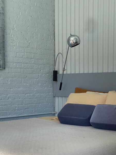
The texture of painted brick plays well against the headboard, painted in a complementary but darker shade of blue.