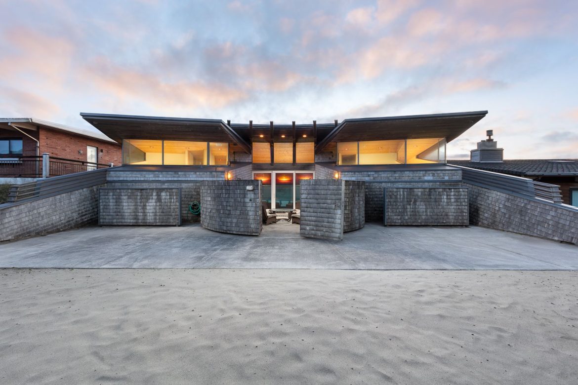
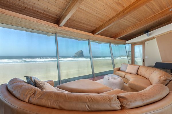
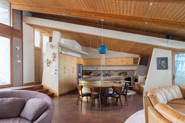
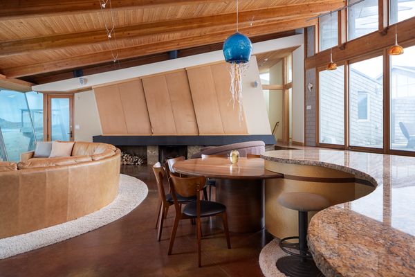
From the Agent:“A pinnacle of oceanfront living awaits in the coveted locale of Pacific City, designed by the esteemed architect Robert Harvey Oschatz. The home’s design, characterized by repeating 12-degree angles, creates a dynamic interplay of sunlight and space, casting playful rainbows throughout its rooms. Designed with hosting in mind, the residence features three main-level bedrooms for adults, while the lower level offers a dormitory-style playroom with bunk beds and a full bathroom. Seclusion and natural light were paramount in the design, achieved through strategic window placement and a grand expanse of clerestory glazing that bathes the interior in daylight while preserving privacy. Upon entry through a solid gate into a courtyard, the home unfolds to reveal an open family, living, and kitchen space, adorned with floor-to-ceiling glass windows that embrace panoramic ocean views. Custom touches abound, from bird’s-eye maple cabinets to rough-hewn granite countertops and a handblown jellyfish chandelier illuminating the dining area. Outdoor living is seamlessly integrated, offering sheltered spaces to enjoy the coastal panorama while being shielded from ocean winds.”
Robert Harvey Oschatz, known for his flowing style of organic architecture, attempted to integrate as much of the surrounding environment as much as possible.
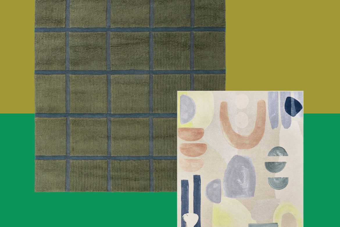
The market for easy-to-clean rugs is booming, but how do they actually look (and feel)?
If there’s been any trend in rugs the past several years outside of checkerboard or Moroccan, it’s washable. Everyone with a dog, child, or tendency to spill red wine while gesturing too much during a dramatic episode of reality television wants a rug they can’t ruin.
First popularized by Ruggable a few years ago, washable rugs are flooding the market right now, but they also can get a bad rap; they’re often associated with cheaper, nonnatural materials, meaning that the very thing that makes them ideal also lowers their value. So I set out to test two from each side of the spectrum: those marketed toward people with children, and those aiming for a slightly higher-end design experience that just want something they know they can clean for sure in the future.
The Kid-Friendly Brand: Tumble
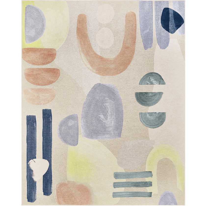
Tumble, a direct-to-consumer brand launched in 2021 by a consultant and a home furnishing executive, set up their company with the intent to fill holes left in the market by other washable rug companies. “After speaking with dozens of customers and analyzing thousands of reviews, we identified common pain points like insufficient cushioning, curling corners, and challenges in keeping the rugs flat,” the brand’s cofounders told Entrepreneur magazine. “Although many washable rugs were marketed as convenient, the reality often involved heavy furniture rearrangement, turning a simple task into a hassle. To address this, we not only focused on making our rugs stain-resistant but also prioritized developing safer, nontoxic materials and earning environmental certifications that ensure they’re safe for children and pets.” The rugs come in lots of different patterns, many of which mimic the lived-in, distressed, it’s-already-vintage style that is so popular these days, but are also abstract and geometric, largely in relatively muted colors.
Add an artful touch to your home with our hand painted Fez rug. Soft pastels set against a sandy colored ground bring fresh modern vibes to your space.
As noted on the brand’s FAQ page, Tumble rugs actually will fit in a home washing machine, while many washable rugs won’t. (This will come into play in my test later.) But because of all the problems the brand is trying to solve, itsrugs are a very specific type of product. While there’s a faux fur option, so far, the rest of the rugs Tumble sells are flat and untextured, relying more on pattern for design than texture. They also come with a padded mat underneath them, much like activity mats for children. In this way, though Tumble only launched a specific kids’ line last year, the rugs—regardless of which category they’re placed in on the website—are perfect for use in a nursery or playroom.
Which is exactly what I got mine for. The sample the company sent for me to test is essentially a really good-looking play mat—and I mean that as a compliment. I chose the Fez in 8 x 10’ for my daughter’s room, which retails for $389, and is 100 percent polyester, and soon it was on its way. The box it arrived in was big, and flat—it’s heavy, but we all know how rugs work. In this case, however, it’s not actually the rug itself that is heavy, but Tumble’s locking mats—which you can simply wipe down, should they need cleaning—that go below it.
The rug comes with clear instructions on how to put it together—the mat comprises puzzle pieces that must be placed in a specific order—and on how to affix it in the corners to keep it from moving further. True to their word, there is no slippage here. And though the website said it would fit under the clearance of most doors, we had to situate ours further into the room than I would have liked for now (the door is too low on its hinges, which we’ll adjust later).
Once you put furniture on top of your Tumble rug, there’s really no moving it, so though I can wash it in our washer, I can’t imagine wanting to move everything to get it up and then put it back in place. I accidentally stepped on it in muddy shoes though, and once the footprint dried, it vacuumed right up without a mark. Besides the keeping it clean aspect, the best part is how it is essentially a play mat that looks good—a challenge they’ve risen to meet for sure.
The Ones That Don’t Look Washable: Revival
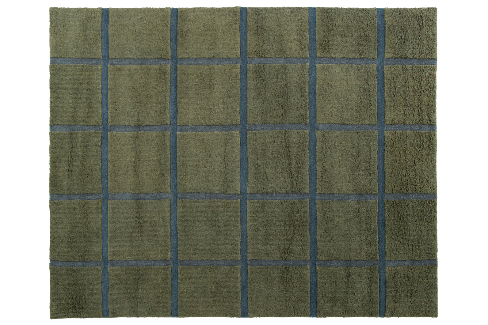
Founded a few years before Tumble, Revival is another player in the DTC rug world, one that cuts down on costs by cutting out the middleman of wholesalers and retailers. It was founded by players from Brooklinen and Blueground, and while they sell many regular rugs, washable rugs soon became one of their offerings. “Something we hear from customers time and again is that they appreciate that our rugs are washable, but don’t look washable,” the company says on its website.
For our guest room, I wanted a substantial, adult rug, but one I knew I’d be able to clean, as it was in a high-traffic area. So I went with the graphic Taylor in Moss in an 8 x 10’, which the company describes as a “soft, high-pile washable wool rug” sourced from New Zealand and India. It sells for $749. It arrived rolled up, and was very heavy; the UPS person who delivered it actually came and checked that we were home before bringing it to the door.
A soft, high-pile washable wool rug. Please note: this piece is designed to be pliable so it more easily fits in a washing machine. As such, we *highly* recommend you pair it with a rug pad for stability, comfort, and longevity. Trust us-it’s worth it.
The Taylor, which is high-pile, feels great; exactly like any “normal” rug you’d find, and looks it too. There’s no interlocking rug puzzle piece set, and though they do recommend a rug pad for their washables because they are thinner than the regular ones to allow for pliability, though they’re not so thin you’d notice any difference as a non-rug expert. One thing to know is even though this rug can be put in a washing machine, that’s not a washing machine you’d (likely, I guess I don’t know your life) have at home. The size I got is large enough that I’ll need to take it to a commercial washer to get it cleaned because my washing machine at home won’t be able to handle it (specifically an 80-pound washer at minimum). One might think then: what’s the point? To me, it’s the flexibility to know it can be cleaned, even if it would be a bit of a hassle to do it, and that if you spot wash it, the fabric will be forgiving. So far it’s been holding up great to vacuuming, and hasn’t required even a spot treatment.
Though the brand notes that shedding can happen for the first several months (and a friend who actually got rid of a Revival rug had complained about this to me) I haven’t noticed it at all. In fact, nothing about the rug screams washable at all—which was exactly what I was going for.
Near Helsinki, expat designer Jussi-Pekka Kajaala and Olympic medalist Adam Rippon build a tiny summerhouse dedicated to Finland’s favorite pastime.
There’s a particular kind of longing that comes with living far from home—and for many expats, it’s important to find a way to stay connected to their culture. For Finnish entrepreneur Jussi-Pekka Kajaala—who founded design studio Super Finnish and is now based in Pasadena, California—that longing lingers in memories of his grandparents’ sauna: the scent of birch smoke, the rituals of sauna culture, and the space to slow down and disconnect from the world.
Before moving to the U.S., he wanted to build a place to evoke these memories, where he and his American husband—Olympic figure skating medalist Adam Rippon—could return to each year to reconnect with Finnish traditions, nature, family, and each other.
The house is about 520 square feet, and there’s a separate sauna building with a guest bedroom, which is under 200 square feet. The project cost just over $250K—about 5 percent under budget. “Sticking to the budget is one of my favorite challenges,” says Jussi-Pekka. “With my long history in real estate, I understand the importance of keeping costs low, even if I never plan to sell this house. You never know what life brings, and it’s always wise to build with future value in mind.”
Photo by Petri Hiltula
The answer lay in a modest prefab kit mökki (a Finnish summer cottage) with a separate wood-fired sauna, located in the countryside about an hour from Helsinki. Built with his father, the project is deeply personal. A tribute to Jussi-Pekka’s memories of home and love for traditional sauna culture, the retreat—which cost just over $250,000 to purchase and build—is where the couple spend four to six weeks each year, with hopes to one day spend entire summers.
The guest bedroom faces the sunrise, and the sauna is located to the left. A breezeway separates the two spaces, creating distinct functional zones.
Photo by Jussi-Pekka Kajaala
“Our mökki is our own little piece of beautiful Finland,” says Jussi-Pekka. “I always thought having a house in Finland would be important, but living in the U.S. has made me realize just how much it truly means to me. It’s perfect for bringing everyone together. Our little, secret hideaway home is where time stops and worries disappear.”
$22,464 Land
$1,080 Ground Survey
$21,534 Ground Building
$8,208 Foundation
$26,568 Structural Sauna Building
$44,280 Structural Main House
$21,600 Log House Assembly
$2,631 Flooring
$6,958 Plumbing
$16,837 Electrical
$864 Paint
$1,080 Ceiling
$3,583 Fireplace & Chimney
$2,106 Air-Source Heat Pump
$1,938 Sauna Stove & Chimney
$324 Sauna Benches
$1,296 Fireplace & Sauna Stove Installation
$734 Water Heater
$5,626 Waste Water System
$4,717 Well
$6,373 Kitchen
$2,700 Countertops
$3,451 Appliances
$2,721 Bathroom Furniture
$1,991 Bathroom Tiles
$1,359 Bathroom Tiling
$864 Lighting
$921 Walk-In Closet Cabinetry
$1,674 Interior Doors
$5,400 Furnishings & Decor
$1,751 Permits
$9,304 General Contractor
$1,348 Electrical & Plumbing Plans
$502 Landscaping
$1,080 Waste Recycling
$8,640 Patios
$2,075 Shipping Container Storage
$10,800 Misc (“this & that”)
Grand Total: $257,390
Returning to My Roots
Jussi-Pekka Kajaala: I live in the U.S. now with my husband, but I wanted a place in Finland to return to every year—a place that felt like home. Building this house and sauna was my way of holding on to my heritage. I grew up immersed in construction, as my family has always worked in the industry. I started flipping apartments in my twenties, and I loved the process of renovation. But this was the first time I built something entirely from the ground up.
A view of the sauna and guest bedroom from the field. “The moss on the bedrock is protected, and the bedrock is surrounded by natural meadows,” says Jussi-Pekka. “Butterflies, insects, and wild animals thrive here, with many deer frequenting the area.”
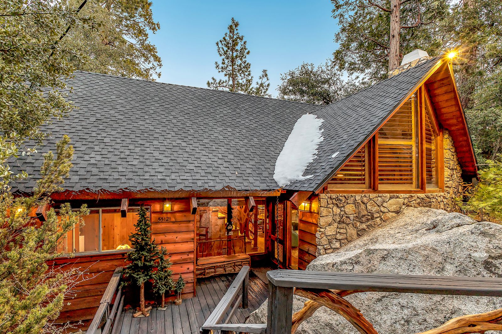
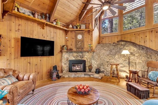
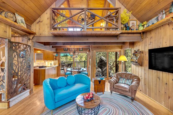
From the Agent: “Dolly Parton’s former Idyllwild retreat! If walls could sing, this charming three-story mountain retreat would be humming a country tune. Recently owned by the one and only Dolly Parton, this home is as full of character as the Queen of Country herself. It has a primary suite, a guest bedroom, and a spacious loft that sleeps five—and it was Dolly’s favorite spot to write and play her music. Nestled along a peaceful seasonal creek and just a short stroll to town, this private escape offers the perfect mix of tranquility and convenience. Locals still share fond memories of Dolly’s time in Idyllwild, where she was known for her kindness and down-to-earth spirit. Designed with chalet-style flair, this home features soaring, wood-beamed ceilings, woodsy details, and a spacious deck where you can soak in the forest views. A brand-new roof ensures it’s ready for its next chapter, while the serene creekside setting adds to its magic. This is more than a home-it’s a piece of music history, a true mountain retreat, and a dream getaway waiting for its next storyteller.”
The deck overlooks Tahquitz Peak, one of Idyllwild’s famed geological formations.
Jim Crandall
The decor, picked by Dolly Parton, is included with the purchase of the home.
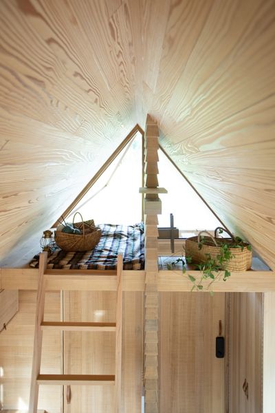
Tiny House Japan’s units are designed like saunas—with plenty of cedar to withstand heat and steam.
Welcome to Tiny Home Profiles, an interview series with people pushing the limits of living small. From space-saving hacks to flexible floor plans, here’s what they say makes for the best tiny homes on the planet. Know of a builder we should talk to? Reach out.
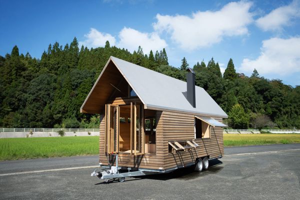
Haruhiko Tagami had been living in his 1960s Eriba Puck when he came across a unique problem: however timeless the travel tailer was, it was not equipped for putting the kettle on. “During winter months, boiling water would result in wall-to-wall condensation, and without absorbent tape, even the sleeping bag would get wet,” Tagami recalls. “Mold gradually grew and the ceiling turned black, and the room began to smell like mold.” Coming from a family that had owned a sawmill, and having once apprenticed as a carpenter, obtaining a second-class architect license (a credential needed in Japan to design smaller buildings), Tagami was well qualified to build a trailer that better suited his needs. “I thought I might be able to build a comfortable wooden one,” he tells us. “So I bought a used bike trailer and built a Usonia-style home out of Japanese cedar.”
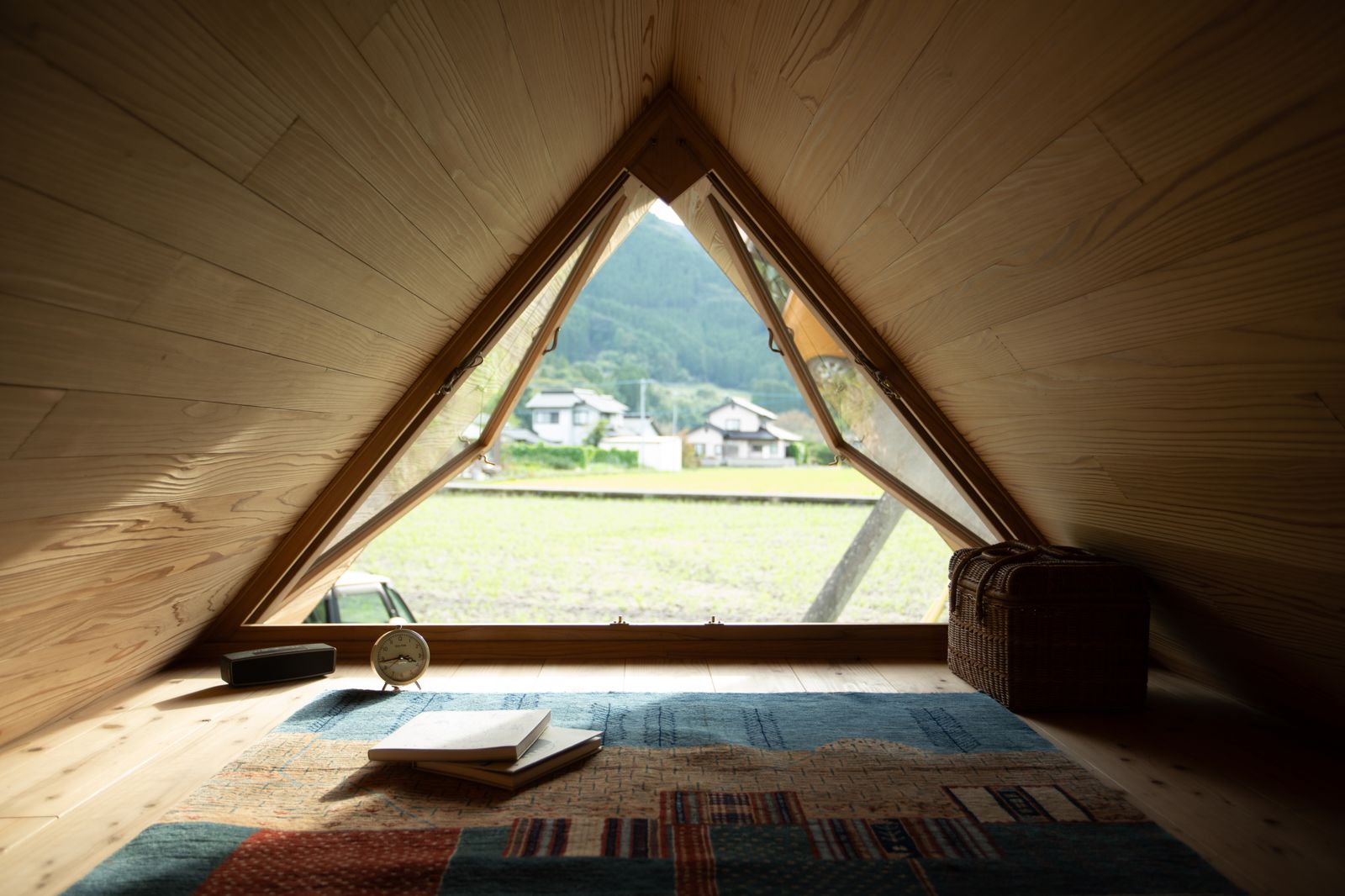
That was in 2014. Since, his company, Tiny House Japan, has made several designs that follow Frank Lloyd Wright’s Usonian principles—from a deployable emergency shelter, to an itinerant tea house, to a stationary home made up of two linked modules—that each aims to make the most of a five-and-a-half meter trailer bed. Here, Tagami shares the philosophy behind his work, a few of his past projects, and his latest build that’s ready for tea-making: the Triangular Roof House.
The Triangular Roof House is equipped for tea drinking on the go, and is also the first by Tiny House Japan specifically made to cope with snow and colder climates.
Photo courtesy of Tiny House Japan
How did you decide to live in and build tiny homes?
My partner and I have sensitivities to sound and pesticides and have lived in and out of various places. Because of these experiences, it was reasonable for us to have a house that we could move around in, rather than live in one place. From a production standpoint, it was also rational that we could build homes for distant clients in our factory.
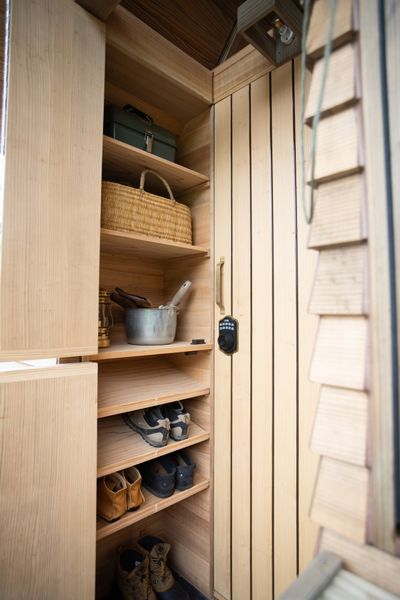
The interior is mostly finished in knotless Japanese cedar, a lightweight species less prone to twisting and warping.
Photo courtesy of Tiny House Japan
The home includes two lofted areas. While the one pictured here is divided into a sleeping space and storage, the other, pictured in the top image, spans the width of the structure.
After a lengthy renovation, the Frick is back. Dwell’s executive editor returns to the famed institution to assess its much-debated $330 million update.
For lovers of house museums, there is little better than the Frick. The former home of the titular Henry Clay Frick on East 70th Street in New York’s Upper East Side is ostensibly an art museum, as it houses the American industrialist’s formidable collection, but as fans know, it’s more than that: the house itself is the art.
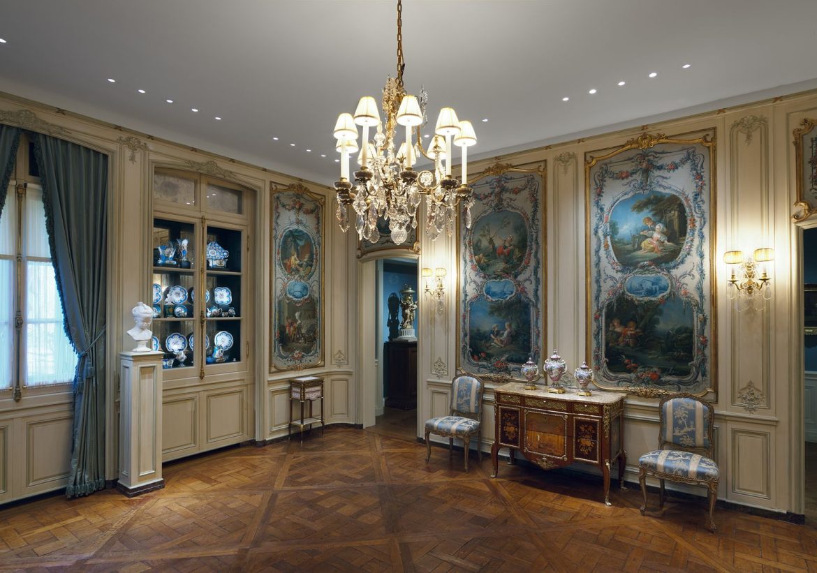
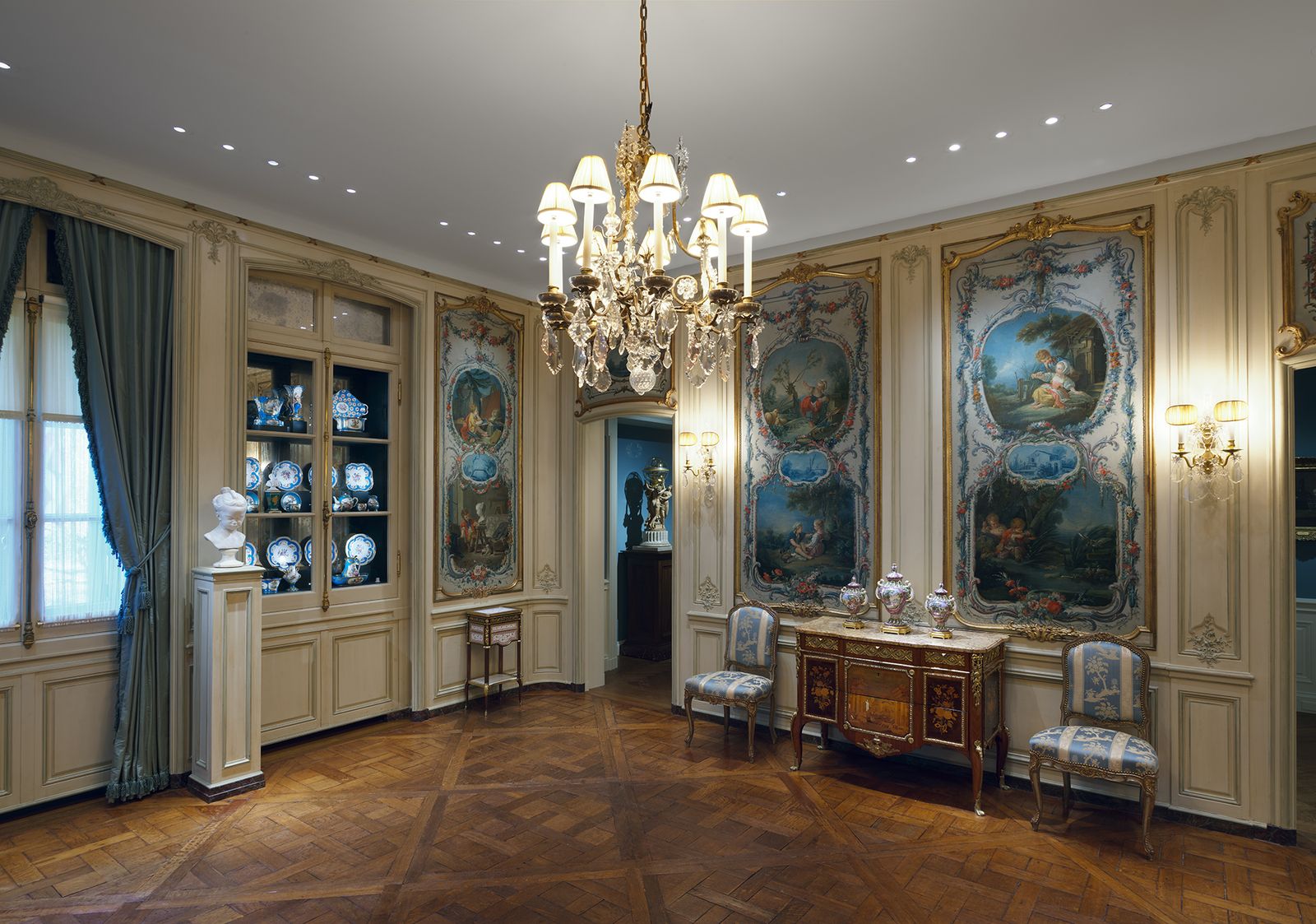
A view into the Frick’s famously serene garden court—which received fresh skylights—from the new addition to the building. The project was designed by Selldorf Architects, while Beyer Blinder Belle Architects & Planners worked as executive architects.
Photo by Nicholas Venezia, courtesy of The Frick Collection
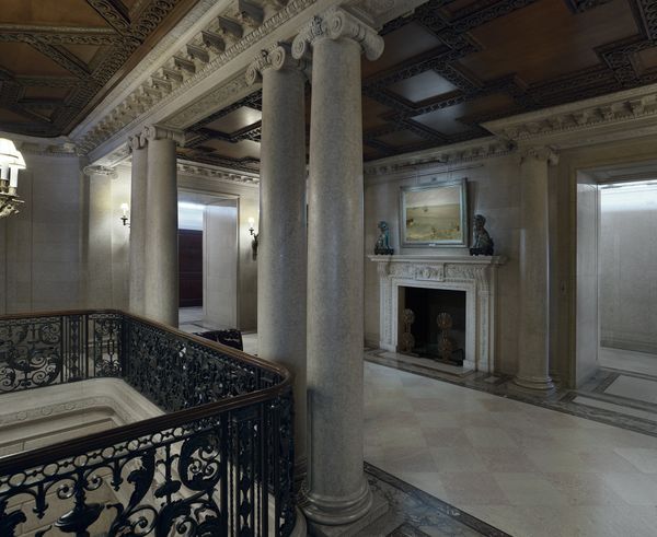
So it was with real excitement that I stepped through its doors for the first time after its five-year closure on one of New York’s first real spring days, a little bit nervous and a lot just happy to be back. I wasn’t alone; it felt like every attendee at the press preview was a true fan of the original 1914 building, and ready to be a fan of its rework and additions. Even the architect on the project, Annabelle Selldorf of Selldorf Architects, admitted in her opening remarks that she was “quite emotional” seeing everyone there.
The facade of the building, new and old, as seen from the entrance on East 70th street. The reworking included 27,000 square feet of additional space and repurposed 60,000 square feet of existing space.
Photo by Nicholas Venezia, courtesy of The Frick Collection
The draw of a good house museum—whether the Frick considers itself one or not—and particularly a historical one is the idea that it is as close to what it looked like when it was first built as possible. But we all know that’s a fiction; after all, it is not 1914 anymore, and the Beaux-Arts mansion’s original designers, Carrère and Hastings, famed architects of the Gilded Age, are long gone. As are those that made many of the tweaks to the building over the years, particularly when it was first converted into a museum in 1935, per its late owner’s request, by John Russell Pope, who added the nine-story art research library; or in 1977, when the 70th Street garden was notably added, along with a reception hall and the (cramped) basement special gallery rooms. “People tend to think the Frick has never changed; in fact, the Frick has withstood a number of changes,” Xavier F. Salomon, deputy director and Peter Jay Sharp chief curator of the Frick Collection said before we were released to explore the museum, which opens to the public Thursday April 17.
The second floor, seen here from the landing, was previously inaccessible to visitors.
Photo by Joseph Coscia Jr., courtesy of The Frick Collection
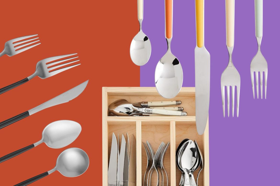
Flatware is one of those everyday essentials that often gets overlooked in interiors, yet it’s one of the things in your home that you’ll use every day. When I talk about flatware (which is embarrassingly often) or even Google it, Sabre’s Bistrot line currentlydominates the conversation. Search interest for Sabre’s brand has been on the rise over the last five years, peaking during the 2024 holiday season. Their retro-modern flatware has become the go-to choice for wedding registries, food stylists and anyone who’s released a cookbook in the last few years. I love Sabre, especially their very slept-on Icone line, and while I do love a candy-colored dessert spoon, I’d like to broaden the table a bit—literally.
There’s a whole world of other brands making beautiful pieces that can elevate your meals. Let’s explore what else is out there.
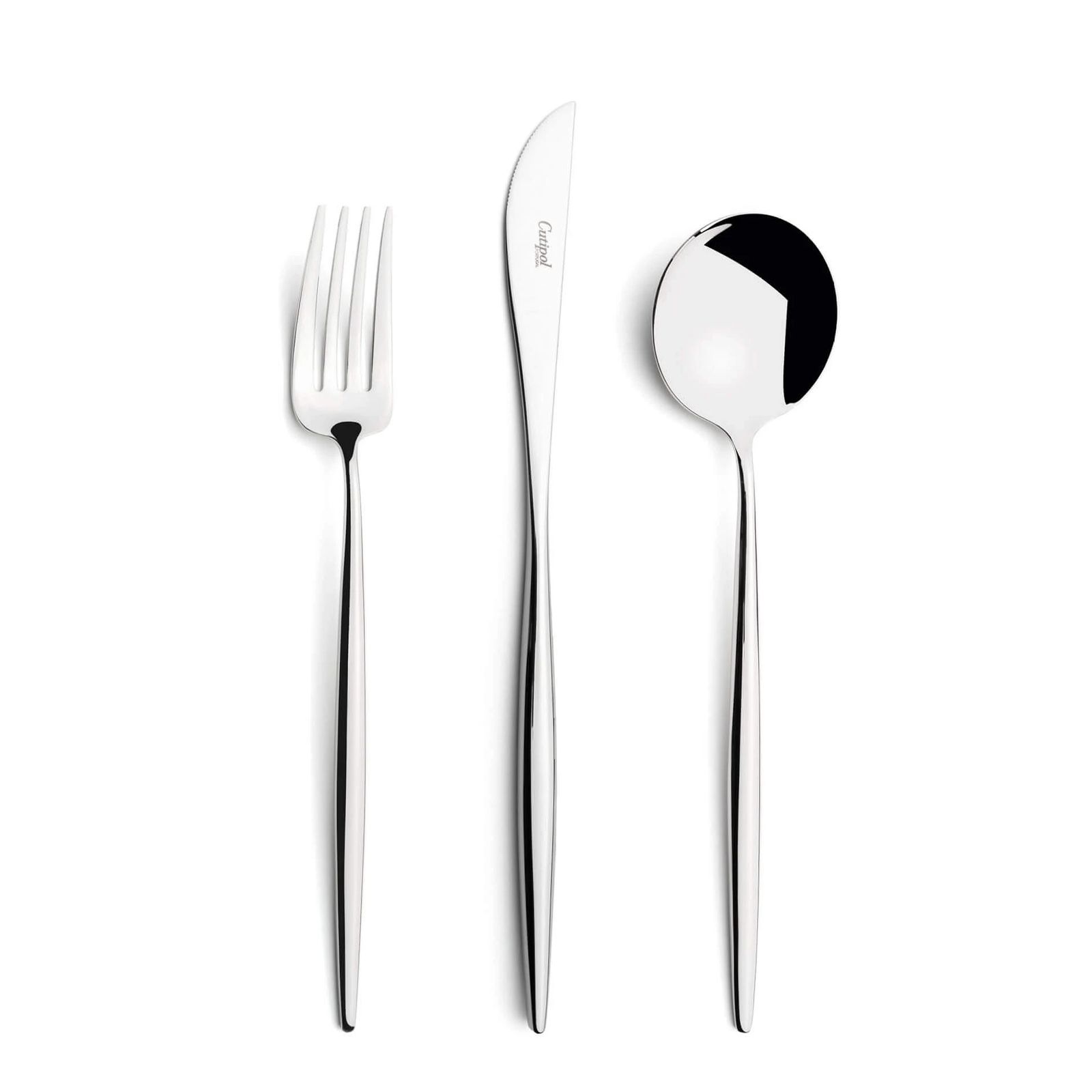
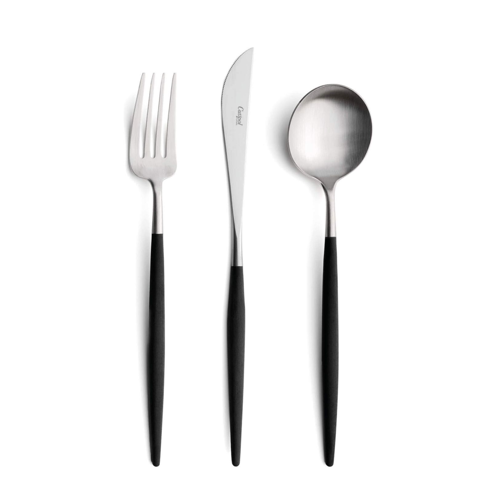
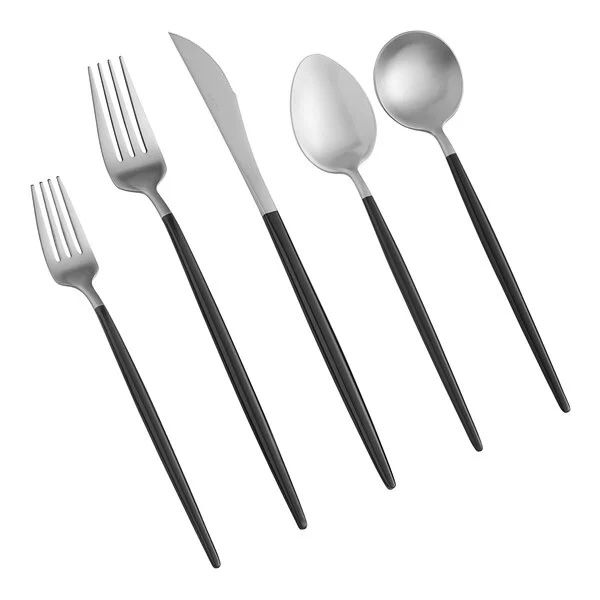
The perfect symbiosis of West and East in ergonomic and delicate pieces that inspire unique gestures. The Goa Cutipol collection has the following parts: dinner knife, dinner fork, table spoon, dessert knife, dessert fork, dessert spoon, fish knife, fish fork, coffee/tea spoon, moka spoon, soup ladle, serving spoon, sugar ladle, serving knife, serving fork, sauce ladle, pie server, salad set, Pastry fork, butter knife, long drink spoon, lobster fork, oyster fork, steak knife, cheese knife, snail fork, gourmet spoon, chopstick set with support (3 pieces) and Japanese fork. Material: Matte brushed stainless steel 18/10 and resin handle available in different colors Coating: Gold plated 24k or rose gold plated 18k Design: José Joaquim Ribeiro
Cutipol flatware is the kind of design detail that whispers instead of shouts. Its pieces look minimalistic and delicate but feel sturdy in your hand. While we were in Lisbon two summers ago, my boyfriend and I dragged his family across town so that we could visit the Cutipol showroom and see every piece up close. The brand’s Goa and Moon lines are my favorites. Both feature spoons with perfectly round bowls, which is really playful and unexpected. This allows you to bring some fun to the table without your cutlery looking like it’s from the kids section. Cutipol pieces come in two different, dishwasher safe styles—fully stainless steel or with resin handles.
Acopa’s Odin flatware collection features comfortably slim, forged handles that taper to a point, providing elegance and charm. Its modern yet familiar design is sleek, slender, and alluring. This set is suited to a variety of fine dining establishments and special catered events, making it a versatile and fun addition to your collection.
There are a ton of Etsy sellers out there offering curated, mismatched vintage flatware. This seller, for instance, focuses on midcentury designs. I bought a set from them as a Christmas gift for my aunt and she loved it. If you’re looking for vintage flatware, I strongly suggest you stick with stainless steel pieces that can go in the dishwasher. Silverware made of actual silver is more finicky and high maintenance, though you may not mind the upkeep if this is your special occasion set.
Vintage IKEA flatware is great too, and readily available on Etsy, though I don’t think it’s a good candidate for the mismatched look. I love the negative space in this 1980s set.
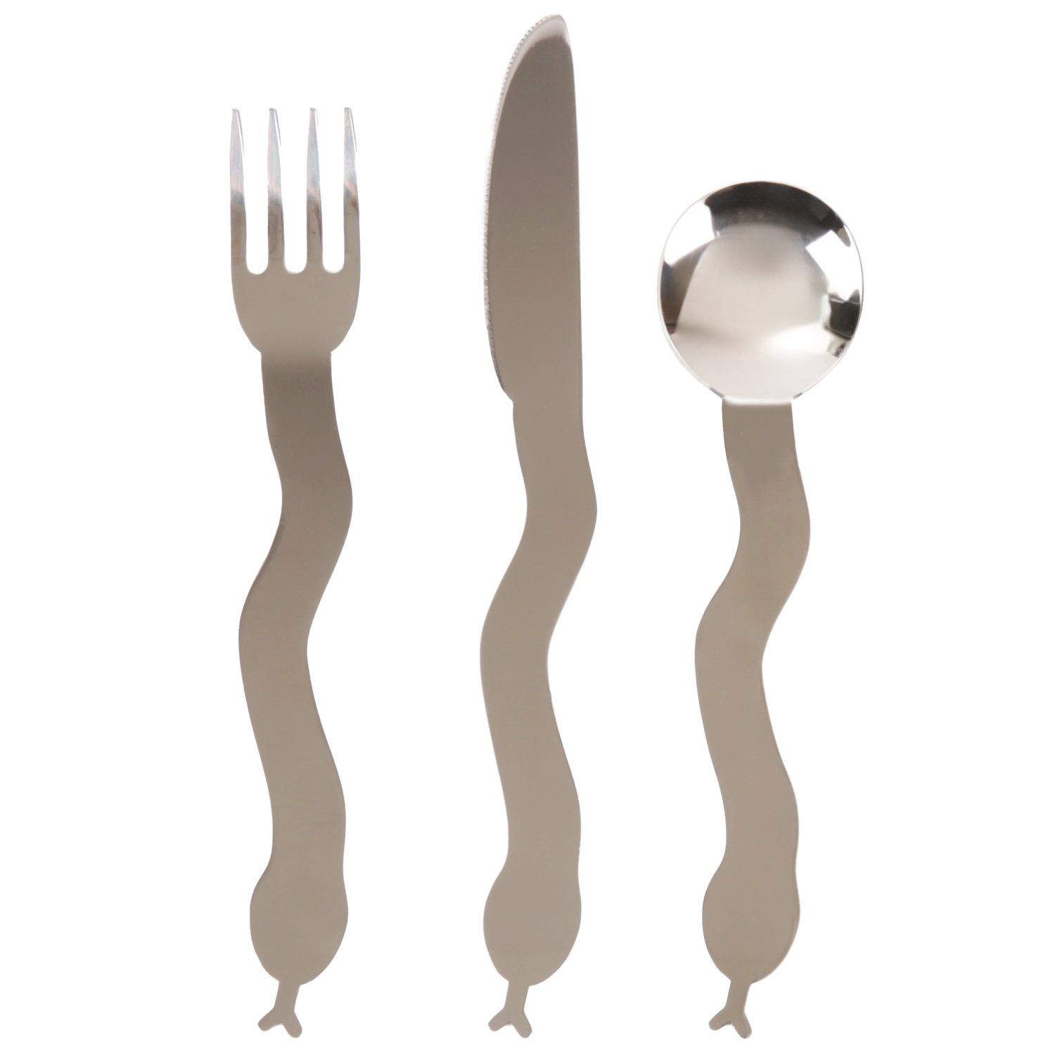
Snake Flatware Set designed by Lorien Stern. A set includes a fork, knife, and a spoon Stainless steel and dishwasher safe. Flatware ranges from 1 in. – 2 in. wide to 7.5 in – 9 in. long
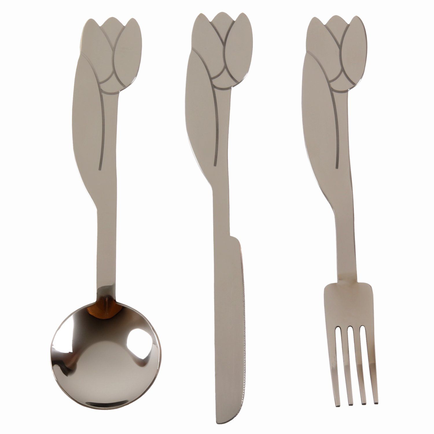
Tulip Flatware Set designed by Lorien Stern. A set includes a fork, knife, and a spoon. Stainless steel and dishwasher safe. Flatware ranges from 1 1/4 in. – 2 1/8 in. wide to 8 1/8 in. – 8 1/2 in. long
Artist and designer Lorien Stern’s first flatware line, released late last year, made me squeal with delight. There are two styles, one shaped like tulips and the other like snakes. They’re definitely more on the quirky side, so you’ll need to really think about them within the context of the rest of your table.
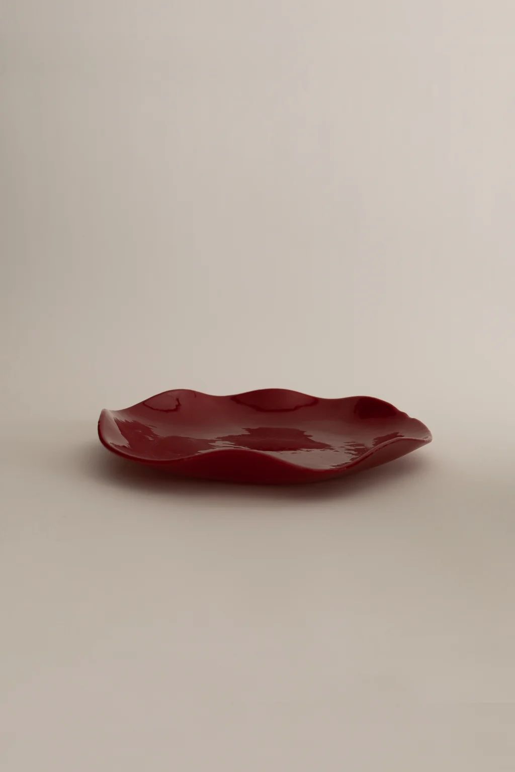
The Petal Plates are a colorful collection of hand-made plates, entirely made in NYC. Available in two sizes, they can be used on their own as serving dishes, combined into a set of dinner plates, or paired with the smaller size to create striking color combinations or color blocked pairings. They also work beautifully as decorative catch all bowls.
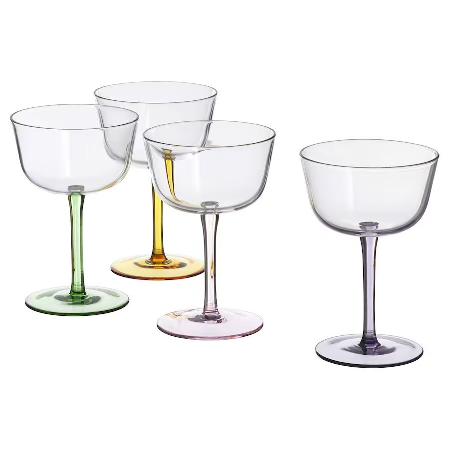
Give spring parties and dinners a shimmer that’s extra festive. These 4 glasses with bright colors are just as great for the welcome drink as for the dessert.
You could pare everything else down and let the tulips shine or you could fully lean into the quirkiness with bold plates and glassware.
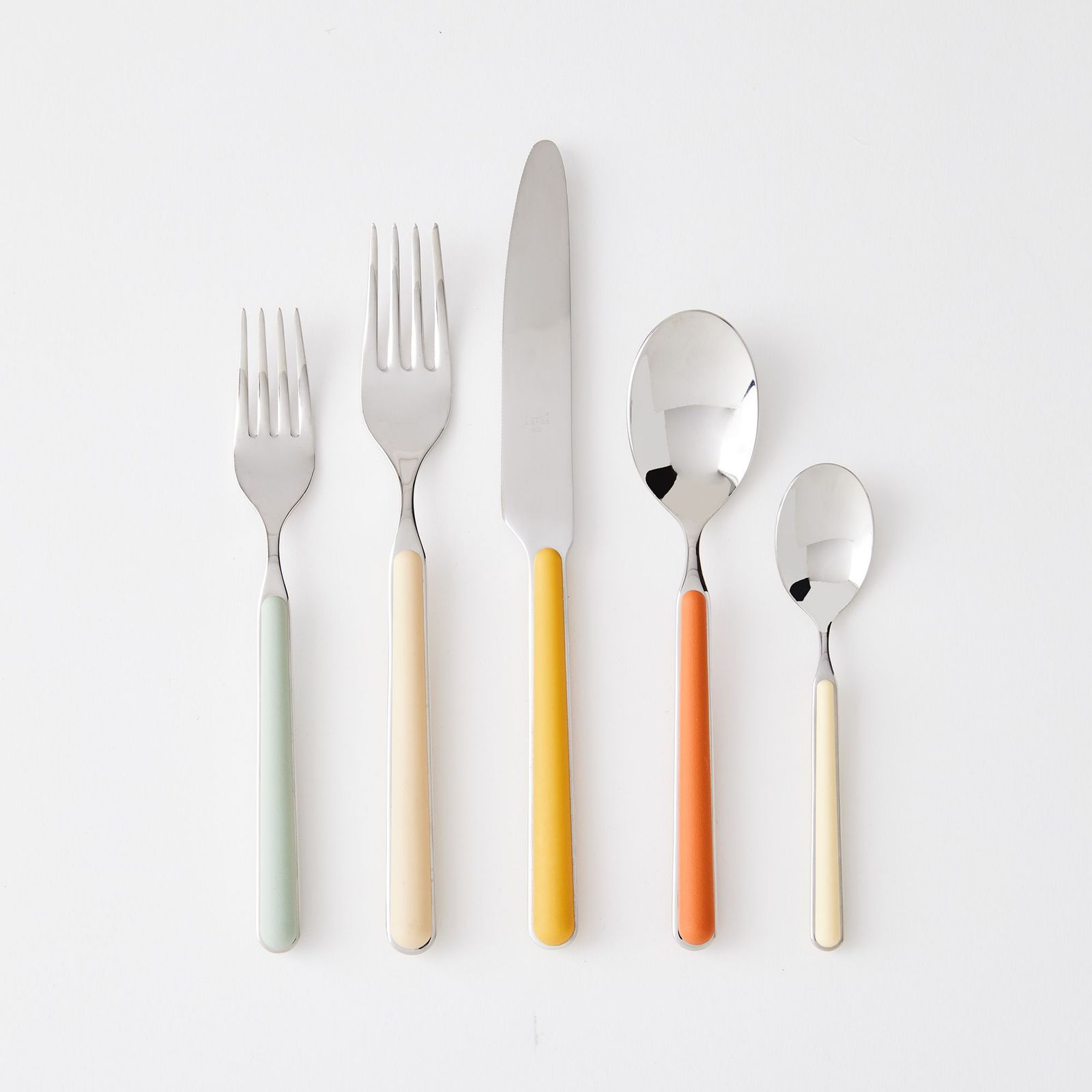
Designed by Muller Van Severen for HAY, this four-piece place setting embodies the designers’ minimalist aesthetic and thoughtful approach to color. Crafted from brushed stainless steel with painted handles, each set of flatware can be used together or mixed and matched to brighten your table. Made in China. Set includes 1 fork, 1 knife, 1 spoon, and 1 teaspoon. Dishwasher safe. Made from brushed stainless steel with painted handles.
Known more for its furniture, HAY would not be my first stop for cutlery—but I found a surprise in the utilitarian MVS line, which really puts the “flat” in flatware. With its subtly off-kilter proportions and unexpected mix of matte and polished finishes, this set feels both deliberate and effortlessly cool. If you’re feeling adventurous, mix up the colors!
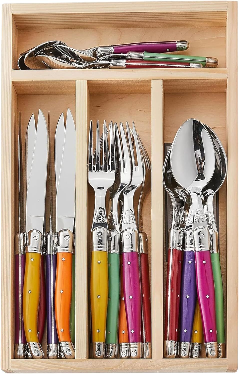
Our community can’t get enough of colorful tableware, and when you see Italian-made Fantasia flatware, it’s pretty clear why. From famed design house Mepra, their vibrant handles are a funky break from all-silver and all-brass everything. Fancy those bright colors? They’ll stay that way, thanks to special glass fibers built right in. Durable 18/10 stainless steel. Resin handles enriched with glass fibers. Dishwasher safe.
What if you want Sabre but… not? Mepra’s Fantasia line is a great alternative. You’ll get similarly bright, sturdy handles but with a more delicate shape overall. Much like my other colored-handle picks, you can commit to a color or buy a pre-mixed set of colors that compliment each other.
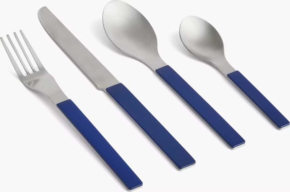
Set the table in style with this chic Laguiole flatware set from Jean Dubost. It features six knives, six spoons, six forks & six coffee spoons, all with assorted fruity-colored ABS handles. Established in 1920 in the south of France, Jean Dubost is a fourth-generation, family-run company that designs, manufactures, and shapes artisan flatware and knives for a difference in quality you can see and feel.
Laguiole is a type of traditional French pocket knife; it’s also the name of a brand and a style of flatware with handles that resemble a switchblade. Jean Dubost’s Laguiole flatware is what I most commonly see in restaurants and stores, but there are tons of dupes out there. You don’t have to commit to a full flatware set, either. The knives are a great way to dip your toe in without replacing your entire set. I have two sets of Laguiole knives that I found at Home Goods and will mix them into meals that require a bit more cutting power.
We love the products we feature and hope you do, too. If you buy something through a link on the site, we may earn an affiliate commission.
A new collection brings legendary works by midcentury designers to a wider audience for the first time in decades.
Coveting midcentury furniture is practically a prerequisite for reading Dwell—yet for many of us, the reality of owning an original piece remains firmly out of reach, both financially and logistically.
That’s a big reason why each piece in CB2’s Design Legends collection feels like a once-in-a-lifetime estate sale discovery. The new line from the high-design furniture brand is a meticulously curated revival, one that’s democratizing access to some of the 20th century’s most significant design works.
Let’s be clear: these aren’t mere “inspired by” pieces. They are authentic reissues of work by Gianfranco Frattini, Paul McCobb, Evelyn and Jerome Ackerman, and Bill Curry that are crafted to the exacting standards of the originals.
What makes this collection particularly noteworthy is the unprecedented access to archives and original specifications. By working directly with the designers’ estates and families, CB2 has created pieces that capture not just the aesthetic but the intent behind these midcentury masterworks.
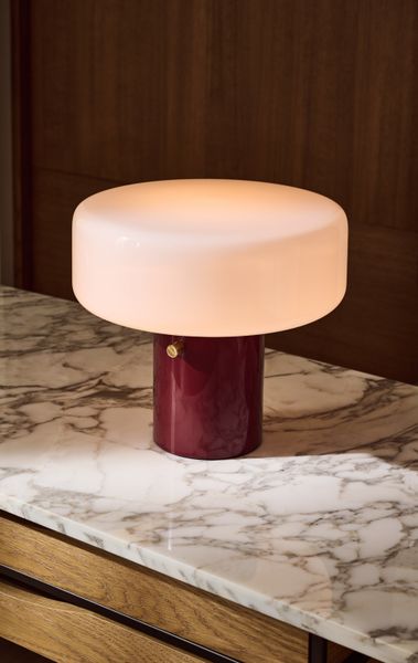
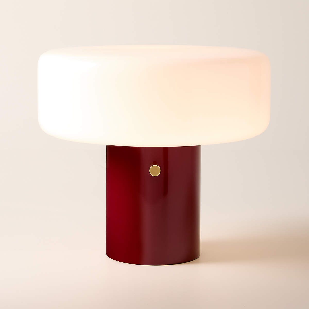
Bill Curry’s Pill High Gloss Oxblood Red Iron table lamp captures the optimistic futurism of Space Age design.
Designer Bill Curry’s sketches from the late 1960s were used for the Design Legends collection. Here, you can see early iterations of Space Age-inspired pieces like his mushroom-style lamp that would become part of his legacy.
Minimalist mushroom-style table lamp from the archive of midcentury American designer Bill Curry embodies the essence of his iconic Space Age-inspired designs. In this late-1960s design, an opaline glass shade contrasts with an oxblood cylindrical base in an elegant juxtaposition of geometric shapes and materials. CB2 exclusive.
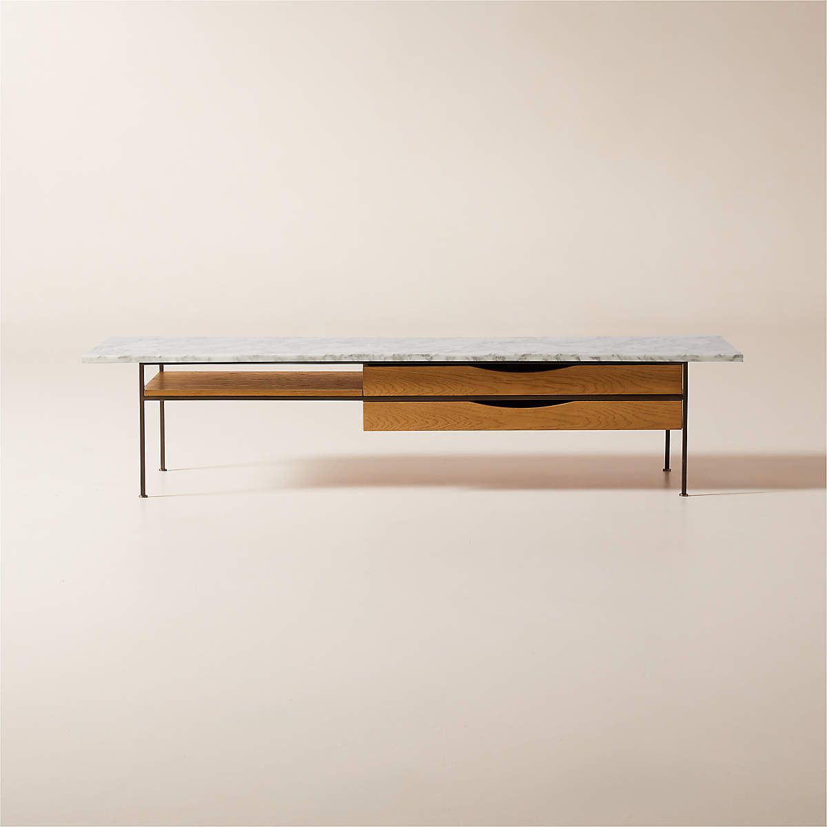
Coffee table by Paul McCobb displays the genius of his straightforward design philosophy. Designed in 1952 as part of his Irwin collection for Calvin furniture, this reintroduction retains the unadorned form and function of the original piece. The white oak frame, certified sustainable by the Forest Stewardship Council ®, holds two drawers and a fixed shelf, all supported by a slim bronze-finish base. A top of Arabescato marble, sourced from an Italian quarry and polished to a semi-gloss, weaves its dark grey veining across a background of white. Made to the highest standards of quality, this classic midcentury piece is a strong example of McCobb’s enduring style. CB2 exclusive.
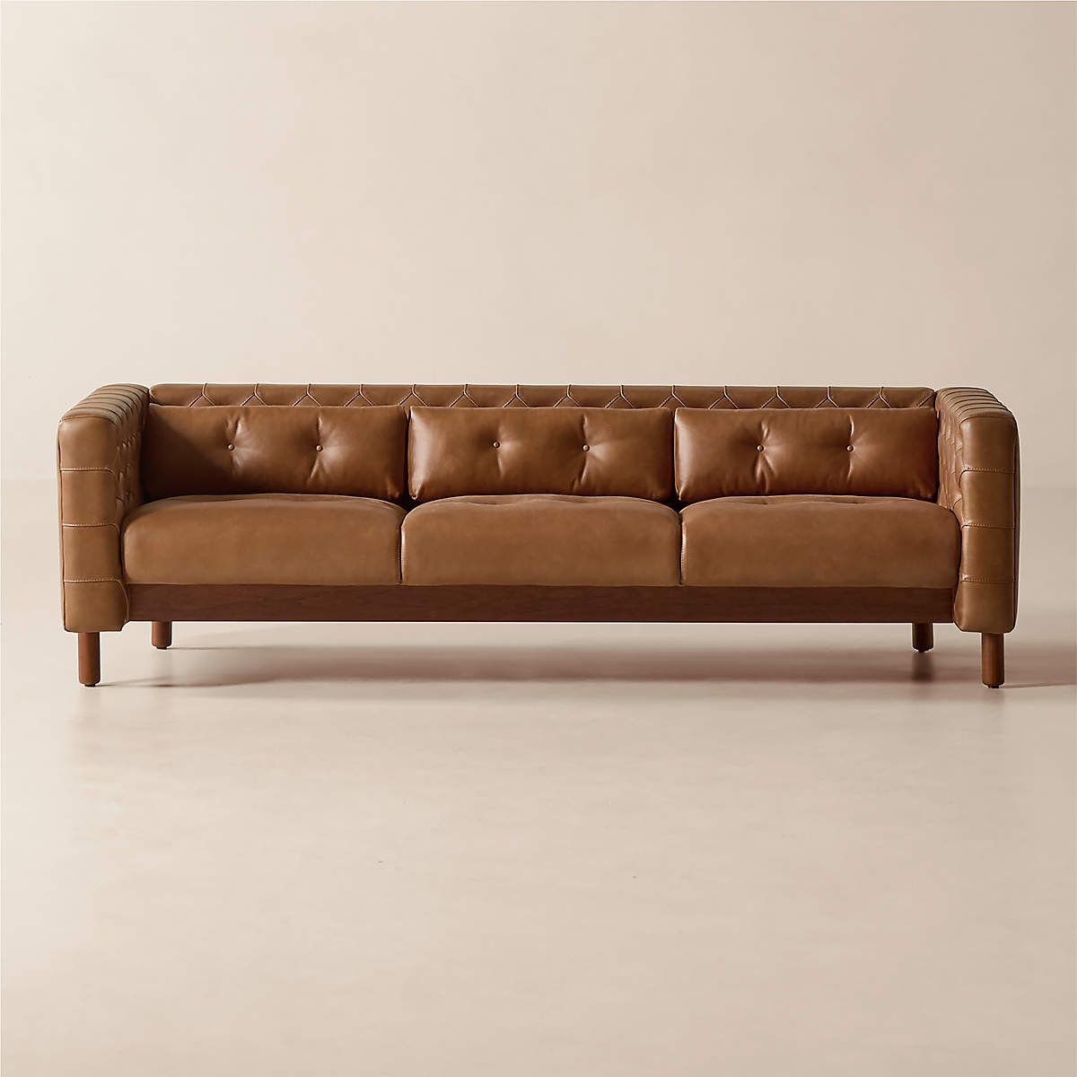
This sleek, low sofa was originally created by iconic Italian designer Gianfranco Frattini for the fashionable Restaurant St. Andrews in the heart of old Milan. Now, a modern classic returns with the same spirit of the original design, reimagined in full-grain saddle leather. Semi-aniline cowhide is gently polished for a smooth hand that showcases its natural markings. Period-authentic details include hand-pulled button tufts on the interior sides and cushions, along with the inset American black walnut legs that are characteristic of the designer’s signature style. CB2 exclusive.
The Portofino desk by Gianfranco Frattini, for example, is a design so rare that even the designer’s children, Marco Frattini and Emanuela Frattini Magnusson, believe it may never have entered production beyond a private commission for an architect to store rolls of drafting paper. Preserving their father’s legacy and archival materials has been a deeply important project for them, and they worked closely with the CB2 design team and Form Portfolios to ensure each piece stayed true to their father’s original vision. The CB2 exclusive is now out in the world for all to enjoy, recreated from a black-and-white archival photo with richly grained walnut, black powdercoated iron legs, and a champagne brass crossbar. It’s design archaeology made tangible.
Based on a Gianfranco Frattini design from 1961, the Memoria lamp remains an eyecatching piece today with its visible telephone-style cord and glass shade.
Now known as Stonestill Lodge, the home lets in the surrounding landscape while honoring the property’s original structure.
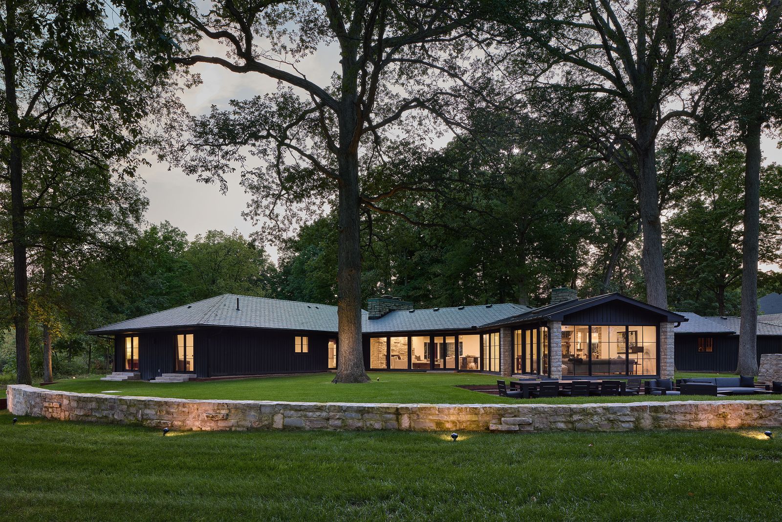
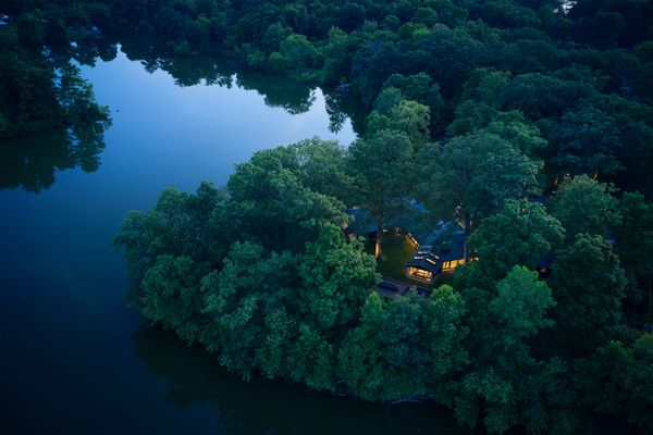
When music and entertainment professionals Harvey Mason, Jr., and Britt Burton Mason were looking for a new home to get away from the hustle and bustle of Los Angeles, they surprised all of their California colleagues by picking a fixer-upper in the middle of rural Ohio. “I was like, ‘Oh my gosh, this place is incredible!’” says Harvey. “I really love the people. I love the energy. I love the scenery.”
Originally built in the 1940s by an architect that studied under Frank Lloyd Wright, the single-story house—now named Stonestill Lodge—was situated on a peninsula with water on all sides. While the location couldn’t be more serene, “It was in a bit of a time capsule,” says Britt. “We bought it from this lovely couple in their late eighties. They raised their family in this home, and it was a beautiful layout. We saw the vision and what it could be for us.”
In addition to the idyllic and private setting, the home’s stonework (including the original stone foundation) and spacious floor plan all played a role in convincing the Masons to make the leap to the Midwest. Britt grew up in Ohio, so it was also a return to her roots—and the couple surrendered to the change and challenge to completely customize the home into their personal lakeside retreat.
Before: Exterior
Originally built with smaller windows and darker interiors, Stonestill Lodge wasn’t taking advantage of the lake views and the easy, natural light available to it. “We didn’t want to knock it down and make some huge mansion. We wanted it to feel comfortable and homey, like it was meant to be here,” says Britt.
In order to make sure the home felt like it was a part of the landscape, the first goal was revamping the exterior. Emphasizing a connection with nature, Harvey and Britt decided that a significant focus of the renovation would be adding large windows and doors to optimize the light and views. “Everywhere you look, we wanted to see glass,” says Harvey, “We wanted to see through into nature, see the lake, see the trees. We even wanted to make sure the bedrooms took advantage of the views.”
Stonestill Lodge is now filled with light, and has sweeping views of the water and grounds.
A hay loft is now a sleeping area and curved built-ins facilitate movement.
Houses We Love: Every day we feature a remarkable space submitted by our community of architects, designers, builders, and homeowners. Have one to share? Post it here.
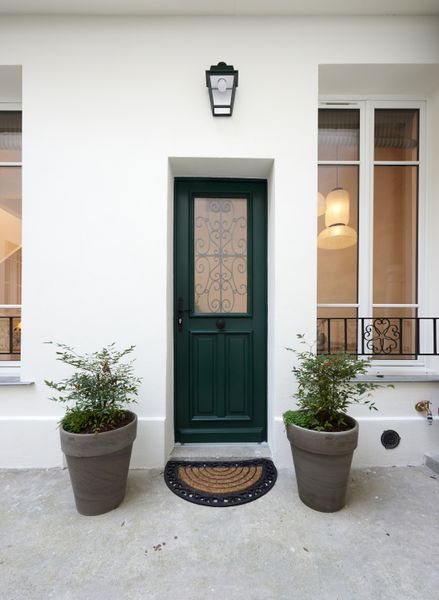
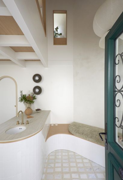
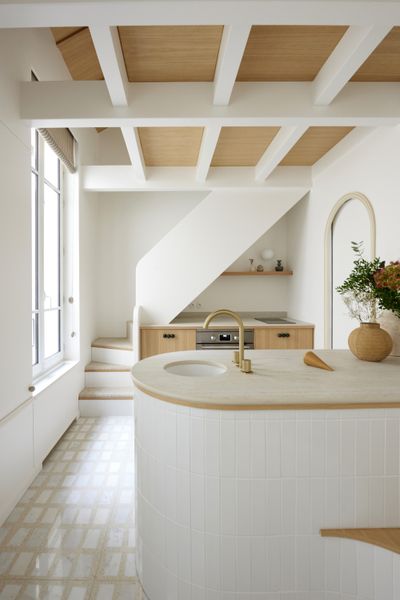
From the Designer: “In 1850, this apartment was just a small stable at the end of a typical Parisian paved courtyard overlooking Boulevard Garibaldi. It had a tiled roof supported by an oak framework with a hayloft on the first floor. At that time, the Boulevard Garibaldi was the rampart between the city of Paris and the beginning of the city of Issy. Between 1853 and 1870, during the time of Baron Haussmann, the boulevard was built and the stable was incorporated into a Haussmanian building facing the boulevard. With the disappearance of the horses and the appearance of the metro, a façade was created and the stable became a small apartment.
“In 2024, the studio underwent a complete renovation. Everything was transformed and renovated. Curves are an integral part of this achievement; they hug the existing walls and facades and link the spaces together. “Made-to-measure” is at its peak here, where every detail counts.
“The project gives full place to natural materials and traditional techniques to give a second breath of life to the building: a crawl space regulates the humidity of the ground; the oak framework was repaired, lightened, and sanded; and the stone walls were plastered with a mixture of natural lime and pigments. The brick façade walls are insulated from the outside with wood fiber and a lime-hemp plaster is sprayed on the inside.
“The high ceilings and the old hayloft have been utilized to incorporate a sleeping area. The ground floor and the mezzanine are linked by a custom-made staircase that is curved and soft. This small area has all the makings of a large one—design and functionality work in symbiosis on this realization.”