large.png

From the Archive: An Experimental Firm Brought the Avant-Garde to Japan’s Factory-Made Houses

When FOBA introduced a design-conscious alternative to the widely used “housemaker” market, they made a strong case for architecturally assertive standardized homes.

As a part of our 25th-anniversary celebration, we’re republishing formative magazine stories from before our website launched. This story previously appeared in Dwell’s June 2001 issue. 

“I could care less about tatami,” 37-year-old graphic designer Shingo Fujiwaki says casually as he pushes a shock of long, black hair out of his eyes. Instead, when he had a chance to scrap his parents’s 30-year-old house with its traditional straw flooring and replace it with the home of his dreams, Fujiwaki went in search of an architect who could give him what he wanted: a blank, white shell. In Katsu Umebayashi, the 37-year-old head of the design firm FOBA, he found just the man. And, in Fujiwaki’s house, FOBA found what proved to be a perfect prototype for its new venture: FOB Homes, the architects’s foray into the market of the housemakers, whose kit-of-parts homes account for almost all new houses built in Japan.
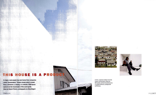
Photo: Nobu/Avgvst

A 12-person practice founded in 1995, FOBA is based in Uji, a tea-growing town outside of Kyoto. FOBA is known for its experimental houses and inventive commercial projects such as its own headquarters building, “Organ,” a snaking tube of continuous space complete with level changes and quirky angles.

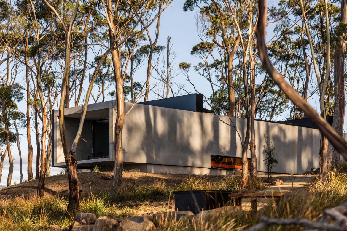
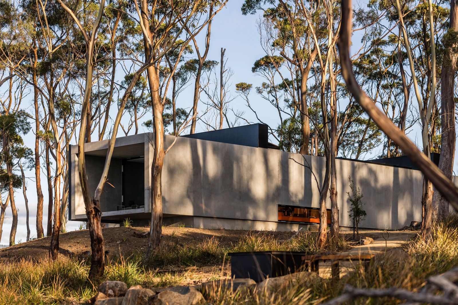
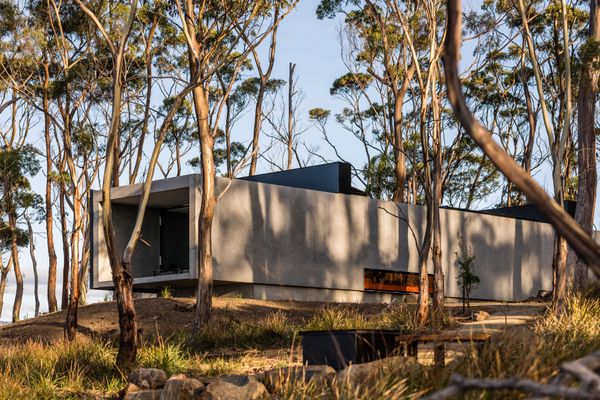
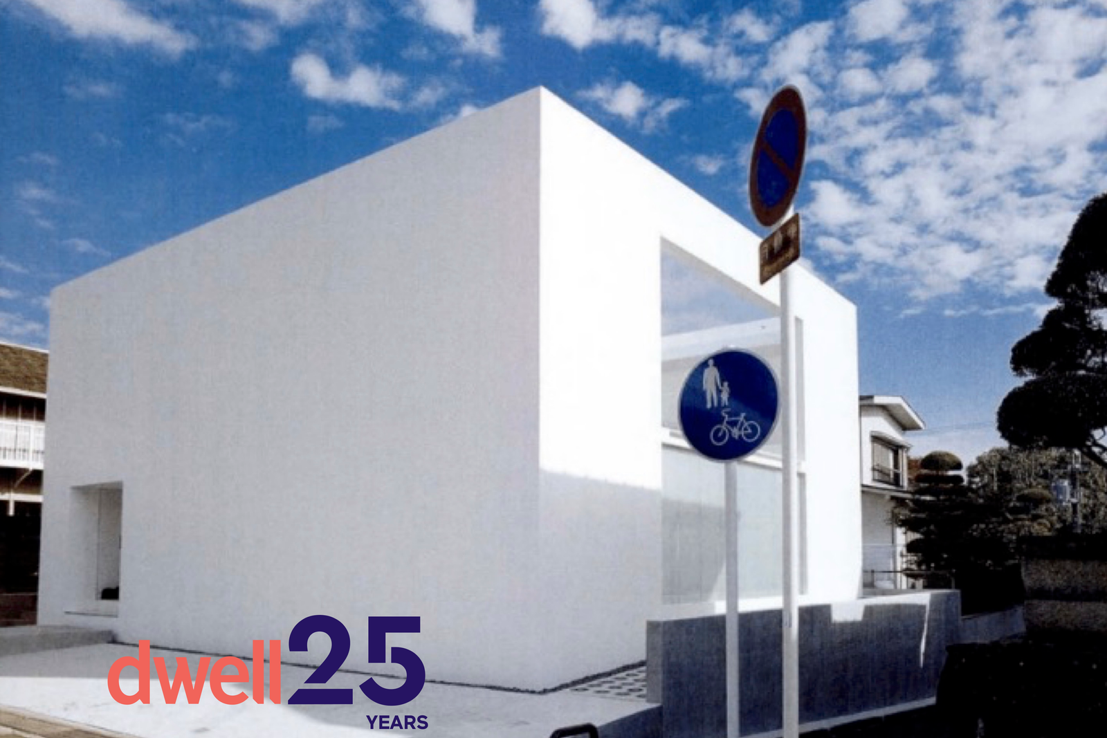
The 1,376-square-foot house that FOBA built for Fujiwaki and his family sits on a corner site smack dab in the middle of Suita, a kind of Japanese Levittown on the outskirts of Osaka that was created at the time of the 1970 Expo (held nearby). Against the backdrop of the neighborhood’s drab cookie-cutter homes, the Fujiwakis’s house is hard to miss. It is a stark white concrete box—no parapets, no balconies, no ornament, no nothing. And, of course, there’s not a curve in sight. It doesn’t even have any windows aside from a low strip of glass on one side and a large plane of frosted glass on the other. Then there’s the facade: a brilliant white wall, unbroken except where a niche was carved out for the entry foyer. Though almost entirely shut off from the outside world, the house was not meant to be introverted or insensitive. On the contrary, “whenever you face a blank wall to a neighbor, it’s a favor,” says FOBA associate Tom Daniell. The walls politely protect the Fujiwakis’s privacy and that of their neighbors. And because they are set back from the property line, they also create welcome buffers of open space between houses. This is no small feat given the density in areas like this, where plots are small and houses are close together.

While this house may look modern with a capital “M,” the orthodoxy doesn’t extend much past its right angles and unadorned walls. The organization of this house and the way the Fujiwakis live in it are definitely homegrown. This becomes apparent the moment the threshold is crossed. Taking over where the exterior stone paving leaves off, polished concrete becomes the house’s interior floor. Nonetheless, the Fujiwakis exchange outdoor shoes for indoor ones before proceeding into the heart of the house: a double-height, combined living and dining room that somehow connects with almost every part of the building. In one direction it flows into a sleek galley kitchen, a stainless-steel Italian import, where the Fujiwakis can whip up espresso without dropping out of the conversation. In another direction it opens seamlessly onto an enclosed courtyard with glass doors that slide open to flood the room with daylight and fresh air (though the dog is the only family member to spend much time out there). A freestanding metal staircase connects to the second floor. But both primary bedroom, a modest affair with just enough space for a double bed, and dressing room, with its exposed hanging bar loaded with the Fujiwakis’s de rigueur black, white, and gray wardrobe, overlook the living area below. Even the upstairs bathroom, a narrow, skylit corridor lined with the most elegant fixtures money can buy, is linked to the main room.
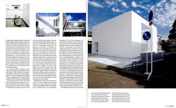
Photo: Nobu/Avgvst

The Fujiwakis’s house is a far cry from the imitation Western-style homes churned out by house manufacturers who build with Lego-like prefab pieces or even their upscale made-to-order cousins. If you buy a car, camera, or watch in Japan, there are loads of good designs to choose from, explains Fujiwaki. But housemaker houses are another story. “You have no choice—it’s bad design or nothing,” says Fujiwaki. True, they come in a vast array of styles and they can even incorporate a traditional tearoom, complete with the customary tatami mats and the decorative alcove known as a tokonoma, plus a pass-through kitchen all under one gabled roof. But design-wise their stock solutions, based on the Western ideal of separate rooms for separate functions, are criticized for being bland at best, and at worst, poorly suited to the Japanese lifestyle. “The only things most people decide on is which housemaker, how many rooms, and how much they’ll spend,” laments Umebayashi.

It’s not cutting-edge design that customers are after when they visit housemakers’s showrooms and websites. The lure of the housemaker house is that it is a known entity before ground is ever broken. Each one comes with the promise of being built on time and on budget. It’s also guaranteed: Should the synthetic slate roof leak, the company’s 24-hour hotline is always ready to provide service with a smile. And because everyone is doing it, there is never the worry of having a house that’s going to raise eyebrows. If the client wants a customized design statement, he can always hire an architect. Yet many prospective homeowners shy away from the incumbent risks of not knowing what sort of self-indulgent house an architect will concoct or how much it will actually cost. “Very few clients want a work of art; most want a life tool, a life container,” says Umebayashi. Between these two extremes of standardized housemaker homes and one-off, architect-designed creations lies the gap which FOB Homes plans to fill by offering a design-conscious alternative that tops the construction quality of the housemakers’s house but matches the price, which usually starts at $300,000 (not including land costs).

How can FOB Homes pull this off? By dividing the building process into six steps that provide the clarity and convenience of the housemaker’s formulaic method and standardizing the design process to limit client choices. Though FOB Homes has yet to fully utilize this system, its products so far have a similar look and are planned as continuous internal spaces (albeit with careful functional zoning) that are composed from a conceptual kit of parts. Enclosed outdoor spaces are also part of the package.

“We want to make living fun and satisfying.” says Mitsue Masunaga, the head of FOB Coop, a nationwide chain of 12 shops devoted to spreading the gospel of good design. Together with Umebayashi, her nephew, she is the driving force behind FOB Homes. Her shops, named after the shipping term “free on board,” stock a range of interior goods, both foreign made and local, and she is eager to add house designs to her inventory. “The thing that people want most is a house,” says Masunaga, “so I want to sell them.” So kitchens are open and inviting, storage is generous enough to conceal all manner of unsightly clutter, and bathrooms are the most sumptuous spots in each house. (The Fujiwakis’s bathroom features a miniature garden and a German-made Duravit tub.) This approach provides an image of the house and its organizational framework, but the rest can be tailored to meet the needs of the most persnickety clients. Even the signature white surfaces are just a starting point. Be it the art on the walls, the food on the kitchen counter, or, as at the Fujiwakis’s house, their forest-green canoe which sits outside, decoration and color come from the client.
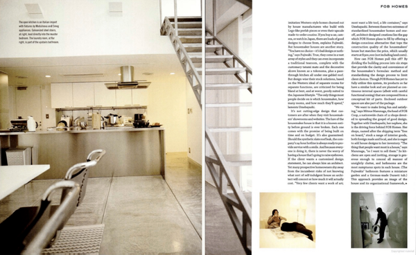
Photo: Nobu/Avgvst

See the full story on Dwell.com: From the Archive: An Experimental Firm Brought the Avant-Garde to Japan’s Factory-Made Houses
Related stories:

large.jpg

A Wedge-Shaped Cabin Braces for Wind on the Chilean Coast

Its wood “skeleton” holds a series of indoor/outdoor spaces across three glass-enclosed levels.

Houses We Love: Every day we feature a remarkable space submitted by our community of architects, designers, builders, and homeowners. Have one to share? Post it here.

Project Details:

Location: Matanzas, Chile

Architect: Gonzalo Rufin Arquitectos / @gonzalorufin

Architect: Felipe Toro

Footprint: 861 square feet

Builder: Constructora Guay Guay

Structural Engineer: Jorge Argandoña

Photographer: Pablo Casals / @pablocasalsaguirre_works

From the Architect: “In the middle of a mountainous sector surrounded by forests and ravines, this house is located on the windy beach of Matanzas, Chile. Its figure appears as vertical and horizontal at the same time, providing its occupants shelter from the climatic conditions of the place. The construction is characterized by the repetition of a module that houses three stories and extends nine times in width, forming 861 square feet of living space. Through a skeleton made up of wood and steel ties, the plan rises vertically. Public areas are on the first floor next to terraces and the private spaces—a primary bedroom and a loft for guests—are on the upper floors. The envelope leaves its sides open to broad views of the forest, accompanied by a set of blinds that generate a permeable closure in connection with the environment.”

Photo by Pablo Casals

Photo by Pablo Casals

Photo by Pablo Casals

See the full story on Dwell.com: A Wedge-Shaped Cabin Braces for Wind on the Chilean Coast
Related stories:

large.jpg

Will Rocket Companies’s Recent Acquisitions Transform Home-buying—for the Better?

The mortgage originator snatching up Redfin and Mr. Cooper for nearly $11 billion could reshape the consumer experience as a one-stop shop for purchasing a house.

Last month, Rocket Companies, the nation’s second-largest mortgage originator, announced that it is making two major purchases, of real estate giant Redfin and Mr. Cooper—the latter the country’s second-largest collector of mortgage payments—in a series of transactions valuing nearly $11 billion total. The home buying and mortgage market has been struggling: According to National Mortgage News, 2025 forecasts for total mortgage production this year fall below pandemic lows; “the change in interest rates from 2020 to 2024 has seen the residential mortgage ecosystem careen from feast to famine,” NMN explains. In this environment, these acquisition shakeups could reshape the consumer experience as realtor and broker may merge into a one-stop home-buying shop.

Over at Redfin, the 2022 interest rate spike caused what ResiClub called “a continuous wave of layoffs,” alongside major losses that have continued through this year. Yet Redfin’s assets, as detailed by Rocket Companies CEO Varun Krishna, include “nearly 50 million monthly visitors, one million active purchase and rental listings and staff of 2,200+ real estate agents across 42 states.” This could drive new mortgage originations, especially as the National Association of Realtors reported that home sales ticked up by more than four percent earlier this year.

As interest rates declined in 2024 and potential home buyers moderately resumed their searches, there’s an advantage in bringing consumers straight to a lender to make their purchase. But it’s not just new loans that Rocket is looking for—according to Axios, the purchase of Mr. Cooper is about maximizing its returning customers, referred to as “recapture rates.” Higher interest rates have meant fewer refinancing opportunities; merging Rocket and Mr. Cooper could retain borrowers as loans are paid off or as homeowners look to refinance if interest rates are cut. It’s a smart move on Rocket’s part to consider not just new home buyers but longer-term outlooks.

The Redfin purchase represents a savvy business approach that ResiClub states “could see [Rocket Companies’s] market share quadruple.” But for the consumer, it’s less clear how it might impact the home-buying process. In car buying, companies like Carvana have managed to integrate shopping, financing, loan approvals, and delivery into one experience—all managed from a smartphone. But buying a house is far more complex. 

A Rocket Company representative couldn’t detail any changes to the website experience at this time. However, in a March 10th investor call, Brian Brown, CFO of Rocket Companies, remarked on this complexity, stating: “The traditional purchase process is fragmented and requires interacting with many entities along the journey—home search, buyer agents, listing agents, a mortgage originator, a title and closing provider, and a servicer. Each stop adds layers of transaction costs, stress, and friction.” For decades, realtors have acted to smooth the frictive process—their relationships with trusted mortgage brokers and real estate attorneys address some of the logistical bumps, especially for those unfamiliar with the process. 

Perusing Reddit, users express frustration and confusion over using Rocket Companies for home mortgages, including required annual income and credit score checks, as well as questionable refinancing offers. One user bemoaned the mortgage prequalification process, which they say was supposed to be “as good as having a check in hand,” yet they describe having to update and revalidate various tax and income documents two weeks prior to closing. As others countered, this is a normal part of the approvals process.

“[The] difference between Rocket Mortgage and a good, local mortgage lender is that we’re gonna remind you about those updated docs we need before the very last minute and keep you in the fold,” writes another user, who claims they work at a mortgage lender. “We don’t just assume you’re mortgage experts that know exactly what we need all the time, and we take the time to explain the process to you so that you’re as comfortable with it as possible during this scary, high-stress, important time in your life.”

For newer buyers using the platform, knowledgeable Redfin agents and financial advisors are still necessary players in the home-buying marketplace; the Great Recession taught us a lesson about the importance of well-informed mortgage consumers and non-predatory lenders. But National Mortgage News reports that Rocket’s acquisitions represent that a vertically integrated model is possible. “A growing portion of the mortgage finance market believes that realtors and loan officers are going to merge functions over time,” reads the story. While we’re a long way off from a “swipe to buy” function, these deals could signal a more consolidated real estate environment—hopefully not at the expense of the consumer. 

Top photo by Seth Joel/Getty Images

Related Reading:

Investors Are Buying a Higher Percentage of Homes, According to Redfin Report

Here’s Everything You Need to Know About Buying a Home, According to Three Experts

nature-meets-the-house-where-its-at.jpg

10 Stunning Architectural Feats—and How They Pulled Them Off

Go behind the scenes of how ambitious design briefs became reality.

Nature meets the house where it's at.

How They Pulled It Off is our ongoing series where we take a close look at one particularly challenging aspect of a home design and get the nitty-gritty details about how it became a reality.

From a hobbit-worthy house in Buenos Aires to a floating bedroom in Berlin, these 10 standout projects show just how’s it done.

A Secret Stair Hatch That Seals Off the Living Space

The home is located on a steep site in Los Angeles’s Montecito Heights neighborhood. Designed by LA-based, female-led firm Claret-Cup, one standout feature is the custom folding stair hatch that can toggle between appearing as an extension of the railing or, when folded down, it becomes an extended portion of the living room floor.

The home is located on a steep site in Los Angeles’s Montecito Heights neighborhood. Designed by LA-based firm Claret-Cup, one standout feature is the custom folding stair hatch that can toggle between appearing as an extension of the railing or, when folded down, becomes an extended portion of the living room floor.

Photo: Ye Rin Mok

The hatch can be operated swiftly and easily by one person, in part thanks to the installation of four hydraulic pistons.

The hatch can be operated swiftly and easily by one person, in part thanks to the installation of four hydraulic pistons. 

Photo by Ye Rin Mok

The sheep graze in their pasture, which is separated from the rest of the property by the knee-high wall, cleverly hidden in the landscape.

Inspired by the work of 18th-century landscape architect Capability Brown, the wall is a reinterpretation of the historic ha-ha, a type of sunken fence with French origins first used to keep animals out of gardens.

Photo: Sama Jim Canzian

See the full story on Dwell.com: 10 Stunning Architectural Feats—and How They Pulled Them Off
Related stories:

large.jpg

What Ikea Designers Keep for Themselves

The minds behind the world’s most ubiquitous furniture brand share the stuff they love so much they use it in their own homes.

When I went to Stockholm in February to preview the 40th anniversary of Ikea’s Stockholm collection, I knew I was in the unique position to ask the question I most wanted the answer to: what does an actual Ikea designer have from Ikea? Would it be something as ubiquitous as the Billy bookshelf, or some obscure product I hadn’t seen before? The team’s answers surprised me, gave me ideas to look for pieces I hadn’t before, and underlined a truth: we all love looking backwards.

Nike Karlsson, designer: I have all those things that never end up in something. It’s the scrap yard. Prototypes.

Paulin Machado, designer: I have Nike’s sofa from 2014 [the PS 2014 sofa]. I found that on a vintage site. I was so happy when I got it.

Dwell: So you’re also looking for vintage Ikea, like everyone else is.

Machado: Oh yes. We love to do that. I think you learn a lot from that too, to see what has sustained in time and how it looks. And I think it’s a good school to learn from.

Johan Ejdemo, global design manager: I have a lot of stuff in my kitchen to cook things, but then I have, obviously there are sentimental projects that I’ve been involved in. And I have Nike’s old day bed; now we have a new daybed, but I have the old one. You can find it at auction sometimes popping up from the PS collection. I have a few products from that PS collection. The steel cabinet, the one that is a locker cabinet, but lower. There have been quite a few of those that we have been moving around. And sometimes they’re all in a row, sometimes they spread out in different places in the home. And they have been with me for a long time.

Machado: I think you have more than me now.

Karin Gustavsson, creative leader: I made a collection a few years ago called Industriell together with a Dutch designer called Piet Hein Eek. And I have that bookshelf. And I collect so many books and it’s the one super smart solution. You can build as big as you want in plywood. So I have that one as one of my favorites. But then I have something every day. I have the mattresses. We have such good quality mattresses. So I’m happy about them. You don’t see things sometimes, sometimes you take them for [granted].

Ola Wihlborg, designer: I have a lot of different stuff because I try them when I design them, I try them and evaluate them. But we have sofas. We have two sofas that we have had for a really long time. The old Stockholm sofa that I told you about with lots of cushions. That one we have had for 10 years. And then we also have Soederhamn, that’s another sofa from Ikea, that one has also been in the house for a long time.

Photos courtesy of Ikea

Related Reading:

The Designers Behind the 40th Anniversary of Ikea’s Stockholm Collection Explain How They Did It

Here’s How Those Instagram Vintage Sellers Find Their Best Stuff

large.jpg

Frank Lloyd Wright’s Surprising Superfan: The Founder of Domino’s Pizza?

One of the 20th-century architect’s biggest admirers is a somewhat unexpected—and similarly complicated—man.

It was the winter of 1985 and Domino’s Pizza was on a hot streak. The franchise, founded two decades earlier by Thomas Monaghan, had become the country’s fast-growing pizza restaurant, and the first phase of Monaghan’s unique vision for the company’s headquarters was complete. This wasn’t a standard HQ: it was a sprawling office park on rolling farmland outside Ann Arbor, Michigan, and unofficial shrine to Monaghan’s longtime idol, Frank Lloyd Wright.

The exterior of Domino’s Farms in Ann Arbor, Michigan—a sprawling office park designed to evoke Frank Lloyd Wright’s Prairie style.

The exterior of Domino’s Farms in Ann Arbor, Michigan—a sprawling office park designed to evoke Frank Lloyd Wright’s Prairie style.

Courtesy Domino’s Farms

Frank Lloyd Wright appreciation verging on the fanatical is no rarity; people still buy his homes for millions, even though they’re notorious for aging poorly, and there’s a substantial web of organizations dedicated to the preservation of his work. Still, there has perhaps been no person more (unexpectedly) committed to the 20th-century architect’s vision than the Domino’s founder. As the story goes, Monaghan first discovered Wright’s work at a library in Michigan when he was 12, then admired his Imperial Hotel while serving in the Marine Corps in Tokyo. By the ’80s and early ’90s, once Domino’s had hit its stride, the founder was gobbling up Frank Lloyd Wright furniture at an unbelievable rate and cost. The volume was so high that Monaghan was considered a key factor in the hike in prices for Wright’s works, according to a 1988 New York Times story, and he was criticized by preservationists who believed deep-pocketed collectors were destroying the artistic value of Wright homes as they snapped up built-in details of the structures that would leave them with less of their original character. Though total amount for this yearslong spending spree are unavailable, another 1988 New York Times story reported that Monaghan spent over $14 million on Wright objects alone by that time, acquiring “the largest collection of the architect’s furniture, stained glass, and decorative objects anywhere.” Never mind the $330,000 he spent a few years earlier on Wright’s 1941 Carlton D. Wall House (also known as Snowflake) and a 1953 Usonian that had been dismantled and stored away for decades. Or that $120 million office park.

An interior room of Domino’s Farms.

Inside the long, slow-slung structure, several of the Domino Pizza founder’s collections are on display, including his massive trove of Wright objects. 

Courtesy Domino’s Farms

Just outside Ann Arbor on a street named Frank Lloyd Wright Drive, Domino’s Farms is a behemoth structure that spans a half-mile long and over 400,000 square feet. Monaghan tasked architect Gunnar Birkerts (a former employee of Eero Saarinen) with designing the structure to evoke Wright’s Prairie style. “Tom is addicted to Frank Lloyd Wright without any reservation,” Birkerts told the New York Times in 1985. The office building is pure postmodern pastiche: With its flat planes and red brick, it’s legibly Wright-inspired on the exterior, though largely unrelated to the Midwestern architect’s style on the interior, save for the chairman’s suite, with its brick hearth and wood-paneled walls.

At the time of the new HQ’s construction, the Domino’s owner (who’d recently bought the Detroit Tigers) was emphatic about Wright’s brilliance. “I’ve been evangelizing Frank Lloyd Wright all my life,” Monaghan told the New York Times. “I’ve never met anyone yet who hasn’t been impressed.” The business tycoon spoke about drawing attention to Wright’s genius as imperative, like the architect’s work might otherwise be completely forgotten. “Wright is the equal if not the superior of Michelangelo,” he stated in an interview with historian Hugh Howard in the 1991 book Preservationist’s Progress. This wasn’t just a personal fixation, but in some ways, a strange offshoot of the Domino’s Pizza brand. For a roughly decade-long period, Frank Lloyd Wright—and architecture by extension—was a part of the Domino’s corporate identity. You could buy calendars that featured “Selections from the Domino’s Center for Architecture and Design” and read semifrequently about Monaghan’s latest auction exploits in the Times. There was a Domino’s-sponsored award for the “Domino’s Pizza World’s Top 30 Architects.” Design historian David A. Banks wrote a 1989 book titled Frank Lloyd Wright: Preserving an Architectural Heritage, Decorative Designs From the Domino’s Pizza Collection.

Tom Monaghan, the multimillionaire founder of Domino’s Pizza, on the University of Ave Maria campus in the Catholic-centric planned community of the same name he founded in Florida.

Tom Monaghan, founder of Domino’s Pizza, on the University of Ave Maria campus in the Catholic-centric planned community of the same name he founded in Florida.

Photo by Joe Raedle/Getty Images

See the full story on Dwell.com: Frank Lloyd Wright’s Surprising Superfan: The Founder of Domino’s Pizza?
Related stories:

that-swoop-was-my-least-favorite-thing-about-the-house-admits-fred-i-was-looking-forward-to-an-angular-craftsman-type-thing-but-i-said-im-going-to-trust-kristin.jpg

Budget Breakdown: A Butter-Yellow, Swooped-Roof Houston Home Gets a Secret Addition for $507K

Inflection Architecture adds 700 square feet to a century-old Texas bungalow by tucking a new second story just beyond street view.

Janette Lindner first bought this Houston, Texas, bungalow 20 years ago, before she and her husband, Fred, got together. “She allowed me to move in,” Fred says with a laugh. The pair made some small tweaks to the interiors to make the 1930 home more comfortable for a modern age, and they lived there, two young adults in love, happily for years. 

Smash cut to 2020. The Lindners were still happy in their historic neighborhood, but they were also starting to feel a little cramped, now that they shared the house with their two kids, Andrew and Alex. “Covid really highlighted our need to expand the space and the function of the home to accommodate our growing family,” says Fred. 

They started dreaming of a more functional layout, with separate rooms for each of the kids, office spaces to accommodate the grown-ups’ hybrid work schedules (Janette is a management consultant; Fred is a brand and software designer), and a new laundry room. The catch? They didn’t want to give up too much of the backyard to make it happen. “Outdoor space is important to us,” says Janette. Oh, and any changes needed to be in keeping with the scale and character of the neighborhood.

During the renovation, they discovered a window on the north side of the kitchen and built some shelving in front of it to enjoy storage while still letting the light in.

For some, this might have been a tall order, but Kristin Schuster, principal of Inflection Architecture, approached the challenge with excitement. “They had this darling little historic bungalow that they really cared for a great deal and had worked hard to make work for them,” she recalls. “The house was bursting at the seams with vibrant, colorful stuff everywhere, and I  remember thinking, ‘Okay, there’s a way to find the place for all of these things and all these people that is going to help them stay connected.’”

Working with Schuster, the family settled on plans for a new-build second story that would bring the 1,200-square-foot bungalow up to 1,900 square feet, with three bedrooms and plenty of space for family music jams and creative pursuits. Schuster placed bedrooms for Alex and Andrew up on the second floor, along with a shared bath and play space, which allowed her to reconfigure the ground level more effectively and make use of shared, overlapping functions. 

Storage is built in wherever possible throughout the home—including in this nook underneath the stairs—allowing the family to optimize the space

“All these spaces connect through looping circulation or sneak-peek openings that borrow light and views and let everyone feel as connected as they want to be while they are home,” says Schuster.

Living in one of Houtson’s more restrictive historic districts, there were some limits on what could be done to the facade of their home, which was built in 1930. But the demolition revealed evidence that the home had once had a large front porch, so Fred took a 22-slide Powerpoint presentation down to city hall and got permission to add one back into the design.

Salvaged shiplap from the original house was repurposed. You’ll find it on the walls in the Zen Den (shown here) and in the primary bedroom.

See the full story on Dwell.com: Budget Breakdown: A Butter-Yellow, Swooped-Roof Houston Home Gets a Secret Addition for $507K
Related stories:

large.jpg

Solar Panels Completely Cover One Side of This 98-Foot-Long Brutalist Home in Tasmania

The generous array, along with a rainwater harvesting system, allows the concrete residence to operate entirely off-grid.

Houses We Love: Every day we feature a remarkable space submitted by our community of architects, designers, builders, and homeowners. Have one to share? Post it here.

Project Details:

Location: Bruny Island, Tasmania, Australia

Architect: Room11 / @room11__

Footprint: 1,722 square feet

Builder: Merlin Constructions

Interior: Vipp / @vipp

Photographer: Adam Gibson / @adam.gibson.photo

Styling: Jack Milenkovic

From the Architect: “Danish design brand Vipp traveled to the southern hemisphere for the brand’s newest guesthouse. Cantilevered over a sloping hill on Tasmania’s Bruny Island, the Vipp Tunnel by Hobart studio Room11 balances beauty and brutalism.

“Balancing on the edge between solid ground and open air, Vipp Tunnel expresses a playful dialogue between concrete cubism and its organic surroundings. The 1,722-square-foot home stretches 98 feet, and wall-to-wall glass and recessed steel doors provide unobstructed views of the surrounding landscape and sea. An atrium yard separates the main living space from the primary bed and bathroom, while at one end of the home, a glass door leads to a framed terrace floating above the land.”

“A separate 377-square-foot concrete cube with 13-foot-high ceilings referred to as ‘the studio’ offers an escape to a space of visual and sensory calm. Ideal as an office space or meditation room, its spare design highlights the architecture.

“Inspired by the area’s natural phenomenon known as aurora australis, or southern lights, when the night sky is transformed into a dreamscape of color, Room11 added chromatic glazing to the building’s central skylights. Polished concrete floors and walls further enhance the effect, reflecting the ever-changing interplay of light like an ever-changing artwork.

“Vipp’s new all-aluminum V3 kitchen anchors the home’s main space. With a monumental stainless steel counter and fluted aluminum doors, the kitchen island mirrors the materiality of the building’s architecture.

“Clad with an entire facade of solar panels facing west, the structure is energy-sufficient and runs off-grid. During the design process, Room11 conducted surveys of every tree on-site and articulated roadworks around significant trees. A narrow construction corridor was established so that the impact on endemic vegetation was kept to an absolute minimum. The concrete panel design provides a thermal insulation to keep a regular temperature throughout the year, minimizing the use of heating and cooling sources. The getaway is purely run off rainwater and self-sufficient energy.”

Photo by Adam Gibson

Photo by Adam Gibson

Photo by Adam Gibson

See the full story on Dwell.com: Solar Panels Completely Cover One Side of This 98-Foot-Long Brutalist Home in Tasmania
Related stories:

this-historic-two-story-condo-by-ray-kappe-has-double-height-windows-original-wood-paneling-and-three-separate-patios.jpg

For $900K, You Can Nab a Ray Kappe Condo in the Hollywood Hills

The historic two-story home has double-height windows, original wood paneling, and three separate patios.

This historic two-story condo by Ray Kappe has double-height windows, original wood paneling, and three separate patios.

Location: 3625 Fredonia Drive, #12, Los Angeles, California

Price: $899,000

Year Built: 1963

Architect: Ray Kappe

Footprint: 1,254 square feet (2 bedrooms, 2 baths)

From the Agent: “Two stories of glass, nine-foot ceilings, and spectacular views subsist in this Hollywood Hills condominium bordering Studio City designed by architect and educator Ray Kappe. The home measures 1,254 square feet, and each element of the living areas, bedrooms, and baths is masterfully planned, functional, stylish, and timeless. The neighborhood is close to dining and entertainment, and the home is freeway convenient to the studios, Valley, and all your favorite places in L.A. Soft story retrofitting is complete, the roofs are one year new, and the HOA dues cover the building’s earthquake and fire insurance, as well as a monthly contribution to the reserve, pool, and more. Rarely is such a true piece of Los Angeles midcentury-modern architecture offered at a price like this.”

Architect Ray Kappe made a name for himself as an LA modernist, designing over 100 private residencies.

Famed architect Ray Kappe designed more than 100 residences over the course of his career.

Shawn Bishop

In addition to the condo, the 12-unit community has a private pool.

The condo is located in a 12-unit building with access to a private pool.

Shawn Bishop

The patio windows stretch from the floor of the first level to the ceiling of the second.

Shawn Bishop

Shawn Bishop

See the full story on Dwell.com: For $900K, You Can Nab a Ray Kappe Condo in the Hollywood Hills
Related stories: