medium.jpg

This $1.6M Gregory Ain Midcentury Just Listed for the First Time in Decades

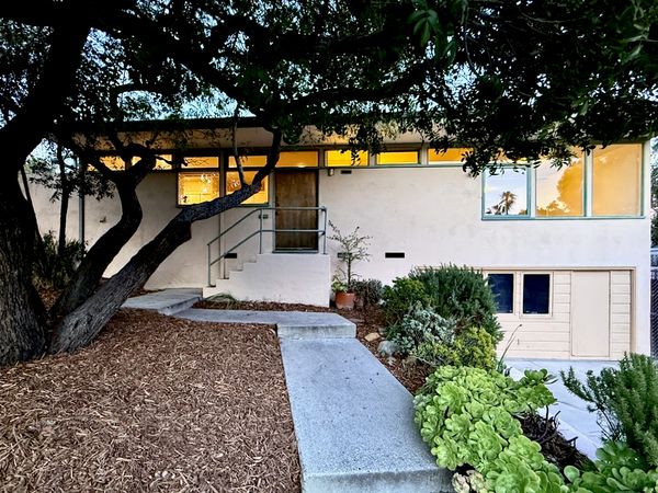
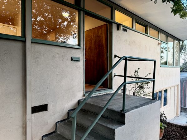
The 1948 L.A. home has long been held by the same family, and it still has its original windows, built-ins, and fireplace.

This 1948 L.A. home has long been held by the same family, and it still has its original windows, built-ins, and fireplace.

Location: 3500 Meier Street, Los Angeles, California

Price: $1,595,000

Year Built: 1948

Architect: Gregory Ain

Footprint: 1,096 square feet (3 bedrooms, 1 bath)

Lot Size: 0.16 Acres

From the Agent: “One of the more original of the 52 homes in this enclave by the pioneering modern architect, this special property has been cherished by the same family for many years, and is being offered for the first time in decades. On a large corner lot on the most desirable street in the community, surrounded by mature landscaping, this home provides a calm and serene sanctuary from big city life. The three-block neighborhood was conceived as a combination of good design and low-cost postwar housing; it was Gregory Ain’s successful attempt to bring modernist aesthetic sensibilities to the masses. By rotating the houses in different directions and alternating rectangular and square forms, the architect was able to create eight unique configurations, resulting in a variegated presence on the streets.”

Stephanie Saley

Stephanie Saley

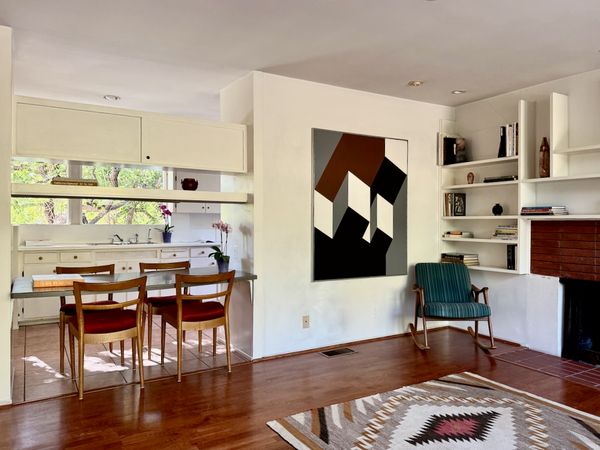
The windows, built-ins, and fireplaces are all original to the home, while the finishes are updated.

The windows, built-ins, and fireplace are all original to the home, while the other finishes have been updated.

Stephanie Saley

See the full story on Dwell.com: This $1.6M Gregory Ain Midcentury Just Listed for the First Time in Decades
Related stories:

large.jpg

This Farmhouse Near Berlin Came With a Tenant. The New Owner Renovated Around Them

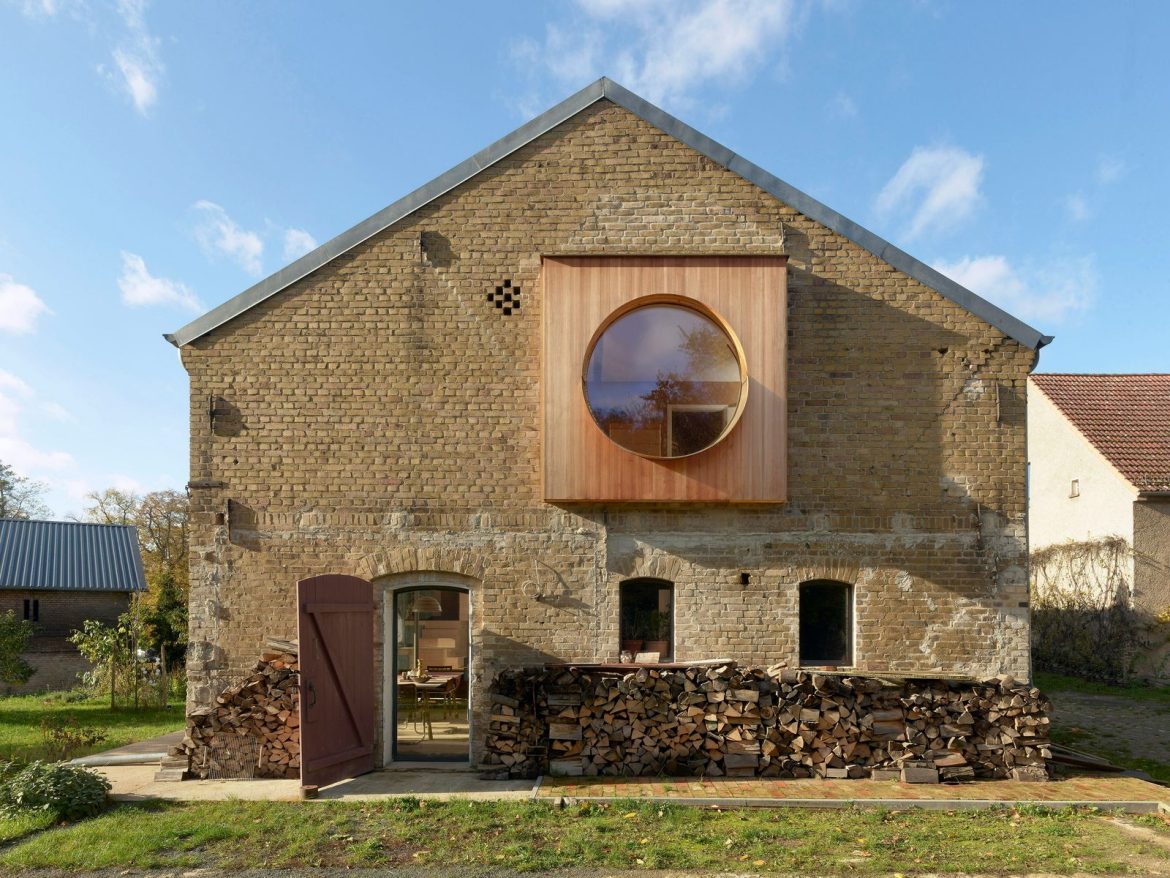
The structure now includes a two-level live/work flat punctuated by a circular window and sculptural wooden stair.

Houses We Love: Every day we feature a remarkable space submitted by our community of architects, designers, builders, and homeowners. Have one to share? Post it here.

Project Details:

Location: Wandlitz-Lanke, Germany

Architect: Christoph Wagner Architekten

Footprint: 4,090 square feet

Structural Engineer: DBV Ingenieure Berlin

Photographer: Eric Tschernow

From the Architect: “This farmhouse half an hour north of Berlin became the client’s new home and workplace. The agricultural portion of the house was abandoned in the 1950s, and the stable and workshop rooms were converted into four flats. The client decided to keep the remaining tenant in the house and not to alter this flat.

“The remaining areas were remodeled and converted into living and working spaces reoriented towards the surrounding garden. A flat with 1,506 square feet was created on two floors. It was important to the client and the architects to preserve the character of the house. For example, cracks were only repaired where structurally necessary and not for design reasons. Large areas of the building were left untouched.

“The formerly windowless gable wall now lets the morning sun into the house through a large, off-center, round window. The curved brass window plate was shaped in such a way that it elegantly directs the water away from the wood and reflects light deep into the house. The glass pane does not sit in a separate frame, but the cross-laminated timber of the bay window was milled so that the pane could be inserted directly. The round glazing bead was made from brass by a blacksmith and emphasizes the special nature of the location.

“The largest structural intervention in the existing building was the opening in the south façade for the wide terrace window, combined with the ceiling opening for the staircase. The double-shell spandrel masonry of the outer wall is supported above the new window by an externally positioned balcony projection. This made it possible to avoid supports on the inside.

“A new staircase marks the privacy of the upper floor with the side stringer of the upper flight of stairs raised as a privacy screen. This projects into the room from above as a negative form and meets the volume of the two lower flights of stairs at the landing. Demolition bricks were reused as non-load bearing interior walls. The floor structure of glass gravel and regional hemp clay fill did not require any waterproofing membranes. Demolished parquet floors were partially reinstalled.

Photo by Eric Tschernow

Photo by Eric Tschernow

Photo by Eric Tschernow

See the full story on Dwell.com: This Farmhouse Near Berlin Came With a Tenant. The New Owner Renovated Around Them
Related stories:

large.jpg

Can Wayfair’s Decorating AI Help Me Reimagine My Living Room?

Muse can't replicate the power of an interior designer, but when you have a blank slate, the tool can at least help guide your direction.

My approach to decorating can be summed up in three words: less is more. I’m at my best in a relatively organized home with clean surfaces and unobstructed corners that allow me to easily assess and access everything. I prefer modern, functional designs that are vibrant yet refined in a way that say, “I live a sophisticated yet streamlined life” (although this isn’t entirely true). In other words, my ideal space feels effortlessly designed, without too many competing elements, accessories, and furniture. We’re talking one step away from minimalist.

But the mere thought of bringing that simple mantra to life honestly feels like too much work/effort/money. Where do I even begin? Since my budget doesn’t allow for hiring an interior designer, Wayfair’s AI-powered tool Muse piqued my interest. Released in February, the virtual design assistant is pretty straightforward: upload a photo of your space and use design templates to fill in the blanks. Wayfair’s labeled their pre-decorated AI-generated spaces as Muses, and although they come ready-made, they’re also customizable. Don’t like the recommended orange camel sofa? Swap it for a purple velvet mid-century modern two-seater or whichever alternative the tool or a quick search provides. You can also explore similar Muses until you curate your preferred look and easily shop the recommended products while you design and save Muses to revisit.

“In general, I think the most helpful aspect of this design tool is the opportunity it offers users to see their spaces in new ways,” says Oregon-based interior designer Allisa Jacobs, who consulted with Wayfair on the development of Muse. “By showing how a space might look with chairs placed in a different position or with new colors, I think it makes design more accessible.”

Working with my Muse

My first task for Muses? A living room makeover. I started by searching “minimalist boho living with gold accents,” which yielded a ton of results. Most of them featured a bland, neutral couch—not exactly my style. Having so many options felt like a blessing and a curse, but I finally settled on an ideal arrangement with a spunky orange sofa. Next, I uploaded a photo of my empty living room and selected “apply to my real space,” which produced seven different images, each with the same color palette but different decor and layouts. After choosing one of the presented images, Muse offers you the option to change details (selecting new chairs, adding/removing accents, etc.) which I toyed around with until I felt relatively satisfied with the outcome.

The space I presented to Muse.

The space I presented to Muse.

Photo: Kenya Foy

...and the first result.

…and the first result.

Photo: Kenya Foy

The result? An image that sort of resembles the original space, but doesn’t really have the same essence. But the Muse-generated living room came with a rust colored sofa that sparked an interest in a color scheme I hadn’t yet considered. Plenty of the pieces were shoppable from Wayfair, but aside from that, the design didn’t exactly move me to embark upon a shopping spree. Overall, the setup was a bit monotonous and crowded—I need my negative space!—and most of the suggested products weren’t exactly unique or inspiring.

After assessing the aftermath of my initial Muse creation, Jacobs had some tips for maximizing results should you choose to use this for yourself. “The types of photos that seem to work best for this tool are those that focus on one space with the focal point or main feature clearly visible,” she says. “In the example photo, the results were skewed I think as the kitchen is peeking out from the next room and the fireplace is not clearly shown. This tool seems limited in reading room details like angles, proportion, and features not fully displayed (such as a fireplace) which will make it difficult to actually apply results to your space.”

Noted! For my second design attempt, I used a living room photo with a different angle—no obstructing items or connected spaces playing peek-a-boo—in the hopes that the results would be more true-to-life. I chose a Dark Academia theme (think Hogwarts for stylish grownups), then added a few green accents, and replaced a set of upholstered lounge chairs and a rectangle glass coffee table with a pair of suggested products.

Now we're getting somewhere!

Now we’re getting somewhere!

Photo: Kenya Foy

See the full story on Dwell.com: Can Wayfair’s Decorating AI Help Me Reimagine My Living Room?

large.jpg

Ask an Expert: A Guide for Choosing the Right Windows and Doors With Your Builder

General contractor Brad Leavitt gives us insights into the biggest considerations homeowners might be overlooking.

Brad Leavitt is no stranger to a construction site. Raised in Southern California, he grew up around the trades—Leavitt’s grandfather started an electrical company after retiring from the Navy, and his dad and five uncles are all electricians. Continuing the family legacy, Leavitt became an electrician himself, before breaking into the world of luxury residential homebuilding—leading to the founding his own company, A Finer Touch Construction, in 2013 in Arizona.

Obvious shortcomings of the construction industry—notably, the lack of communication and transparency with clients—led Leavitt to found AFT Construction more than 10 years ago. Between a client portal, dedicated project coordinator, and real-time site updates, client communication is a hallmark of AFT’s award-winning process. Pulling from his toolbox of experience, Leavitt shares his pro tips for successful client-builder communication when tackling critical design decisions—including the all-important window and door selection.

Wall-to-wall glazing on multiple sides of the home helps create a fluid indoor/outdoor experience, expanding the home’s usable square footage. For ultimate transparency, eliminating the corner post is also an option.

Wall-to-wall glazing on multiple sides of the home helps create a fluid indoor/outdoor experience, expanding the home’s usable square footage. 

Photo: Marvin

Identify solar vulnerability 

When it comes to the early stages of design, it’s important to consider site orientation and pinpoint areas of solar vulnerability. “One thing we have to look at is, where is that sun hitting the house?” says Leavitt. To effectively analyze exposure, Leavitt and his team use Building Information Modeling (BIM) to zero in on locations with heightened solar contact. “We render homes and lay them out because that sun from the southern hemisphere in June, July, August, September is beating on the south and west of the home,” Leavitt explains. By identifying areas of elevated solar vulnerability, Leavitt and his team can design and implement protection measures for glazed openings. 

Don’t limit the architecture

For many clients building custom homes, indoor/outdoor living is top of mind. In Arizona, Leavitt emphasizes, “It’s essential.” Designing homes for seamless indoor/outdoor flow often yields large expanses of glass—which can create practical and budgetary challenges. “We never want to limit the architecture to have less glass,” says Leavitt. “We always make sure that it’s protected, and you can do that in several ways.” Some of these ways, Leavitt suggests, include overhangs, automated pocket shades, or triple-pane windows in especially vulnerable areas where overhangs aren’t an option.

Composed of a durable wood and aluminum frame, Marvin’s Ultimate Multi-Slide door can be configured in widths as large as 60 feet. Generous overhangs can help shield these large expanses of glass from solar exposure.

Handcrafted with premium wood (interior) and durable aluminum (exterior), the Marvin Ultimate Multi-Slide door can be configured in widths as large as 60 feet. 

Photo: Marvin

The process is just as important as the product

When it comes to window framing—especially with specialized construction methods—the technical install process can be just as significant as the windows themselves. The structural design of the home may impact the cost and precision required to frame and install the windows. “We do a lot of ICF—Insulated Concrete Form—construction,” says Leavitt. Instead of wood-framed walls, walls are composed of styrofoam and concrete. “Because of that, you have to have a bigger opening, because there’s rebar and concrete there,” says Leavitt. “With the bigger opening, you have plywood set inside that concrete so that you can install the window.” Unlike a wood-framed house, this method of construction requires a higher level of precision, considering the smaller margin of error with concrete. Any adjustments or reframing “would be a matter of jackhammering and cutting concrete, which is a big deal,” says Leavitt.

Consider mixing and matching

“One thing we love about working with Marvin is they have such a diversified portfolio of products,” Leavitt says. This expansive portfolio can support modern or traditional architectural styles—and everything in between. When we’re doing aluminum wood clad [windows], that would typically lean more traditional,” says Brad. “When we’re doing modern or contemporary, we’ll use aluminum [interior and exterior], because the profile is a lot thinner,” he adds. For transitional styles, Brad doesn’t shy away from mixing and matching—a creative approach enabled by the variety and versatility of the Marvin portfolio.   

Practicality and ease of install can directly impact on-site workflow—creating timing and cost implications. The Marvin Skycove—a one-of-a-kind suspended window that Leavitt discovered while visiting Marvin’s showroom at 7 Tide in Boston—provides an install-ready window bench option. “That’s always been a challenge for us,” Leavitt says of the pop-out window. “It’s always been hard to build, whereas we could buy that whole unit from Marvin.”

Photo: Marvin

See the full story on Dwell.com: Ask an Expert: A Guide for Choosing the Right Windows and Doors With Your Builder
Related stories:

large.jpg

The Mirror in This Tiny Brazil Apartment Hides an Entire Work-From-Home Setup

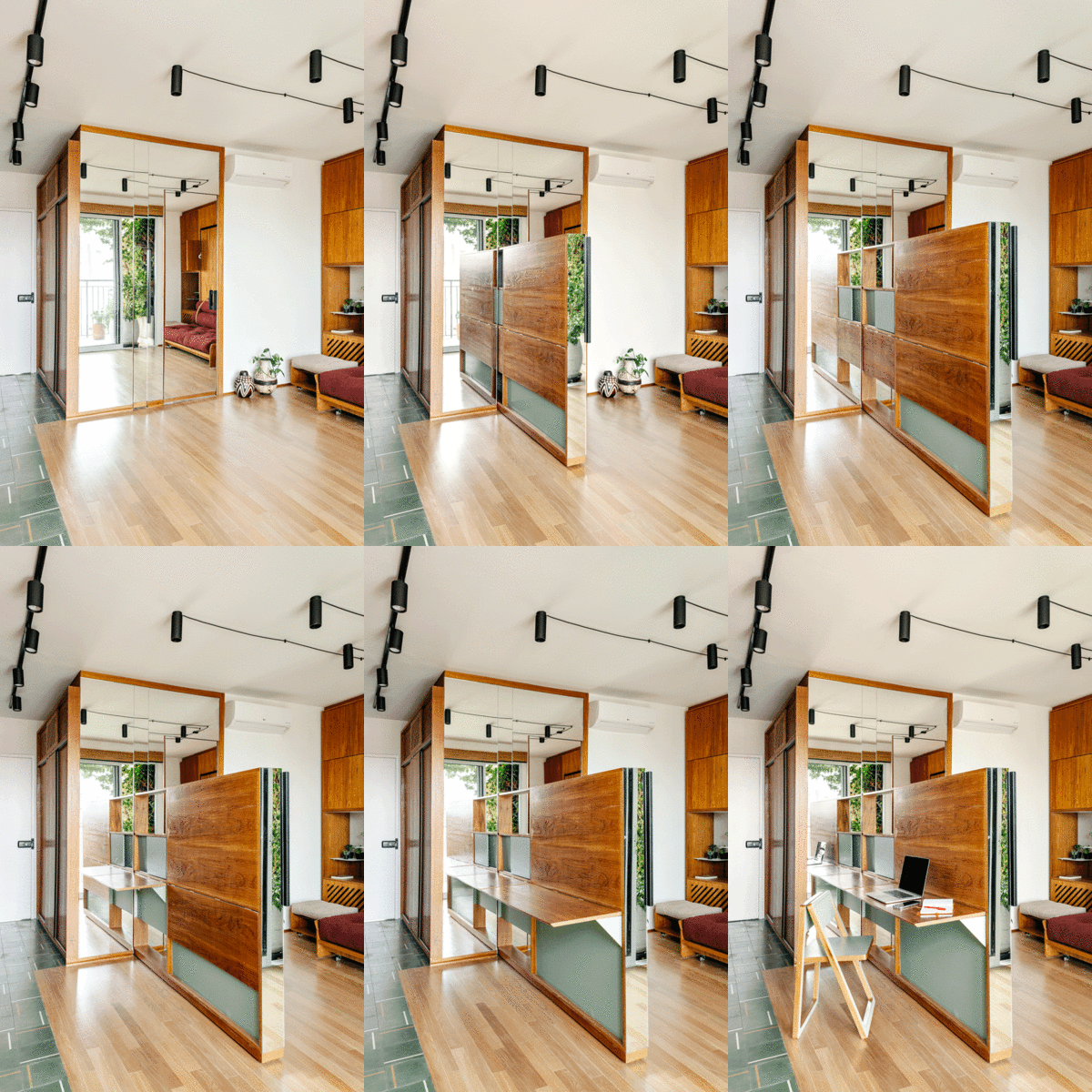
A retractable unit turns the 312-square-foot flat into an office space with flatpack chairs and fold-out desks.

Houses We Love: Every day we feature a remarkable space submitted by our community of architects, designers, builders, and homeowners. Have one to share? Post it here.

Project Details:

Location: São Paulo, Brazil

Architect: Studio Papaya / @studio.papaya

Footprint: 312 square feet

Photographer: Arthur Duarte

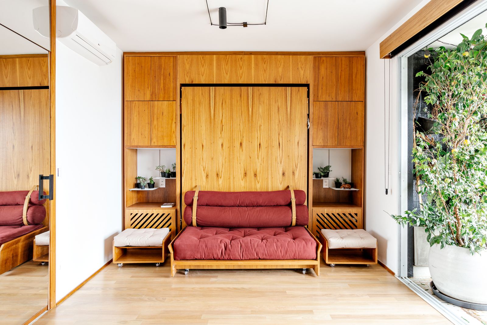
From the Architect: “Located between Augusta Park and Roosevelt Square in the center of São Paulo, the CP Apartment sought to create a multifunctional environment suited for the client’s range of daily activities. The 312-square-foot space had a sliding door and window separating the living area and the bedroom, which we demolished in order to create one unified space. The apartment is now flexible with the introduction of hybrid furniture, which provides a range of uses.

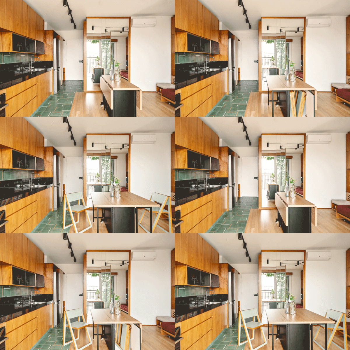
“The custom furniture is made of freijó wood, detailed with light green laminate and black painted metal. In collaboration with designer Laura Garcia, we created a collection of unique handmade objects including a retractable bed, a sliding desk that is also a TV cabinet, and a set of folding table and chairs. Thus, the apartment can be reorganized and transformed into a bedroom, a living room, a dining room, a TV room, a home office, or even in a space for exercising and contemplation. With the intention of giving each area in the apartment its own personality, we designed the floors with different finishing materials: tauari hardwood for the sleeping area, hydraulic tiles for the kitchen area and balcony, terrazzo slabs for the bathroom, and yellow epoxy paint in the shower.

“Despite the limited size of the apartment, the project creates the possibility of multiple uses in order to optimize the footprint. This amplitude, achieved by focusing on the furniture and its functions, met and expanded the possibilities desired by the client, as well as provided a reflection on dwelling in large urban centers and the role of design. With the desire to live in a central area of the city, which comes with high density and high price per square foot, shifting the perspective on the real necessities of living was an essential part of the project.”

Photo by Arthur Duarte

Photo by Arthur Duarte

Ultra-compact apartment with versatile custom-made carpentry furniture.

Ultra-compact apartment with versatile custom-made carpentry furniture.

Photo by Arthur Duarte

See the full story on Dwell.com: The Mirror in This Tiny Brazil Apartment Hides an Entire Work-From-Home Setup
Related stories:

the-kitchen-features-a-curved-wall-from-which-the-island-organically-extends-both-with-a-microcement-finish-the-hinterland-stools-are-by-australian-designer-daniel-boddam.jpg

A Golden Thread Runs Through This Sydney Apartment Revamp

After discovering richly veined marble in the bathrooms, Studio Prineas carried the gilt hue throughout the home’s richly textured spaces.

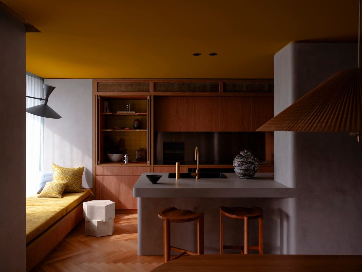
The kitchen features a curved wall from which the island organically extends, both with a microcement finish. The Hinterland Stools are by Australian designer Daniel Boddam.

For architect Eva-Marie Prineas, founder of Studio Prineas, repeat clients are more than friendly faces—they represent the rare opportunity for expression that comes with deep trust and a shared vision. When a young Sydney couple expecting their first child reached out to Prineas for their apartment redesign, it marked the third project Studio Prineas had undertaken for the design-savvy family—having previously worked with the husband’s parents and brother.

<span style="font-family: Theinhardt, -apple-system, BlinkMacSystemFont, &quot;Segoe UI&quot;, Roboto, Oxygen-Sans, Ubuntu, Cantarell, &quot;Helvetica Neue&quot;, sans-serif;">The blue painting—by emerging Australian artist </span><span style="font-family: Theinhardt, -apple-system, BlinkMacSystemFont, &quot;Segoe UI&quot;, Roboto, Oxygen-Sans, Ubuntu, Cantarell, &quot;Helvetica Neue&quot;, sans-serif;">Kasper Raglus—picks up on the soft, powder blue shade of the curtain and the cobalt armchair. The table beneath the painting is the Orbit console by Faye Toogood for Tacchini.</span>

The blue painting—by emerging Australian artist Kasper Raglus—picks up on the soft, powder blue shade of the curtain and the cobalt armchair. 

Photo by Felix Forest

“The family are very interested in design, which made for a lovely process,” says Prineas. “With repeat clients, there’s a lot of trust, so we had considerable creative freedom.”

The brief for the project was clear: Transform a generic, developer-driven apartment in Double Bay—a coveted harborside location in Sydney—into a warm, family-friendly home, working within a tight timeframe and controlled budget. “Our challenge was to rethink how to make minimal changes with maximum impact,” explains Prineas.

Curved timber joinery offers storage for <i>objets d'art </i>and a small desk space. The door handles used throughout are from the Lever 01 collection by Australian architectural hardware brand Bankston.

Curved timber joinery offers storage for objets d’art and a small desk space. The door handles used throughout are from the Lever 01 collection by Australian architectural hardware brand Bankston. 

Photo by Felix Forest

The table beneath the Kaspar Raglus painting is the Orbit console by Faye Toogood for Tacchini.

The table beneath the Kaspar Raglus painting is the Orbit console by Faye Toogood for Tacchini.

Photo by Felix Forest

See the full story on Dwell.com: A Golden Thread Runs Through This Sydney Apartment Revamp
Related stories:

originally-built-in-1881-this-home-in-kent-england-was-renovated-in-2024.jpg

This £2M Home in a Converted Schoolhouse Might Be the Best in Its Class

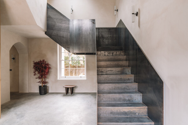
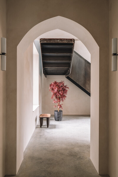
Located steps from the beach in Kent, England, the recently renovated structure has a Flemish-bond brick facade, limewashed interiors, and a striking steel staircase.

Located steps from the beach in Kent, England, the recently renovated structure has a Flemish-bond brick facade, limewashed interiors, and a striking steel staircase.

Location: Stanley Road, Deal, Kent, England

Price: £1,950,000 (approximately $2,523,504 USD)

Year Built: 1881

Renovation Year: 2o24

Renovation Designer: Raycasa Investments Limited

Footprint: 3,964 square foot (5 bedrooms, 4 baths)

From the Listing: “Built over 200 years ago, this five-bedroom former schoolhouse in Deal’s Old Town has been reimagined by its current owner. It unfolds across over 3,960 square feet, with a muted, limewashed palette that emphasizes its generous proportions and soaring ceilings. Original features have been paired with modern interventions such as the steel staircase that winds through the core of the house. An open-plan kitchen and dining room opens to a south-facing courtyard garden. The property lies on Stanley Road, which leads to the town’s shingle beach.

“The house’s period frontage belies the contemporary interiors within. From the outside, Flemish-bond brick and a towering pitched roof render a distinct profile. Entry is from the north side, via an original wooden door that opens to a hallway. Ahead lies the sleek central steel staircase along with adjacent six-over-six Georgian glazing.

“All five of the home’s bedrooms lie upstairs. The principal is defined by tall ceilings, contoured walls, and enough space for a seating area beneath a large, original arched window. There are two further bedrooms on this floor, both with en suite bathrooms concealed behind wardrobes. The remaining two bedrooms lie on the second floor with exposed timber frames.

“Entered via the dining room, the house’s wide and private courtyard garden is bounded by brick walls along three sides, with a row of pleached holm trees along the fourth.”

Originally built in 1881, this home in Kent, England, was renovated in 2024.

Originally built in 1881, this former schoolhouse in Kent, England, was renovated in 2024.

Photo courtesy of The Modern House

Photo courtesy of The Modern House

The ground floor material palette features polished concrete floors and lime washed walls.

The kitchen features polished concrete floors, limewashed walls, oak cabinetry, and marble countertops. 

Photo courtesy of The Modern House

See the full story on Dwell.com: This £2M Home in a Converted Schoolhouse Might Be the Best in Its Class
Related stories:

large.png

A 10-Minute Action Plan for Flood-Prepping Your Basement Living Room

After their below-grade space flooded in multiple storms, a Brooklyn-based couple figured out a quick emergency plan to save their couch during hurricane season.

Those who live along the Atlantic coastline are no strangers to hurricane season, which typically spans late summer through late fall when warm ocean waters abrade with chilly atmospheric temperatures, colliding with hurrying jet streams. In late summer 2021, the remnants of two tropical cyclones—Hurricanes Henri and Ida—gravely impacted a swath of the Northeast, causing devastatingwidespread flooding across the region just a few weeks apart.

Married couple Dewey and Marie were sitting in their basement-level living room in north Brooklyn during Henri (downgraded to a tropical storm by landfall) when they asked themselves what they would do in the event of a flood. The question was hypothetical at that point, but “we both agreed we’d save the couch, which is the most valuable thing in our apartment,” says Marie. “We would lift it onto something, but we never thought that we would actually have to do that.”

A week later, Hurricane Ida hit—and that storm was far more destructive than Henri. When it passed over New York as a post-tropical storm, it broke the city’s record for heaviest rainfall in a single hour and caused unprecedented inland flooding. (Eleven people died in flooded cellar apartments, sparking a wider conversation about the dangers of the city’s mostly unregulated basement homes.)

While the couple was watching a Noah Baumbach movie in their below-grade living room, Dewey says he started to feel “a cold wetness on the bottom of my foot.” He saw sewer water coming up from the drains in the HVAC closet and bathroom. “Right away we snapped into action and got the couch up onto the coffee table and some chairs,” he says. 

Some items couldn’t be saved—vinyl records, suitcases, bath mats, and some laundry—but their West Elm sectional was elevated in time. Their rug was so heavy and foul-smelling from the soaked water that Dewey and Marie had to cut it up into pieces the next day to get it out of their rental.

After the flood, their building’s management replaced the broken water boiler and moldy baseboards and doors, although Marie says “they did the cheapest, most minimal repairs that they could possibly do.” An electrician came in. A gas leak was fixed. But, for the most part, the couple cleaned the mess themselves. Dewey bought a Vacmaster and supplies like Clorox and Swiffer to mop the porcelain tile floor. They opened all of the windows and ran industrial fans that they borrowed to clear the smells of mildew and chemicals.

“The plumber told us that water will find a way. It’ll come out of the toilet.”

Though the couple has renter’s insurance, they learned after their claim was denied that it doesn’t cover floods. They, instead, fought to have their building’s management company reimburse them for the cost incurred by damages. Management essentially shrugged at the incident—they told the pair that flooding was a citywide problem, with the drains not being able to handle the amount of water going in.

Marie and Dewey then spoke to a plumber about setting up a backflow stoppage in the pipes so that water doesn’t come up from the drains, but they learned that it’s impossible to contend with the forces of Mother Nature. “The plumber told us that water will find a way. It’ll come out of the toilet,” says Marie. So they came up with an action plan. 

“Over the course of this ordeal, we have essentially become professionals at dealing with this situation, to the point where we’re very prepared for it if this would’ve happened again, which it did,” says Dewey, referring to the floods that affected New York City in September 2023.

First, the couple keeps an eye on the weather apps—they especially like Clime. “We now know what level of precipitation to look out for and we’ll know a day or two in advance if something might happen,” says Marie. Dewey bought durable sawhorses (trestles used to support wood when sawing), which they usually store in a closet, but bring out to elevate and support the weight of their couch during storm prep the night before. Next, they roll up their rug and place it on top of the couches. All of the electrical items get unplugged and the cords are rolled and cleared from the outlets. Dewey’s gigantic framed John Cassavetes poster is moved upstairs.

The idea of moving to try to escape inevitable climate patterns seems more trouble than it’s worth. 

To get valuables off the ground, the couple set up a shelving system under the staircase where larger objects like musical gear and instruments are stored. There is a third drain located near the laundry appliances—the floor is slightly sloped for this drain, and it’s where flooded water eventually goes into—and everything else is pushed as far away from this drain as possible.

“I can whip this basement into emergency formation in about ten minutes,” says Dewey. “I basically get everything off of the floor.” They set up a Nest Cam that points toward the couch so the couple can keep an eye on the status of their basement living room if they happen to be out of town during heavy rainfall.

“Whenever I explain this situation to somebody who doesn’t live in New York, I sound crazy. They ask, ‘Why don’t you move?’” says Marie. “But we have a rent-stabilized apartment in a neighborhood we love, it has a washer and dryer, all of these things, and I’m willing to put up with this inconvenience to live here and have it be great most of the time.”

Dewey also points out that “everybody, to a certain extent, contends with the hazards of weather and natural disasters,” and that they happen to live in an apartment that is prone to flooding. Their neighbors on the top floor deal with leaky ceilings. Their friends in Los Angeles have lost homes in fires. Dewey’s sister, who lives in Massachusetts, deals with strong winds that can knock down trees and damage her house. The idea of moving to try to escape inevitable climate patterns seems more trouble than it’s worth.

“If this situation were ramped up by ten or fifteen percent, then I would not live here, but right now it’s manageable,” says Dewey. “We’re super dialed into all the weather apps and New York City announcements that we have a good enough runway of knowing when stuff is going to happen. I get hundreds of alerts a day, mostly Silver Alerts of some old person wandering around, but I keep these apps on my phone so that we never have a weather-related emergency again.”

Illustration by Sergio Membrillas 

Related Reading:

Is GoFundMe the New Insurance?

Why Do We Keep Developing in Climate Disaster Zones?

large.jpg

Why “The Studio” Created a Faux Frank Lloyd Wright and Filmed at Multiple Lautners

The long list of cameos on the new Apple TV+ series includes a handful of L.A.’s midcentury landmarks—and an invented one as well.

There’s a scene in the first episode of The Studio, Seth Rogen’s new Apple TV+ showbiz satire, when his character, Hollywood executive Matt Remick, charges into the office building of his employer, Continental Studios, past a tour guide who’s telling visitors that the structure was designed by Frank Lloyd Wright in 1927 “in his signature Mayan style.” It was built, the guide says, “to literally be a temple of cinema.” Remick, who is woefully on his way to a meeting about a potential Jenga movie, audibly scoffs, telling his equally fast-paced assistant, “A temple of cinema, huh? And they want me to make movies out of wooden blocks.”

That exchange sets up the whole premise of the already highly praised, cameo-packed series: Legacy film studio fights to stay relevant in the era of streaming, franchises, and fractured viewing. While Rogen’s Remick is a self-described artist and film buff, he’s made his bones pumping out action thrillers. Later in the premiere, he’s promoted to head of the studio, but there’s a catch: His first project has to be a big-budget blockbuster about Kool-Aid. Oh, yeah!


To build the (fictional) studio at the center of The Studio, Rogen and series cocreator/longtime collaborator Evan Goldberg first had to build out their vision for Continental. To do that, they enlisted production designer Julie Berghoff, who’d previously worked with the pair on AMC’s Preacher. They told her they wanted her to think out of the box and create something akin to one of the “Big Five” Hollywood film studios (Warner Bros., Paramount, Sony, Universal, and Disney), complete with its own movie lot and backstory.

She knew from the show’s script that Continental Studios started around 1923, which led her to look at Art Deco and Spanish Revival architecture, two of the dominating styles in Los Angeles during that era. Rogen and Goldberg love midcentury design, with Rogen in particular having a fondness for John Lautner, so the trio settled on Frank Lloyd Wright’s Mayan Revival period. (Wright was an early mentor to Lautner.) It was an easy reference, with examples of that early 1920s Wright era, like the Ennis House, already dotting the L.A. landscape. Berghoff got to work.

Seth Rogen as Matt Remick and Catherine O’Hara

Seth Rogen as Matt Remick and Catherine O’Hara as Patty Leigh on Apple TV+’s The Studio.

Courtesy Apple TV+

“Wright came to Los Angeles after the World’s Fair in San Diego and he was in a very dark place—he was designing a lot of buildings that were very tomblike because he’d lost his wife and his children,” Berghoff explains. “Seth and Evan liked the idea that the studio’s office could feel tomblike too, because it was embracing the fact that this silver screen cinematic world was almost coming to an end with streaming. Creating this place that was antiquated amplified the storyline of the studio.”

To capture Wright’s Mayan Revival essence, Berghoff designed decorative blocks that reference the Continental Studios logo for the facade of the building, as well as the atrium’s pillars and the cavernous entry. “That logo is throughout the whole set,” Berghoff says. “It’s on the floor, it’s in the fountain, it’s on the walls, it’s on the screens, and it’s in the office.” The textile block–style pieces weren’t made out of concrete, brick, or stone though; they were crafted through a combination of CNC routing, laser cutting, and casting. Berghoff’s team laid dark plaster on top of wood, mixed with glass aggregate so it would reflect a little light on-camera.

Production designer Julie Berghoff modeled the set for the offices of Continental Studios after Frank Lloyd Wright’s Mayan Revival–style architecture built with textile blocks.

Production designer Julie Berghoff modeled the set for the offices of Continental Studios after Frank Lloyd Wright’s Mayan Revival–style architecture built with textile blocks.

Courtesy Apple TV+

They had to do it all quickly, too, because they only had six weeks to build the more than 8,000-square-foot Continental Studios interior on a Warner Bros. lot soundstage. (They built the studio’s facade over the front of the actual Warner Bros. TV offices, as well.) Berghoff was conscious of camera movement and how light would reflect through the structure, saying she took particular inspiration from Wright’s Palmer House in Ann Arbor, Michigan, built with perforated brick to let light in and encourage its flow from room to room. She created boxy acrylic lights for the atrium’s pillars inspired by Wright’s Imperial Hotel in Tokyo. Berghoff says the building’s front doors were inspired by the almost-brutalist sunburst doors at Lautner’s Hollywood Hills Harvey House, which is where Catherine O’Hara’s character, a savvy producer and Remick’s former boss, lives on the show. (Lautner’s Carling House stands in as Remick’s home, and another Lautner classic, Silvertop, or the Reiner-Burchill Residence, is the setting for one of the show’s standout episodes.)

When The Studio takes place in the faux-Wright building, it’s often for scenes full of long, moving shots that soar from the atrium to the balcony level of offices above, or that let Remick survey his whole domain through a wall of glass in his corporate fishbowl. Set decorator Claire Kaufman was responsible for sourcing all the studio’s contents, from Remick’s 10-foot walnut desk to a massive mural of Hollywood’s geodesic Cinerama Dome or a custom conference table etched with the studio’s logo.

Much of the midcentury-inspired furniture for the office interiors had to be built from scratch.

Much of the midcentury-inspired furniture for the office sets had to be built from scratch.

Courtesy Apple TV+

See the full story on Dwell.com: Why “The Studio” Created a Faux Frank Lloyd Wright and Filmed at Multiple Lautners
Related stories:

built-just-a-few-years-ago-this-black-catskills-cabin-has-30-foot-ceilings-10-acres-of-land-and-it-comes-fully-furnished.jpg

For $1M, You Can Scoop Up a Sleek Black Cabin in the Catskills

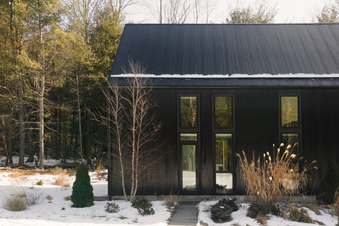
Built just a few years ago, the getaway has 30-foot ceilings, 10 acres of land, and comes fully furnished.

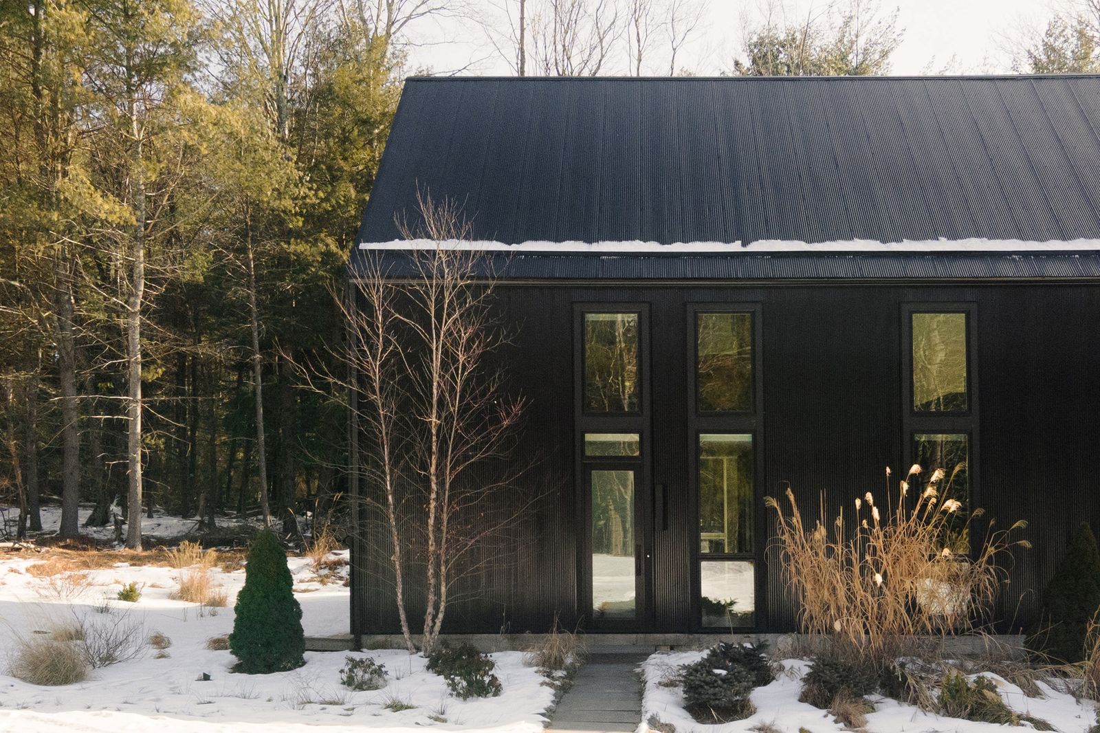
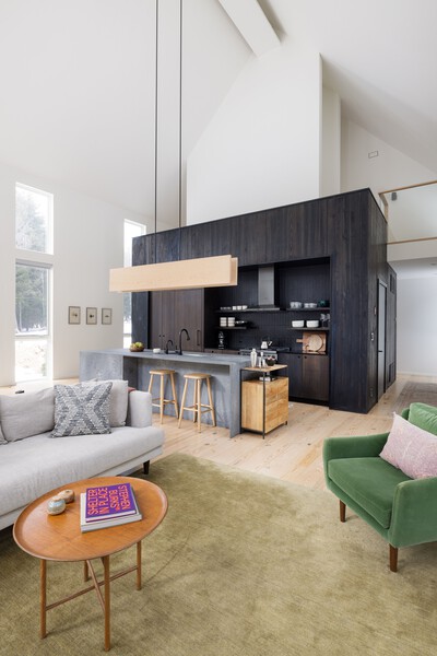
Built just a few years ago, this black Catskills cabin has 30-foot ceilings, 10 acres of land, and it comes fully furnished.

Location: 249 Goldsmith Road, Bethel, NY

Price: $1,095,000

Year Built: 2022

Architect: INC Architecture

Footprint: 2,072 square feet (3 bedrooms, 2 baths)

Lot Size: 10 Acres

From the Agent: “Bethel Pines is a meticulously curated 10-acre sanctuary nestled in the heart of the Catskills. Located just under two hours from NYC, this fully furnished and turnkey property offers both a meditative escape and a vibrant base for exploring the boundless natural beauty of the region. More than a home, it’s an experience—a retreat designed to remind you of the art of slowing down and living well. The prime location places you at the crossroads of culture and nature, just minutes from Bethel Woods Center for the Arts, Jeffersonville’s charming Main Street, and the vibrant energy of nearby towns like Livingston Manor, Narrowsburg, and Callicoon. Whether you’re drawn to the Upper Delaware’s pristine waters or the region’s thriving arts and culinary scene, this home offers a rare balance of solitude and connection—a place to live fully and intentionally.”

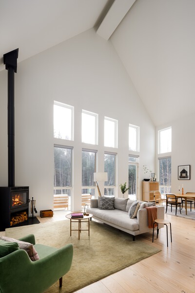
The main room's cathedral ceilings reach 30 feet high.

The main room’s cathedral ceilings reach 30 feet high.  

Travis Mark

Travis Mark

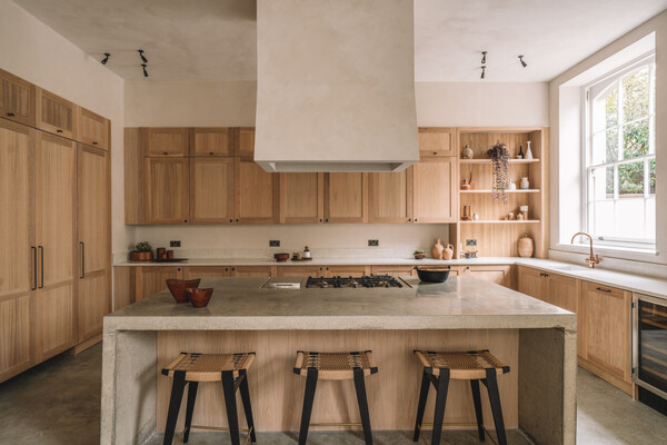
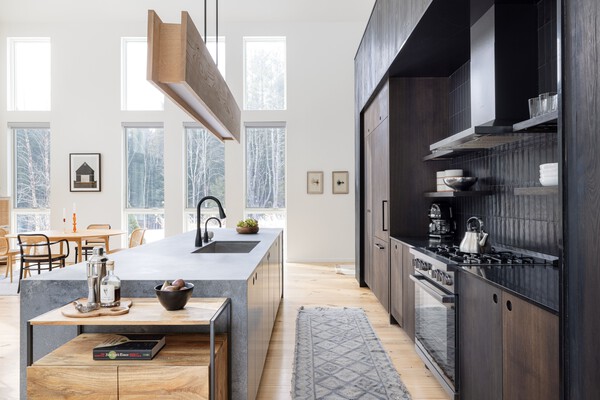
The kitchen cabinetry is fashioned from oak and the island is quartz.

The kitchen cabinetry is fashioned from oak and the island is quartz.

Travis Mark

See the full story on Dwell.com: For $1M, You Can Scoop Up a Sleek Black Cabin in the Catskills
Related stories: