Post-gridiron, Kevin Jones took an internship with USM. Now he’s given the company’s famous Haller pieces what might be their most radical update yet.
Former NFL running back Kevin Jones is full of surprises. Twenty five years ago, as the number-one college draft pick in the country, Jones was suspected to be choosing between Penn State and Virginia Tech. In a much-anticipated televised reveal, he picked up the Penn uniform and tossed it aside, ripping off his sweatshirt to reveal a VT jersey to announce he would be a Hokie. The stunt kicked off a long and fruitful pro-athlete career for Jones, who, after leaving Virginia Tech his junior year, went on to play for the Detroit Lions and Chicago Bears. Then, when Jones retired in 2009, he made another surprising move, this time into the world of design. He returned to Virginia Tech for a bachelor’s in industrial design followed by an MBA, and then founded his own design firm, Joba Studio (Joba is an acronym for Just One Billion Attempts) in 2015 to pursue his longtime passion for creating objects and environments.
This year at Salone del Mobile in Milan, Jones unveiled his latest: an update to USM’s famous Haller shelving that represents a major update to the modular system’s functionality and industrial aesthetic. The release, a collaboration with French designer Marc Venot, introduces felted two-tone reversible panels and magnetic attachments that lets users customize their pieces on the fly. Here, Jones shares why it was time to bring a “more connected, more human, and more modular” touch to the beloved utilitarian shelving, and how his former career on the gridiron helped prepare him for one working with one of the biggest design brands in the world.
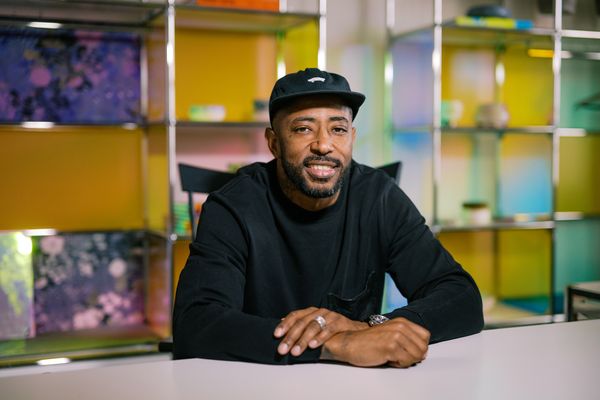
Designer Kevin Jones, a former NFL running back, and his firm Joba Studio have released an update to USM’s Haller shelving system that adds customizable touches.
Photo courtesy of USM
Dwell: Let’s start with your decision to make a leap from professional sports into industrial design—what was going on professionally, intellectually, or emotionally that made you want to change careers?
Kevin Jones: I left early from Virginia Tech to enter the NFL draft, so I didn’t finish my degree. I was studying business and property management. I didn’t know about industrial design as a practice or major, and I thought architecture was the same as construction at that time, so I had really no desire to pursue it. During my time in the NFL, I was sponsored by Reebok, Under Armor, and Red Bull. Having those relationships, you get involved—I wanted to make a decision on the color for my cleats, or I wanted the bottom of my shoes to be all chrome so when I’m running past somebody, they see the shining sole of my shoe. Sitting at the tailor’s shop, my wife was like, Oh, we got to be here all day, because I was so interested in the thread count of the fabrics and the colors. Back then, I didn’t see athletes really caring about fashion and things like they do now, from the standpoint of, like, having a custom-made piece.
So when I was trying to figure out what I wanted to do next, I thought fashion was my gig. I went back to Virginia Tech and told an advisor I wanted to study fashion. They said go to Parsons in New York. And I’m like, Well, I’m a Virginia Tech guy. So what would be comparable if I didn’t do fashion? They said to go check out the architecture program—but again, I thought that that was construction. I talked to an advisor there, and she gave me a tour. They had this huge space where I saw architects and engineers and industrial designers. And I had an overwhelming sense of this is what I should be doing. As soon as I walked in the room, I was like, Oh my God. Product designers were making prosthetic legs and designing sneakers and handbags and all these different things over here, and then there were architecture students that had all these skyscrapers and buildings and pavilions. And I was just like, Yo, this is heaven.
You completed an internship with USM during school. What types of experiences were exciting to you that maybe still resonate with you today that made you want to work with them again?
In my junior year, I met the owner of USM at a Virginia Tech sporting event. He was a football fan, and invited my wife and I to sit in the president’s box—my wife was the president of her class at VT, so that’s why we were invited. We were having a conversation, and I said, Hey, do you guys give internships? And then he basically says, yes, but it wasn’t like this positive, yeah, we do internships. When do you want to start? It didn’t start off like that. But three months later, I got a call from my professor who said USM reached out and asked if I was still interested in an internship.
I went to the company’s headquarters in Switzerland and learned there was a process by which they do things. They manufacture on-site, so I was able to get a first hand experience of the company’s history and how they make the products. I got really familiar with all the parts and the modules and their ethos and way of thinking.
I also got to move around with the creative directors and the COO of the company. They had clients that were creatives—designers that worked for Louis Vuitton and all these other companies, but also work for USM. Most of the employees that work at USM are engineers: They never really have designers or creatives on their team because they don’t want to have group think; they want creatives to stay innovative and not just be stuck with the same modules and tools.
Because it was never on the table to go from being an intern to a creative person within the company, I found other ways to work with them—I had the USM internship, and then they recommended me to Scott, which is a bike and outdoor product company. And at the end of my senior year, I wound up using USM as my thesis project.
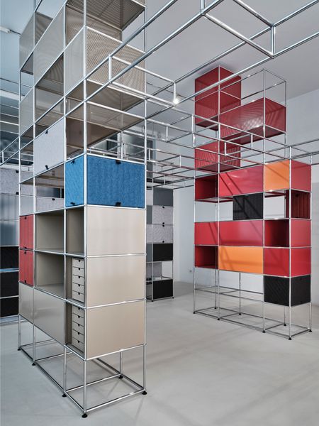
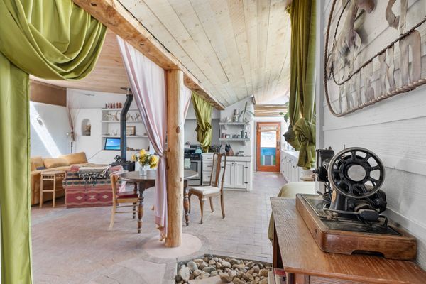
The new release utilizes the same framework as the original shelving, but lets users swap out felted and patterned panels, which are fixed with magnets.
Photo courtesy of USM
Now you’re back with USM, this time collaborating on its famous Haller shelving system. Tell us about the new iteration.
It’s like sports—there’s a system that you put athletes into. That’s why I like the USM Haller system—you have a set of rules, and you have a system, and you can play within those rules. These are the tool: In sports, you have a quarterback, a running back, offensive lineman, wide receiver; in the Haller system, you have a tube, a ball joint, and panels. This is how you put it together. For the new Soft Panel system, we were thinking about the phrase, “More connected, more human, and more modular.” And I was scared to say more modular, because USM is the modular company, right? For us, it was a doubling down on the brand promise.
As a customer, I can build my Haller system from a modularity standpoint online. I can make what I want, but then when I get it in person, it’s hard for me to change it and adapt it in my house to something different. You need special tools, and it’s a tough process. So when we were creating the Soft Panel, we used magnets. It has magnets on the four corners, and you can literally just take a panel, and as soon as it hits the metal, it’s in the frame. And then you can flip the panel up or down, or slide it left and right, depending on what size you have. We also have a two-color panel: Every time you flip the panel, we want the consumer to have a new option. If you have vertical lines on the panel, when you flip it, the other side is going to have color.
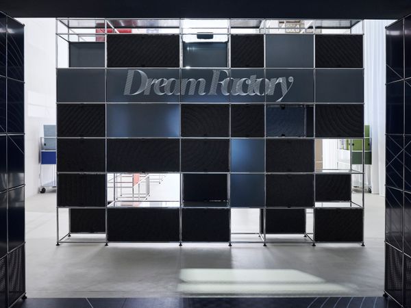
Jones, USM, and French designer Marc Venot, a collaborator on the release, debuted the update at Salone del Mobile in Milan.
Photo courtesy of USM
See the full story on Dwell.com: How a Former NFL Player Made This Beloved ’60s Shelving System Even More Modular